Web Design

Jill B Gilbert reaches a milestone with pro bono projects impact

Volunteer work benefits a range of educational, environmental, professional development, and philanthropic non-profits in the U.S. and abroad

JIll B Gilbert has provided more than 800 hours of pro bono graphic and web design services for non-profit organizations

JIll B Gilbert recently reached a milestone: she has provided over 800 hours of volunteer work, saving non-profit organizations more than $USD 100,000. And she’s not slowing down—currently working on her next project!

Gilbert provided marketing communications, graphic design, and web design services on two dozen projects—many were multiple projects for the same client. The projects ranged from a highly-customized presentation for a sister organization to a U.S. National Park, to branding and logo design for childhood education and Head Start programs and a new high school, to custom presentations and brand guidelines for healthcare organizations.

Gilbert began working with volunteer matching organization Catchafire in 2021, during the height of the pandemic. Technology advances in the past 5 years made it possible to complete all of this volunteer work remotely—even for clients in the Houston area—with client meetings via Zoom or Google Meetings.  She provided project deliverables in electronic format, using Adobe Creative Cloud apps like Adobe Illustrator, Adobe InDesign, Adobe Photoshop, and Adobe Acrobat; Microsoft PowerPoint, Google Slides, and Apple’s Keynote slide software.

Gilbert remarked, “I have enjoyed working on projects with these non-profits. I am open to paid commissions and plan to continue volunteering marketing, graphic design, and web design services to worthy non-profits so they can spend their budgets to further their missions.”

You can read more about several of the pro bono projects in our blog.

"Jill is extremely organized and creative. Her commitment to advancing causes is genuine and inspiring. Jill goes above and beyond! It was a pleasure working with her."
Rosa
Bridges to Science
"I highly recommend anyone to work with Jill. She has a wealth of knowledge, is very kind, responsive, and did a wonderful job on our visual brand guide."
Heather
Wisconsin Association of Free & Charitable Clinics
"Jill knows design! She understands principles of good design and has in-depth knowledge of professional tools to make your designs look great!"
Kerry
Many Hands
Posted by JBG in Branding, Consulting, Corporate Identity, Design, Education, Graphics, Guidelines, Illustration, Logo Design, Marketing, Standards, Typography, Web Design

Jill B Gilbert selected to advise Physician-Patient Alliance for Health & Safety on Learning Management System

The physician-Patient Alliance for Health & Safety (PPAHS), a New Jersey non-profit organization, provides Continuing Medical Education (CME) to nurses, doctors, respiratory therapists, and other medical professionals. Over 30,000 individuals subscribe to their service.

PPAHS needed advice on a new learning management system they plan to launch later in 2022 and selected Jill B Gilbert to help. 

Jill pulled several tools out of her tool kit to help–experience designing and building websites, expertise in graphic design and typography, and, most important, the ability to assess PPAHS’s needs and create a plan for the new LMS website. 

PPAHS was thrilled with the results, and plans to use Jill for future projects. 

Slide presentation for the Physician-Patient Alliance for Health & Safety
Learning Management System Website Content & Design | PPAHS
Jill is an absolute delight to work with. Truly a guru of design! In addition to help with this project, we learned so much from her about fonts, colors, headings, etc.
Dots in a Row
Michael Wong
Executive Director, PPAHS
Posted by JBG in Branding, Color, Consulting, Design, Graphics, Typography, Web Design

So, you want a new website… 30 questions to answer before you build it

Creating a new or updated website to reflect your organization’s identity takes a bit of thought and planning.

Your website is an important part of your organization’s identity. A well-designed website reflects well on your organization, and a poorly-designed website can damage your reputation. I know this is hard, but spend time planning your website before you build it. Understand your audience and design your site accordingly. Make the site attractive and easy to navigate.

Whether you plan to redesign your website or are in the enviable position of designing a new website from scratch, take the time to find answers to the following questions to set your website project up for success. You will be glad you did!

Purpose

  1. WHO is your target audience?
  2. HOW will your website serve that audience? 
  3. WHAT is the compelling marketing message that is tailored to your audience?
  4. WHAT problem does your website solve for each type of person in your audience?
  5. WHAT is the site’s purpose, such as informational, e-commerce, blog, portfolio, news, or a combination of several purposes?

Content

  1. What is the clearly defined goal for each page on your website?
  2. Is your Home/Welcome page compelling?
  3. Does your About page describe the problems that you solve in simple and easy-to-understand terms?
  4. Is your web copy geared to your target audience, clear, easy to understand, and free of jargon?
  5. Do you have a landing page that you can use to collect email addresses and create email subscriptions?
  6. Do you have effective Calls to Action that lead your visitors to a desired action?
  7. What legal content do you need, such as Terms of Use, Privacy, Copyright, and/or other statements?

Design

  1. Is your website “look and feel” cohesive, and consistent with your company’s branding and color standards?
  2. Is your website’s navigation clear and easy to use?
  3. Is the site typography easy to read (fonts, type size, type hierarchy, headings, color and contrast)?
  4. Do you use high quality graphics and images on your website?
  5. Do your fonts and images load quickly?
  6. What is your preferred technical platform, e.g., as HTML + CSS, or a Content Management System like WordPress, Wix, or other?
  7. Is your website responsive—readable on mobile, tablet, laptop, and large screen devices?
  8. Can you maintain and update your website in-house, or do you need an outside specialist?

Marketing Goals and Objectives

  1. What business results you expect from your website?
  2. How do you plan to drive traffic and visitors to your website?
  3. What system do you have in place to track visitor behavior and interactions on your site?
  4. How will your organization generate and capture website leads?
  5. Are your site and any blog posts optimized for search engines?

Security and Backups

  1. What systems will be in place to protect your site from hackers?
  2. What tools or systems are needed to address website crashes and spam?
  3. What user and password security measures will your site have?
  4. What is your backup and recovery plan, including on-site and offsite storage?
  5. What is your periodic site audit plan?

Granted, 30 questions is a lot to answer—but take the time to find answers to every question if you want a website that addresses the needs of your audience and yields business results. If you are not sure how to proceed with your website design and build, please consult a professional that understands the technical, marketing, and business aspects of website creation. You will be glad you did!

Posted by JBG in Best Practices, Branding, Color, Corporate Identity, Design, Marketing, Standards, Typography, Web Design

Should you build your own website, or hire a professional?

If your organization’s website needs a major refresh, you can hire a professional or build it yourself. After all, thousands of free and paid website templates are available, and website building tools are better than ever before. TV and social media ads make it look so easy to build a website! Let’s look at some of the questions to answer before you make a “build or buy” decision.

Website “build vs. buy” questions

What are your objectives? Why do you want to change your site? You may want to refresh your site because it is outdated, because your company is growing or adding products or services, to start a blog, to add the ability to sell products or services online, or for other reasons. Think about the technical and financial objective you want to achieve.

What types of changes do you need? You might be thinking of a total new look and feel, a change to the website structure, or both. Maybe you need a media library to easily store and retrieve images, videos, etc. You might need entire new features, e.g., a blog or e-commerce capabilities. You simply might want a new website that is easier to maintain in-house, rather than hiring a web professional to make changes each time you need them.

How is your current website built? Is it written (coded) in HTML + CSS, or is it built on one of the new platforms like WordPress, SquareSpace, WIX, or other? If it is an HTML site, you will need to know how to write code. If it built on one of the newer platforms, you may be able to build your own site; it may look professional but, depending on your HTML know-how, the site can be a mess behind the scenes. Yes, you read that right! This is because you cannot refresh these sites just by applying a new theme. Many of the current “drag-and-drop” website themes have widgets, code blocks, and other complexities. These site elements may not work in the new theme without a lot of tweaking.

How tech-savvy are you? If you are a lover of things tech, and the first of your friends to get the latest electronics, and you are committed to doing site updates yourself in the future, then building a website may be for you. If you use computers, social media and smartphones every day, but rarely update your electronics or software, this is a warning sign that you should speak to a web designer. But read further…

What is your timeline? If you need it quickly and can effectively plan and build a website, then do-it-yourself might work for you. Just keep your project objectives in mind, spend adequate time planning, get advice as needed, and go for it! If you need it quickly, don’t even consider slapping something together quickly to get a new, improved website up and running. This will do more harm than good. If you have a reasonable timeline, then you have plenty of options, both do-it-yourself and professionally-built.

What will it cost? First, think about the value that the website updates will bring to your company in terms of new clients, more business, and better market penetration. Second, consider the total cost to your organization. This is a cost-benefit issue, not the price tag to get the site up and running. If web development or computer coding are not your core business, you may find yourself spending hours updating the website yourself, at a significant cost to you in terms of lost revenue, missed marketing opportunities, missed new clients, etc. Third, what are the ongoing maintenance and update costs for the next three to five years?

Congratulations! If you have read this far, you now have more questions than answers! At the least, you understand some of the “build vs. buy” issues, and the many choices available to you. If you still have questions about what is best for you, please consult a professional. A short discussion could save you hours of time and a stack of money.

Posted by JBG in Best Practices, Consulting, Design, Guidelines, Web Design

Looking for design inspiration? Try these blogs…

Most designers do not just wake up in the morning, feeling inspired. Something they see or do gets their creative juices flowing. I often find my inspiration on the Internet, and I follow several design blogs. If you don’t know where to look, here is a compilation of 20 design and development blogs to follow. It includes several I have followed for years, plus some new ones I am eager to try… if only there were more hours in the day!

Posted by JBG in Best Practices, Design, Guidelines, Web Design

Develop style guides for your design projects

Whether you are developing a 50-page Website, a small mobile phone app, or an annual report for a corporate client, you should get in the habit of developing a style guide.

Branding and style guides are important for projects large and small. They help to provide consistent messages about an organization and provide a degree of professionalism. Creative Bloq has a good post on this topic, with examples of thirteen style guides for famous organizations.

Client project style guide

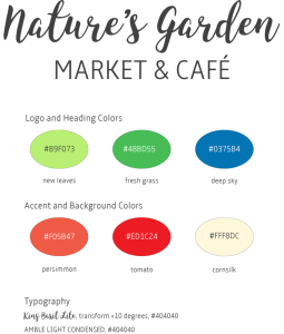
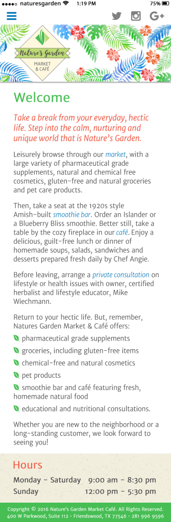
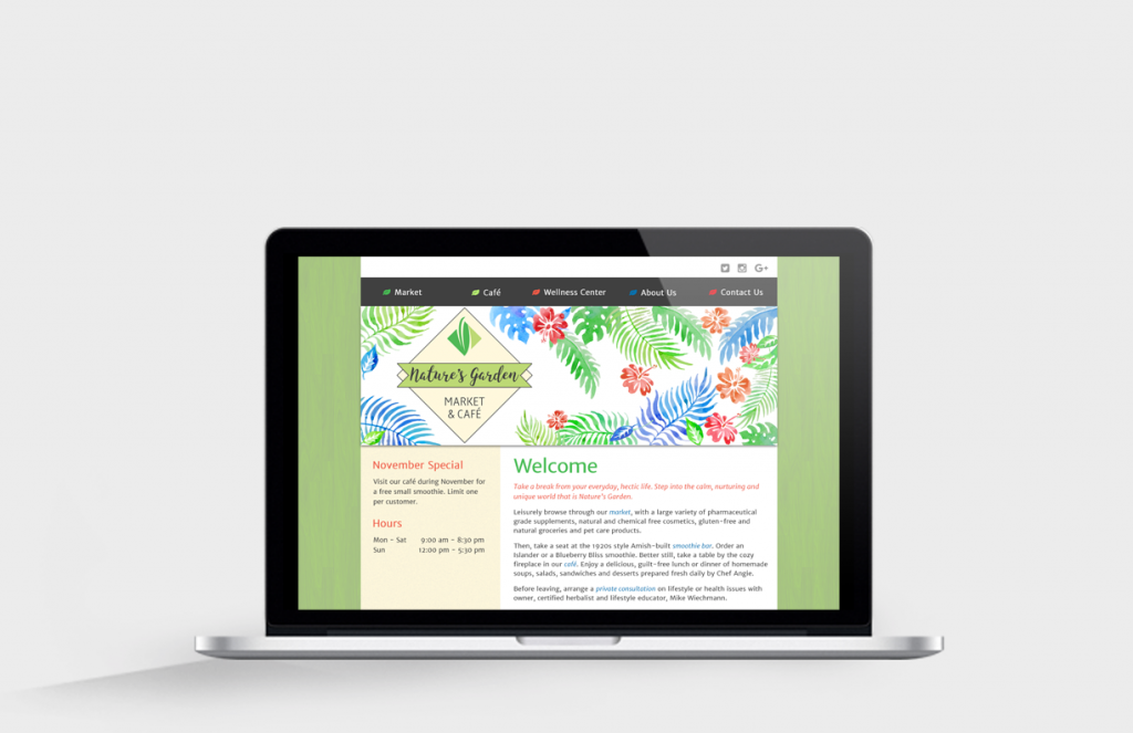
The client’s goal was to refresh their brand and their Web site to draw more customers to their wellness practice and retail establishment. I prepared a simple style guide, using Adobe Illustrator. The Style Guide displays the brand, color chips for main and accent colors, typography and usage examples:

Style Guide | Nature’s Garden

Here is how the styles look when applied to a “mobile first” Website design. Note how the colors and the leaf motif are repeated throughout the page. The design works well on a smartphone, on a tablet or on a large HD screen.

Mobile View | Nature’s Garden
Responsive Home Page on Retina Display

University style guide

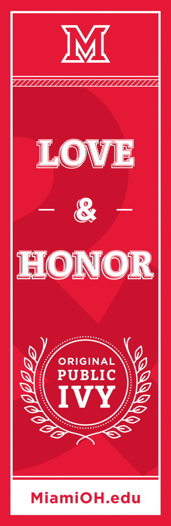
On a whim, I researched my alma mater’s color and brand guidelines. The Miami University is a nationally recognized Public Ivy, and its brand is particularly important. The brand must convey the Public Ivy experience.

The University uses different reds for print, Web and merchandise use. Several formal and informal logos are available for these uses. The use of certain “vintage” logos requires special permission.

The branding guidelines include logos, colors, typography and graphic elements. They encompass Web, print publications, social media, photos, use in athletic programs and more.

How people – alumni, students, future students, faculty and staff, fans, donors, and the public at large – feel about Miami University directly relates to the University’s success. In a sense, the brand speaks on the University’s behalf without saying a word. It represents who we are and what we stand for. It is the visual representation of our reputation.

Miami University Brand Guidelines

Here is the “M” spirit mark often used on sportswear and signs.

The Miami University Spirit Mark

Posted by JBG in Best Practices, Branding, Color, Corporate Identity, Graphics, Guidelines, Logo Design, Marketing, Standards, Typography, Web Design

Why the Internet is blue

Blue rules on the Internet

Envato’s blog post confirmed what many of us have known for a while… blue is the favorite color on the Internet. Just look at logos for social networking sites, and you will see a sea of blue, with some other colors sprinkled in. Facebook Twitter, LinkedIn and Google all use blue for logos and Web sites.

The sky is blue, and the atmosphere is blue. But why did Internet pioneers choose blue, or a specific blue?

  • Tim Berners-Lee, the father of the Internet, was shown blue links on early screen prototypes. The color stuck.
  • Mark Zuckerberg chose blue for FaceBook because he is (red/green) colorblind.
  • Google tested 41 shades of blue for Internet links, and today billions of people see the blue that won the user test.

Designer Paul Herbert’s 2016 analysis of the hues used on the ten most popular Internet sites shows that blue is by far the most popular color, with twice the usage of red or yellow, and four times the usage of green or purple(see my post, The colors of the Web). You can find an interactive version of the image below on his Web site.

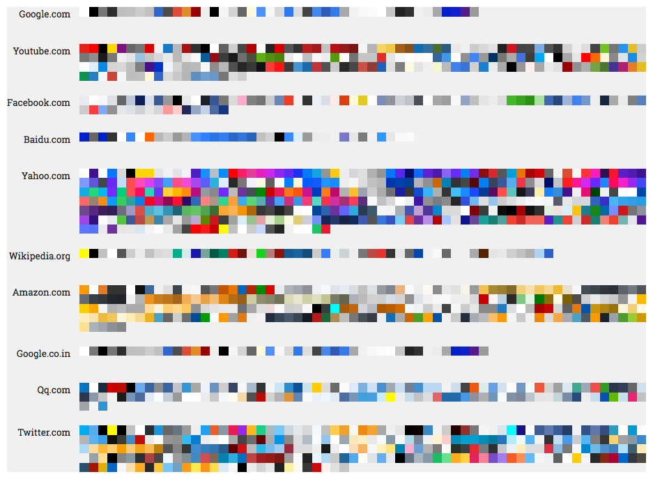
Colors of the 10 most popular Web sites, 2016 (http://paulhebertdesigns.com/web_colors/)

Blue has many personalities

Blue is like a chameleon, with many hues and many personalities. Blue can convey professionalism, it can be warm and inviting, exciting, or cold and scientific. Which blues do you use?

Posted by JBG in Color, Corporate Identity, Design, Web Design

Style matters

Importance of style

Branding and style guides are important for projects large and small. They help to convey consistent messages about an organization and provide an insight into the organization. Creative Bloq posted  examples of thirteen style guides for well-known organizations, from Adobe and Apple to Firefox and Urban Outfitters.

Case study

I attended The Miami University in Oxford, Ohio—established by a charter signed by George Washington and founded in 1809—not the much newer school in Florida. I researched my alma mater’s brand guidelines and found that Miami uses different reds for print, online and merchandise. The Web site provides guidelines and downloads of formal and informal logos in different styles and sizes for print, Web and merchandise use. Certain “vintage” logos require special permission from the University.

Here are examples of school “marks.” The formal signature is used on official stationery and for formal publications; this is one of several. Informal signatures are used for merchandising, sports, and other purposes. 

The Miami University Formal Signature
The Miami University Informal Signature
The Miami University Spirit Mark

Miami’s branding guidelines also include Web standards. It was interesting to see the fonts used. I learned about a new font, Promesh, which looks good on athletic wear and athletic posters. You can download Promesh One and Promesh Two here.

Posted by JBG in Branding, Corporate Identity, Marketing, Typography, Web Design

Designing and building a user interface (UX)

If you have ever designed a Web site, an app or a software User Interface (UX), then you know that it is part art, and part science. The process takes several steps and you may go through several versions of a design before arriving at the final design. Your interface will help users solve certain problems. Therefore, getting the right people involved and keeping them engaged throughout the process is critical.

UX Distilling

Designers are asked to perform minor miracles by transforming large amounts of information into simplified communicative designs.

–Daniel O’Sullivan

Daniel O’Sullivan wrote an InVision blog post about UX Distilling. He likens designing and building a great (UX) to distilling a fine bourbon. O’Sullivan uses a five-step process: identify components | gather requirements | outline | mockup | refine.

Step 1: Identify Components

Identify which ingredients are needed

  • navigation
  • features
  • metrics

Step 2: Gather Requirements

Carefully choose the finest ingredients.

  • for each of the identified components in Step 1
  • focus on helpful and positive metrics vs. all metrics

Step 3: Outline (Design)

Combine the ingredients and distill.

  • know your tools; you don’t have to know how to code, but you have to understand how code works
  • use proper color theory
  • identify iconography

Step 4: Mockup

Beautifully bottle the bourbon.

  • use Photoshop, Illustrator or other tools

Step 5: Refine

Serve and enjoy, and serve and enjoy.

  • use prototyping tools
  • conduct UX testing
  • build
  • an iterative process

My Take

O’Sullivan’s summary of the process is easy to digest and makes perfect sense. I have managed many software business requirements and implementation projects over the last 20 years and follow a similar process. In the early days, I used PowerPoints and crude drawing tools to create mockups. Today, Photoshop, Illustrator and prototyping tools make the process much easier.

To get the full story, watch at least the first 20-25 minutes of the video presentation.

Posted by JBG in Best Practices, Design, Web Design, 0 comments

The colors of the Web

Blues top the charts

Blue hues reign at the top of the most used hues on the most popular Internet sites, according to Paul Herbert Designs. This designer wrote a script to “scrape” the most-used colors from the most visited sites, according to alexa.com. First, he has a graphic with the colors from the top ten sites. You can mouse over a color on his Web site to see its HEX code.

The Most Popular Colors on the Web (Source: Paul Herbert)

The most popular colors by hue

Herbert also charts colors by hue, both on a bar chart and using a radial map where you can change the background color. Blues rule!

Color formats

Herbert analyzed the color code formats used. Designers used HEX (hexadecimal) most often, then RGBa (red-green-blue + alpha), 3-digit HEX and named colors, in that order. None of the designers used RBG, HSL (hue-saturation-lightness) or HSLa (HSL + alpha )formats.

Tools and Tutorials

Finally, Paul Herbert describes the meaning of different color formats, and how to convert colors among the formats. He explains the science behind the different formats; predefined color names, RGB, RGBa, HEX, 3-digit HEX, HSL and HSLa.

Posted by JBG in Color, Guidelines, Standards, Web Design, 0 comments