typography

Multilingual graphic design matters

When asked to do a project for a repeat client, naturally, I said, “Yes!” My pro bono graphic design skills would allow my client–and the original author–to more widely distribute an important training manual. Welcome to multilingual graphic design!

Multilingual graphic design | English layout and translation of a Spanish training manual

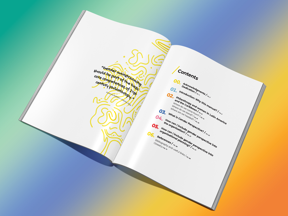
The non-profit philanthropic organization in Melbourne, Australia came across an 80-page training manual written in Argentina and had it translated from Spanish into English. They wanted me to create the English manual with the same typesetting and layout as the Spanish version.


This introduced several challenges, also known as localization issues:

  • English sentences are shorter than Spanish sentences. This creates pages with less text and more “white space.”
  • Some typefaces/fonts are multilingual; others are not.
  • Graphic design and style naming conventions differ among languages.
  • The translation required the designer to recognize differences in spelling and word usage between Australian English and U.S. English.
  • The English translation required rewriting in a few areas to make the words sound more natural.
  • The original, Spanish manual looked good to those who are not trained in graphic design. Behind the scenes, the document needed to be set up with consistent typographic styles and colors.

Luckily, I have a working knowledge of Spanish and have written hundreds of English articles. I enjoy layout and typography. I was up to the challenge.

In this case, my mission was to make the English translation look like the original manual, published in Argentina. But what if my client originally envisioned a document that worked well in multiple languages?

Multilingual graphic design considers several localization issues:

  • Language differences—the translation and the use of common phrases.
  • Cultural differences—the use of acceptable images, colors and words.
  • Sentence length in different languages.
  • Languages that read from left to right vs. from right to left.
  • Multibyte languages with complex characters, e.g., Chinese, Japanese, and Korean.
  • Multilingual fonts—fonts that have all the characters, glyphs, and accent marks found in each language you want to use.
  • White space—embrace the use of white space when designing a document to be written in multiple languages; one line of text can look as elegant as two.

If you are not well-versed in multilingual graphic design, you can find a design firm that is. This was an enjoyable project with great results. My clients and the author of the original, Spanish training manual were pleased, and I learned a few new things as a bonus.

Posted by JBG in Best Practices, Consulting, Design, Graphics, Guidelines, Marketing, Typography

How we helped the Wisconsin Association of Free & Charitable Clinics upgrade their branding

The Wisconsin Association of Free & Charitable Clinics (WAFCC) is an advocate for the State’s ninety free & charitable clinics. The organization provides state advocacy, education opportunities, consulting services, and telehealth services to clinics. WAFCC fosters collaboration, networking, and resource-sharing. They selected Jill B Gilbert for two branding initiatives–brand guidelines and a custom presentation template consistent with these new guidelines. 

Brand Guidelines

Brand guidelines are the rules an organization–large or small–follows to ensure their brand is consistent across various digital and print communications.  These guidelines typically communicate the organization’s voice, style, logo, type, and colors. 

They show the accepted use of the logo, any color variations, and placement, including  very important “Do’s and Don’ts.” If an organization uses specific graphic styles, icons, or illustrations, the guidelines contain these, too.

Brand Guidelines are meant to be flexible, changing as the organization grows and changes. The WAFCC Brand Guidelines are a living document, soon to be updated with examples from the new slide presentation template. 

Wisconsin Association of Free & Charitable Clinics (WAFCC) Brand Guidelines Mockup
Brand Guidelines | Wisconsin Association of Free & Charitable Clinics
"I HIGHLY RECOMMEND ANYONE TO WORK WITH JILL. SHE HAS A WEALTH OF KNOWLEDGE, IS VERY KIND, RESPONSIVE, AND DID A WONDERFUL JOB ON OUR VISUAL BRAND GUIDE."​
Heather Ule
WAFCC

Presentation Template

The most common methods of communication are email,  PowerPoint (/Google Slides/Keynote/Other) presentations, and social media. 

Branding is important in slide presentations, because it sets the tone for your organization’s message. Consistent style and message are key!

Jill B Gilbert designed a template that was a great match for WAFCC’s message and style needs. 

"This was my second project with WAFCC. I enjoyed working with Heather and building a relationship. We plan to work together on more projects in the future."
Wisconsin Association of Free & Charitable Clinics Slide Presentation Template
Wisconsin Association of Free & Charitable Clinics | Presentation Template
Posted by JBG in Best Practices, Branding, Color, Consulting, Corporate Identity, Design, Graphics, Guidelines, Logo Design, Marketing, Standards, Typography