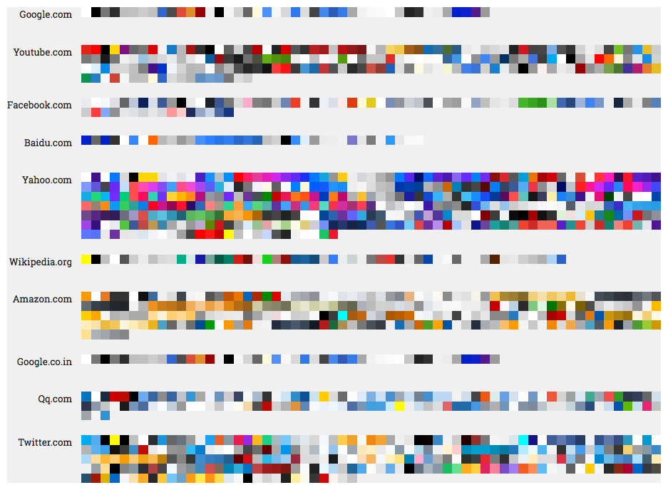
Web Design

Size matters

Your body text is too small

When coding a client website, I needed to make several adjustments in heading and body text size. As a recent blog post by Christian Miller (aka Xtian Miller) says, you can make body text too small, but nobody complains if it is too large. The benefits of using LARGER body text include:

  1. easier to read from a distance
  2. improved readability
  3. improved usability
  4. increased visual impact

Miller says that the majority of Web sites use 15-18 px body text… which brings to mind the (rhetorical?) question that I posed last week–which units to use, points or pixels–when sizing text? I started to use ems and % for line height in my last few Web projects. I like using these relative measurements rather than fixed measurements, once the base font size is defined. I can also use these relative units for font height, for example, headings and other text used for highlights and emphasis.

Miller also writes that “Mobile First” designs can cause designers to be afraid of using larger body text. He provides examples of several sites that use 20 px or larger body text, including Jeffrey Zeldman’s.

Posted by Jill B Gilbert in Best Practices, Corporate Identity, Design, Guidelines, Typography, Web Design, 0 comments

What is minimalist design?

I like minimalist design, but I really did not know exactly what it was until I read this blog post, Minimalist Design: 25 Beautiful Examples and Practical Tips.

Minimalism can be described as the stripping away of all unnecessary elements and focusing on what needs to be there. In this sense, minimalism encourages purpose.”

Worth reading… and I look forward to applying some of the design principles in the future.

Posted by Jill B Gilbert in Best Practices, Design, Web Design, 0 comments

(Almost) everything you need to know about color on the Web

W3 Schools

W3 Schools is a great resource for information on using colors in HTML. The colors HOME page starts with a tutorial on the most common color designations–named colors, RGB, and HEX. The tutorial lets you try the HTML yourself.

If you want to explore different color standards, you can 

  • dive into different national and trade organization color standards
  • find the HEX codes for your favorite Crayola crayon colors
  • see the latest color trends, 
  • and much more!
Posted by Jill B Gilbert in Color, Design, Web Design, 0 comments

Case Study: Client’s design selection process

Background

Our client runs a small business and wants to draw in more customers. An updated Web site will help them to market the business. Our team’s design goals were to develop a fresh look and to bring the site up to current HTML and CSS standards. This included making the new site responsive, so users can access it from a desktop, tablet, or smartphone.

First, we met with the Client to understand their needs and business requirements. Second, our team developed a site structure with the key pages and elements. Third, we coded the Web designs with sample pages.

Typography first, color second

We presented our Client with three different Web designs with desktop and mobile mockups. The Client was neutral during the presentation and did not seem to favor one design over another. Later, when he provided feedback to the project manager, the Client was interested in typography first, colors second, and hardly mentioned other design elements.

Typography can make or break a Web site

It was interesting that many of the changes to get our client site “ready for prime time” involved typography and Gestalt principles. Typography and Gestalt can make a site a success or a disaster.

Typefaces:

  • must fit the organization’s image to convey the intended message and purpose of the Website,
  • must be legible and readable,
  • should be limited to two or three, and
  • should be styled differently to provide emphasis and to separate thoughts.

I took an Invision course, Designing with Type, to learn basic type terms, font pairing mechanics, how to use type on a grid, and more. This will help me to design better Web sites and other graphic communications.

Top 100 Web fonts

Typography trends change, and so do Web fonts. For example, hand-lettered brush fonts are very popular now. In case you were wondering, here is the list of the Top 100 Web fonts for September 2016 and the Top 100 Web fonts for October 2016.

Posted by Jill B Gilbert in Branding, Corporate Identity, Design, Marketing, Typography, Web Design, 0 comments

FontAwesome vs. Google Material Icons

I have used the FontAwesome desktop font for my Web designs and used the Web font on one of my projects. If you like the ability to use the desktop font for your designs in Photoshop and insert the icon names in your HTML, then you have the flexibility to style them to your own specs using CSS. You can find all of the hundreds of FontAwesome icons on their Cheatsheet; just copy and paste the one you want into your Photoshop design. However, FontAwesome takes a lot of resources, especially if you need only a few icons, e.g., phone, location, mail, and social icons. 

Google Material Icons to the rescue! Google offers the MaterialIcons Regular desktop font (TrueType), and a Google Web font as well.  Google claims that its Web font is very compact and does not require a lot of resources. If you prefer to host the icons, you can download individual icons in .png or .svg formats in any color you like, and save these in your Dreamweaver Images folder. Or you can download and host the 900-plus icons on your own server.

I made a “cheat sheet” in Photoshop using Google’s Noto Sans Regular and MaterialIcons Regular fonts. Some of the glyphs are pretty intuitive, e.g., type a lowercase “c” for Close, lowercase “p” for Phone, and lowercase “s” for Search. If you get stuck, just use the Glyphs panel in Photoshop or the Mac FontBook in other programs. Google has fewer icons than FontAwesome, and lacks icons for the common social platforms. 

Posted by Jill B Gilbert in Typography, Web Design, 0 comments