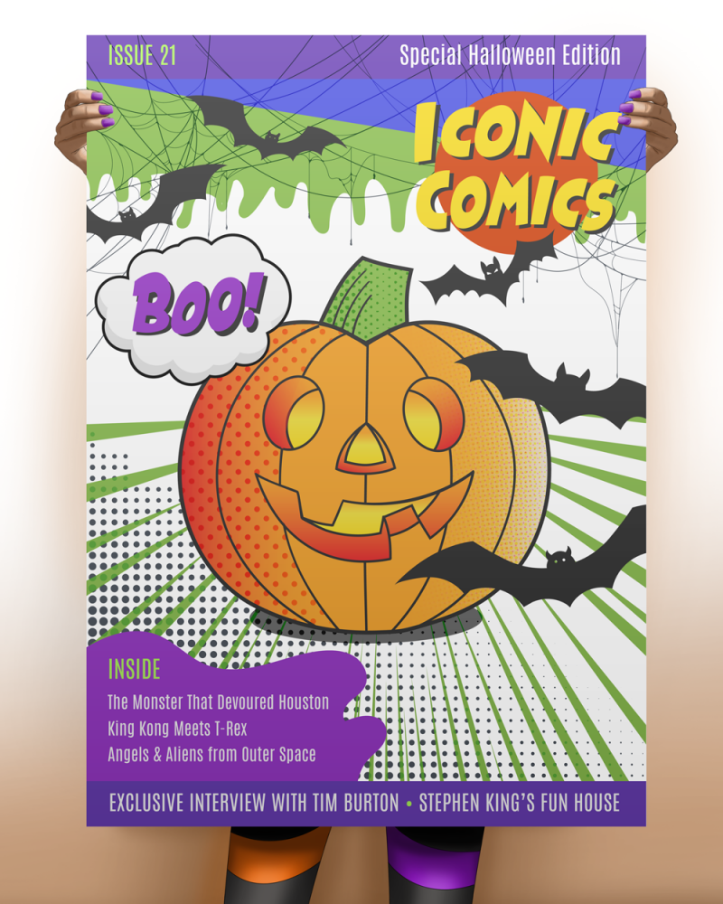
Howzabluz breeds and shows Russian Blue cats. Jill B Gilbert took cues from the owners and ran with it… creating the Texas cattery’s brand as a “cool cat” that brings to mind the Blues Brothers.
The business name “Howzabluz” and the fedora are a rich azure blue; the sunglasses and tagline “Russian Blue Cats” a deep charcoal gray.
The design has made its way to cat shows a few times since its introduction. The brand adorns T-shirts, tote bags, and stickers.
The top three graphic design deliverables my clients request are new or updated brands, brand guidelines, and custom presentation templates.
PowerPoint has been around for more than 35 years. It still rules the roost as the leading slide presentation tool, despite the emergence of tools like Google Slides, Keynote, ZOHO Show, Canva, and Prezi. Organizations large, mid-sized and small use it to communicate all sorts of messages–sometimes well done, and other times not so well done.
With hundreds of free and paid templates available, many of my clients request custom, branded slide templates. Why? Because custom templates do a better job of communicating your brand.
The Venture Mentoring Team | Custom, branded slide deck
Showcase your brand and ditch boring bullet slides
A custom template allows you to showcase your brand. Your brand is more than a logo; it is your company’s personality. Your brand is how others perceive, interact with, and build trust in your company.
Your organization’s personality really shines when you ditch a deck of boring “bullet” slides for a mix of text and graphics. Use a custom template to consistently communicate your brand. See the template above, created for The Venture Mentoring Team. This template fits the organization’s mission, vision, and values, and takes advantage of their logo style and colors. It is a complete package that truly changes how they can communicate from now on.
The Venture Mentoring Team Logo
Primo presentation pointers
Use the template throughout your organization for a consistent message.
Provide guidance on usage of your logo, color palette, typefaces, and fonts (bold, italics, regular, etc.).
Find a style that works for your organization, whether playful or serious, bold or subdued, geometric, minimal or corporate.
Use a single style for graphics and illustrations; don’t use cheap clip art with a first-rate template.
Provide a variety of infographics, photo, and text layouts for different purposes.
Make it easy for others to use the template, providing instructions and training as needed.
If online presentation tools don’t meet your needs, if you want more than the built-in templates that come with your software, or have trouble finding a template you like, then a custom template may be for you.
I have designed dozens (hundreds?) of templates for PowerPoint, Google Slides, and Keynote (for Mac users). If you need a custom, branded presentation template and don’t have the know-how to do it yourself, then consult a pro!
When I studied Art & Design, we had a Photoshop project due just before Halloween. I now call it “The Pumpkin Challenge.” Our assignment was to take a digital coloring book page of a Jack O’ Lantern–just black lines–and use different Photoshop brushes to color the drawing. My pumpkin that year used red, yellow, blue and black halftone dots to create shades of orange and blue. I added a few bats, and it was done!
Last year, I created a special Halloween comic book cover with the same pumpkin outline, elevating the project with other illustration and typography work. This was the first edition of Iconic Comics. I sent it to my former professor, and he was excited to show it to the class.
This year, I continued the tradition with a 2021 version of the Iconic Comics Special Halloween edition. I drew the pumpkin outlines, the green “goo” and the purple blob using the Adobe Illustrator Pen Tool (my former nemesis). I must admit that these days, I use Illustrator more than Photoshop for graphics. I created a Halloween color palette of orange, purple, green and black. The pumpkin uses gradients and three different halftone effects for shading and highlights. I found vector drawings of the spider webs and bats on Vecteezy, and modified them to fit my theme.
I sent a copy of the latest comic book cover to my professor, who was happy to share it with his class. Enjoy!
Paul Rand designed the IBM trademark, the Westinghouse “W,” the marks for American Broadcasting Company (ABC), UPS, Esquire Magazine, Harcourt-Brace and other memorable trademarks. A recent post on logodesignlove discussed a 1971/72 article by Stanley Mason on how Rand presented his work to clients. Long before the days of digital graphic arts, Rand created short-run offset print publications to present to his clients. Paul Rand avoided flashy presentations and let the work speak for itself, presenting booklets to the top decision-making executives. This was pure genius, as these printed materials helped cement the designs as finished products.
IBM Logo | Image: Wikimedia Commons
In the article, Mason wrote that the trademark “should be distinctive, memorable, and reflect in some way, however abstractly, the nature of the product or service it represents.” Rand’s rebranding of IBM added eight horizontal stripes and a brilliant blue to the previous trademark. This added movement and color made the mark more dynamic and memorable. It remains strong today.
The ABC logo is simple and understated, yet everyone remembers it. Image: Wikimedia Commons
The NeXT computer logo may not be as memorable since the company disappeared. Image: Wikimedia Commons
You can read more and download the Mason article here.