A brand is how your customer or audience views your business. A brand includes your organization’s brand identity—a logo and other assets used to convey your message; a brand strategy or blueprint; and brand marketing to spread your message via different digital, print, and word-of-mouth channels.
If you need a new logo, you can work with an in-house graphic designer or hire a freelancer. Follow the eight tips below for a greater chance of success.
1. Understand the "Why"
Why do you need a new brand? If you are just starting out, you may want to brand your products or services. Maybe you are launching a new product or service within an existing company. Perhaps you have a brand, but feel it is outdated, or it no longer reflects your organization’s mission, vision, and values. Do a majority of stakeholders share this need?
2. Understand the "What"
What do you want to accomplish with your new brand? What benefits do you expect, for example, the ability to reach larger audiences via new digital and print channels, greater market share, easier brand recognition, or other?
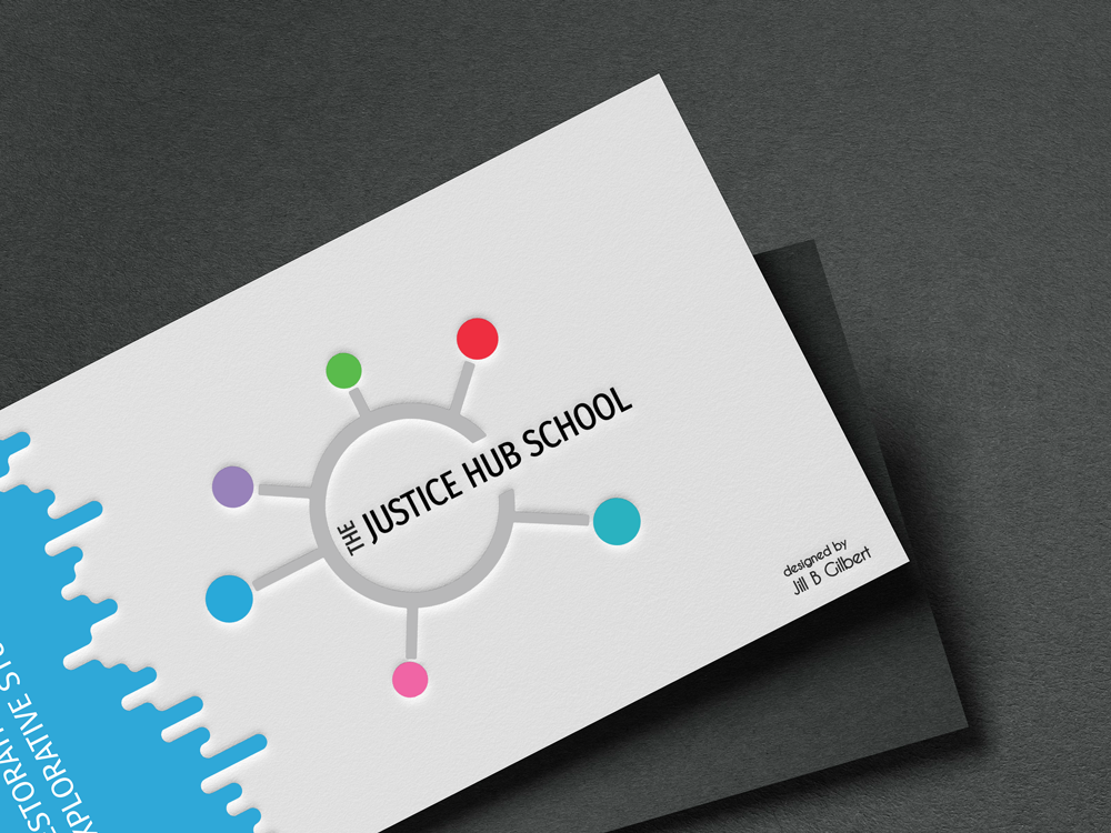
3. A brand is more than a logo
A brand is how your customer or audience views your business. It is the voice of your organization or company. A brand includes your organization’s brand identity—a logo and other assets used to convey your message; a brand strategy or blueprint; and brand marketing to spread your message via different digital, print, and word-of-mouth channels.
4. Do Your Homework
Do your homework before working with the graphic designer. With graphic design projects, it’s easy to express what you don’t like, but not always so easy to express what you do like, and what you really need. Identify your stakeholders, both internal and external to your organization. Talk with these stakeholders to get a feel for how they view the organization and its key message. Get consensus on stakeholder needs, wants, style, and color preferences. It is important to keep in mind that a consensus is something everyone can accept, versus “100% agreement.” Do research and find three to five examples of brands that inspire you; be prepared to talk with the designer about how similar aesthetics might work for your organization.
5. Follow a Process
Creating a brand is a project that should follow a process. This process typically includes the following steps:
- Study Client Brief
- Research
- Brainstorm
- Sketch
- Develop Concept
- Revise
- Deliver.
The designer should set expectations upfront regarding the project schedule and specific deliverables, such as the number of concepts and rounds of revisions.
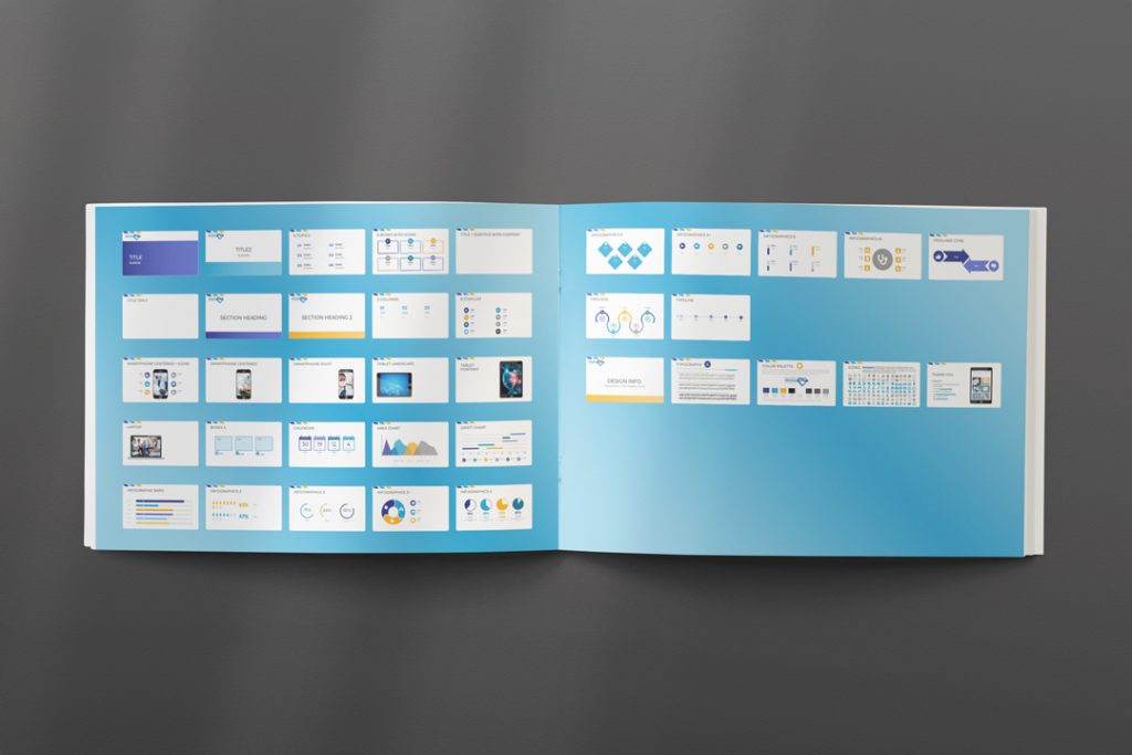
6. Consistency Counts
You will use your brand in digital and print formats, maybe on signage, T-shirts, and more. Make sure that your brand looks great and reads well in different sizes, from an inch or two on a business card or letterhead, to a 12-foot banner at a trade show. You might need a horizontal layout on your web page or a large banner, a vertical layout on stationery and business cards, and an icon only for a website favicon.
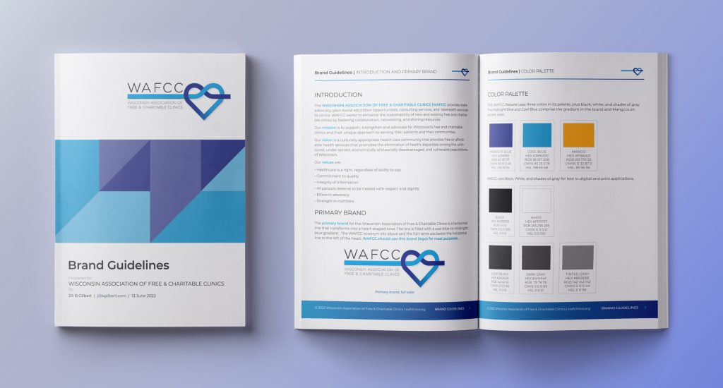
7. Set Standards and Communicate Then
If you do not have Brand Guidelines or a Visual Standards Guide, this is a good time to create one. Such a guidelines describe your organization’s mission, vision, and voice, and how your brand communicates these. The Brand Guidelines should provide official colors for print and web materials; your official accepted logo/brand layouts and color combinations; logo/brand placement; and typography for web and other marketing communications. A brand–even when it consists only of letters or words– is artwork that must not be altered in any way, such as changing its aspect ratio, colors, or typography, or placing it within another shape. Make sure to communicate these standards and their use to your staff. Provide simple training materials.


8. Protect Your Assets
A brand is one of your organization’s assets and becomes more valuable as it becomes widely used and recognized in the marketplace. Enforce the proper use of your brand assets to protect them. Protect your brand like the valuable asset it is—stick to your Brand Guidelines/Visual Standards Guide—always! Add a trademark (™) or service mark (SM) symbol to your brand, and apply for registered trademark status (®) as appropriate.