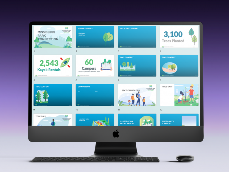
A couple of weeks ago, a client selected my design firm to help with getting their brand on merchandise to sell at events and in their online store. I asked if they had their brand in various layouts and file formats for digital and print purposes. If the answer was, “Yes,” they were ready to go.
It turns out that what they really wanted was a new or refreshed brand, as they felt the current one was outdated.
If you want a new or refreshed brand, find answers to the following eleven questions before you speak with your graphic designer.
Arm yourself with plenty of information before you start the design process. If you don’t know where to start, seek advice from a graphic designer in knowledgeable in design, business and marketing issues and trends.
1. What are your business goals?
Believe it or not, a brand is more than a logo or graphic design; it is about your organization’s message, and how you communicate that message verbally and visually. So, it follows that business goals are connected to your brand. What is your organization’s “big picture?” Are you expanding into new markets? Are you planning new products, services, locations, or methods of reaching out to current or prospective clients?
2. What do you want this Brand to accomplish?
Think about how the graphic design of your brand fits into your marketing plans. If you have an established brand, you might want to update it to capture new markets. If you plan to launch a new brand, how will you generate brand awareness in the marketplace?
3. Who is your target audience?
Do/will you use digital marketing–social media, email, blogs to communicate with current and prospective clients– or traditional print, TV, radio and merchandise marketing methods? Where and how will you display your brand?
4. What marketing channels will you use?
Lorem ipsum dolor sit amet, consectetur adipiscing elit. Ut elit tellus, luctus nec ullamcorper mattis, pulvinar dapibus leo.
5. How Do you want your brand perceived?
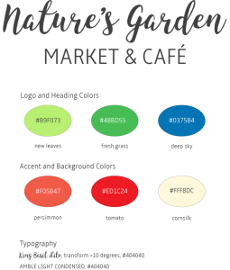
What 3-5 adjectives describe your brand’s personality? For example, “youthful, urban, and edgy,” “corporate, seasoned, and traditional,” or something else? Do you see your brand as casual or formal; modern or traditional? Where do you see your product or service positioned in the market?
6. What are your brand/company values and mission?
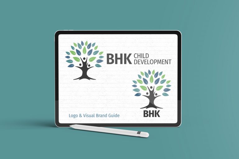
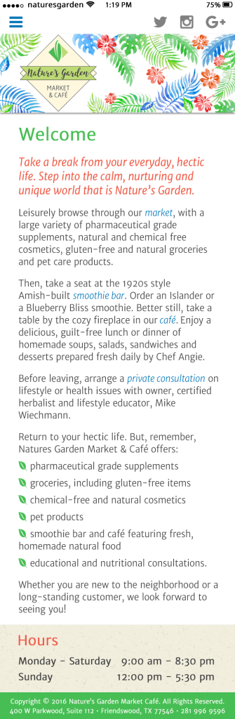
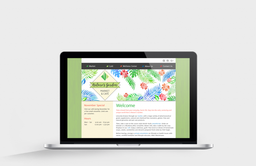
If you closely tie your business model to your values and mission, then your brand design may reflect them. A preschool might want to incorporate a school or students. An environmental organization might want to use a tree, a leaf, something green, or something related to the earth.
7. Do you want to avoid certain topics, themes, imagery or colors?
Images and colors mean different things in different cultures. You may think that all firms that cater to your target audience have brands with similar elements, and you want your brand to stand out. Or, you simply might not like the color orange or purple.
8. Who are your key competitors?
What do you like or dislike about your competitors’ brands? Your graphic designer should create a brand that stands out from the competition, at the same time keeping in mind that you are going after the same audience.
9. Which existing brands do you admire or want to emulate?
If you are a tech startup, do you admire the designs of Apple, Dell, or Microsoft?All of these are quite different, yet recognizable worldwide–and each has gone through a transformation over the decades. What do you specifically like about the brands you admire?
10. What do you like and dislike about your current brand?
Knowing what you like and dislike is valuable information that will help you to launch your new or refreshed brand. You may think the colors or typeface are outdated, or you may think you want to start over with a new design. Either way, this is a great opportunity to enhance your overall brand strategy.
11. What is your decision making style?
When you embark on a branding initiative, your graphic designer will ask you to make a series of decisions, from design choices like brand style, images, color and typography (fonts) to technical choices like file formats, resolution, and the size your brand will be displayed. Where you are on the scale from Decisive to Indecisive will impact your ability to meet project objectives, scope, schedule, budget, and timeline.
Do you make decisions quickly? Do you make decisions based on feelings or facts? Do you get bogged down in “analysis paralysis?” For a description of business decision making types, read more here.
When I say, “You,” I really mean “you and your key stakeholders in this branding effort.” I recommend that you seek input from your key stakeholders before reaching key project milestones, but I do not recommend building your brand “by committee.”
Spending time to answer these eleven questions–including input from key stakeholders–can better position you for success in your branding initiative. Credit to 99 Designs for their original post; I added my perspective to their eleven questions.
Is all this effort worth it? Clients who understand the importance of branding say it is. If branding is new to you, So You Think You Need a New Brand might provide some insight.
As always, if you lack the internal resources to do a branding project, seek outside help. And, if you don’t know where to start, seek advice from a graphic design professional that also understands business and marketing issues. You will be glad you did.