14
Jan
2022
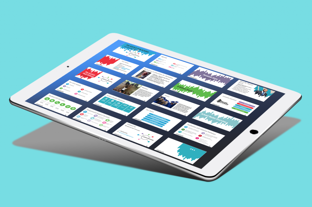
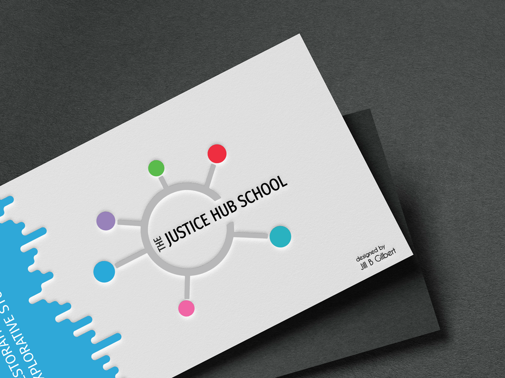
Jill B Gilbert delivers stylish slide templates for The Justice Hub School

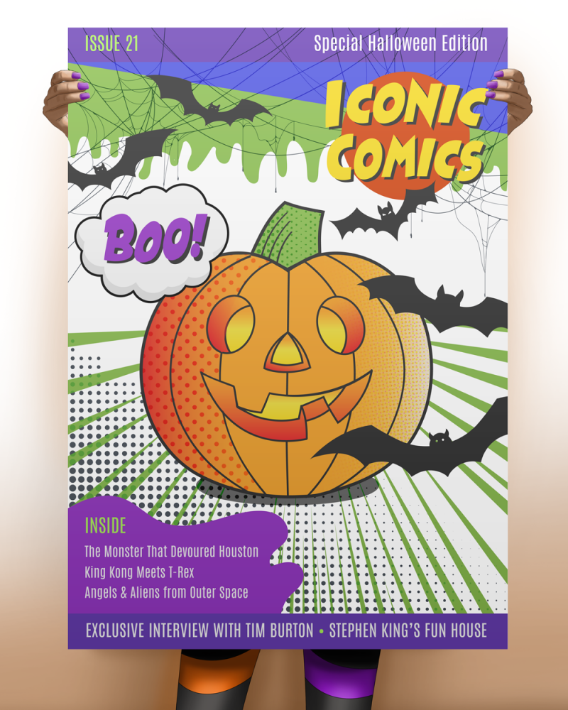
Halloween 2021 Comic Cover
When I studied Art & Design, we had a Photoshop project due just before Halloween. I now call it “The Pumpkin Challenge.” Our assignment was to take a digital coloring book page of a Jack O’ Lantern–just black lines–and use different Photoshop brushes to color the drawing. My pumpkin that year used red, yellow, blue and black halftone dots to create shades of orange and blue. I added a few bats, and it was done!
Last year, I created a special Halloween comic book cover with the same pumpkin outline, elevating the project with other illustration and typography work. This was the first edition of Iconic Comics. I sent it to my former professor, and he was excited to show it to the class.
This year, I continued the tradition with a 2021 version of the Iconic Comics Special Halloween edition. I drew the pumpkin outlines, the green “goo” and the purple blob using the Adobe Illustrator Pen Tool (my former nemesis). I must admit that these days, I use Illustrator more than Photoshop for graphics. I created a Halloween color palette of orange, purple, green and black. The pumpkin uses gradients and three different halftone effects for shading and highlights. I found vector drawings of the spider webs and bats on Vecteezy, and modified them to fit my theme.
I sent a copy of the latest comic book cover to my professor, who was happy to share it with his class. Enjoy!

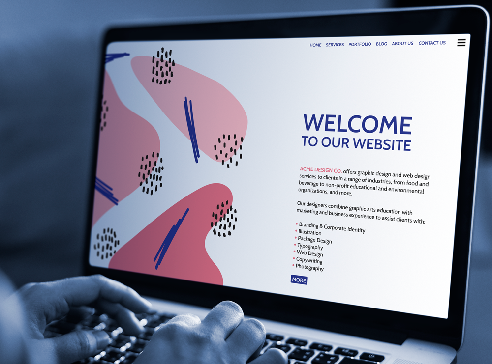
If your organization’s website needs a major refresh, you can hire a professional or build it yourself. After all, thousands of free and paid website templates are available, and website building tools are better than ever before. TV and social media ads make it look so easy to build a website! Let’s look at some of the questions to answer before you make a “build or buy” decision.
What are your objectives? Why do you want to change your site? You may want to refresh your site because it is outdated, because your company is growing or adding products or services, to start a blog, to add the ability to sell products or services online, or for other reasons. Think about the technical and financial objective you want to achieve.
What types of changes do you need? You might be thinking of a total new look and feel, a change to the website structure, or both. Maybe you need a media library to easily store and retrieve images, videos, etc. You might need entire new features, e.g., a blog or e-commerce capabilities. You simply might want a new website that is easier to maintain in-house, rather than hiring a web professional to make changes each time you need them.
How is your current website built? Is it written (coded) in HTML + CSS, or is it built on one of the new platforms like WordPress, SquareSpace, WIX, or other? If it is an HTML site, you will need to know how to write code. If it built on one of the newer platforms, you may be able to build your own site; it may look professional but, depending on your HTML know-how, the site can be a mess behind the scenes. Yes, you read that right! This is because you cannot refresh these sites just by applying a new theme. Many of the current “drag-and-drop” website themes have widgets, code blocks, and other complexities. These site elements may not work in the new theme without a lot of tweaking.
How tech-savvy are you? If you are a lover of things tech, and the first of your friends to get the latest electronics, and you are committed to doing site updates yourself in the future, then building a website may be for you. If you use computers, social media and smartphones every day, but rarely update your electronics or software, this is a warning sign that you should speak to a web designer. But read further…
What is your timeline? If you need it quickly and can effectively plan and build a website, then do-it-yourself might work for you. Just keep your project objectives in mind, spend adequate time planning, get advice as needed, and go for it! If you need it quickly, don’t even consider slapping something together quickly to get a new, improved website up and running. This will do more harm than good. If you have a reasonable timeline, then you have plenty of options, both do-it-yourself and professionally-built.
What will it cost? First, think about the value that the website updates will bring to your company in terms of new clients, more business, and better market penetration. Second, consider the total cost to your organization. This is a cost-benefit issue, not the price tag to get the site up and running. If web development or computer coding are not your core business, you may find yourself spending hours updating the website yourself, at a significant cost to you in terms of lost revenue, missed marketing opportunities, missed new clients, etc. Third, what are the ongoing maintenance and update costs for the next three to five years?
Congratulations! If you have read this far, you now have more questions than answers! At the least, you understand some of the “build vs. buy” issues, and the many choices available to you. If you still have questions about what is best for you, please consult a professional. A short discussion could save you hours of time and a stack of money.
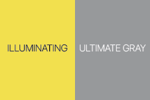
Each year, Pantone selects a Color of the Year that establishes design and fashion trends. And the Pantone Colors of the Year for 2021 are… Illuminating and Ultimate Gray. This is the first time that Pantone selected two colors.
The bright yellow and the medium gray colors signify a fresh start, and together are bright and cheery. Last year, the color was Classic Blue–which, as it turns out, describes 2020 well.
I used the Pantone Connect app to discover different color harmonies for the 2021 Colors of the Year–analogous, complementary, triadic, and tetradic color palettes. I selected fourteen colors plus yellow and gray to create art in the style of Damian Hirst. Here is the colorful result.
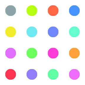
Note: you can use Pantone Connect online in a browser, as an extension to Adobe Creative Cloud applications, and as a smartphone app.