02
Sep
2020

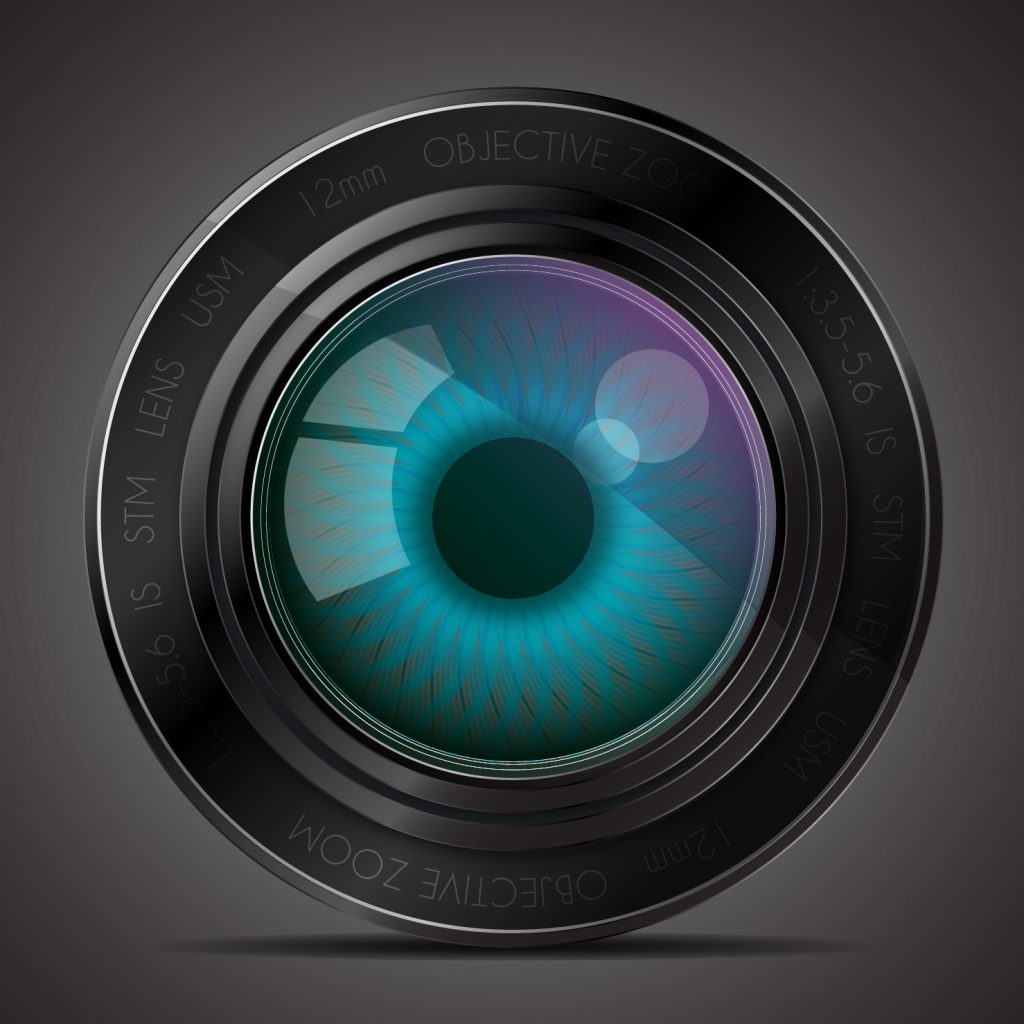
Procreate is a Raster (pixel) drawing app with many features not found in other drawing apps available for the iPad.
In 2019, my “go-to” tools for making quick–and detailed–graphics and illustrations were Adobe Illustrator and Adobe Photoshop on my Macbook Pro. My setup included a Wacom drawing tablet, a wireless keyboard, and a large monitor. My iPad was a secondary tool, hardly part of my graphic design workflow. I dabbled in the different Illustrator and Photoshop apps for the iPad, but they seemed awkward.
Then I traded in my iPad for an iPad Air (3rd Generation) and bought an Apple Pencil. I kept hearing about an app called Procreate, designed for the original iPad Pro and the Apple Pencil. A blog I follow had lots of Procreate tutorials, so invested a small sum of ten dollars (!) and got started. Read on to learn the ins and outs of Procreate.


Procreate offers many features not seen in competitors’ drawing apps. I recommend it as part of a graphic design workflow and use it almost daily. It is a true gem, and well worth the money.
On April 20, San Jacinto College Vice-Chancellor Laurel Williamson, QEP Director Ann Pearson, and the QEP Committee announced that it selected Jill B Gilbert’s design to represent the program for the next five years (see the QEP page here). The college’s Quality Enhancement Plan (QEP), Thinking and Beyond, promotes student success through critical thinking.
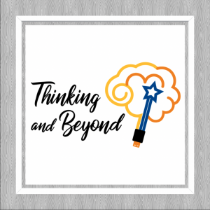
Gilbert’s design addresses the “right brain” creative and “left brain” logical aspects of critical thinking, as well as the San Jacinto Monument, topped by a star, and a USB connector to symbolize how students are always plugged in—the connection between critical thinking and technology.
Viewed another way, the symbol depicts a launched rocket, shooting for the stars, with puffs of exhaust parting as the rocket travels upward. This is an homage to Houston, aka the Space City; Jill’s Dad, a rocket scientist, and her little brother who followed in his Dad’s footsteps.
Last week, one of my French friends sent me a link to a PowerPoint presentation on the hidden meaning behind several corporate logos. I knew about the hidden arrow in the FedEx logo; the smiley face and lowercase letter “g” in the Goodwill logo; the smile and arrow from A to Z in the Amazon logo; and the hidden number 31 in the Baskin-Robbins logo. I know enough French to translate the captions on the slides.
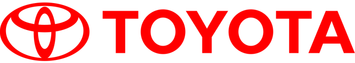
Today, I came across an English version in a blog post by Onextrapixel. It is a pleasant and quick read. The biggest surprise is the meaning of Toyota’s oval icon—it combines strokes for each of the English letters in the company name!
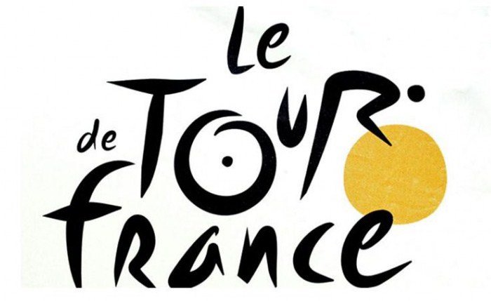
Another favorite is Le Tour de France brand. The letter “R” depicts a bicycle rider and the letter “O” and the yellow circle represent two bicycle wheels and the sun; the ride takes place only during daylight hours.
Both of these brands have stood the test of time—they are crisp and memorable. Their hidden meanings make them more interesting.
A Fast Company Design article relates how Steve Jobs worked with legendary designer Paul Rand to develop a logo for NeXT Computer.
Whether you have millions of dollars or a more modest marketing budget, the takeaways ring true.
The Envato blog had an interesting post about the stories behind Paul Rand’s logo designs.
Born in Brooklyn in 1914, Paul Rand is responsible for some of the most iconic brand identities, including IBM, ABC, Westinghouse, UPS and Next Computer. Though he studied art at Pratt Institute, he claimed that he was self-taught. He was inspired by European commercial arts journals and European modern artists and started his career creating magazine spreads. Soon he created magazine covers, notably for Esquire. At 27, he headed an ad agency, incorporating art into what, in the past, was mostly copy.
By the 1950s Rand moved on to logo work. And the rest is history, as they say.
Good design is good business” —Thomas Watson Jr., IBM
You can see some of the famous work here.
Paul Rand designed the IBM trademark, the Westinghouse “W,” the marks for American Broadcasting Company (ABC), UPS, Esquire Magazine, Harcourt-Brace and other memorable trademarks. A recent post on logodesignlove discussed a 1971/72 article by Stanley Mason on how Rand presented his work to clients. Long before the days of digital graphic arts, Rand created short-run offset print publications to present to his clients. Paul Rand avoided flashy presentations and let the work speak for itself, presenting booklets to the top decision-making executives. This was pure genius, as these printed materials helped cement the designs as finished products.
In the article, Mason wrote that the trademark “should be distinctive, memorable, and reflect in some way, however abstractly, the nature of the product or service it represents.” Rand’s rebranding of IBM added eight horizontal stripes and a brilliant blue to the previous trademark. This added movement and color made the mark more dynamic and memorable. It remains strong today.
The ABC logo is simple and understated, yet everyone remembers it. Image: Wikimedia Commons
The NeXT computer logo may not be as memorable since the company disappeared. Image: Wikimedia Commons
You can read more and download the Mason article here.
As a consultant, it is interesting to see if prospective clients want a “second set of hands” or if they want advice to help them address a business need. In my past life as a management consultant in the software business, I sought the second type of assignment. The more problem-solving, the better.
In my role as a freelance creative professional, I still seek, and truly enjoy, “value-added” assignments where I can solve problems. I am still a consultant. The difference is, now I have lots of business and marketing expertise plus I have an eye for, and possess, Web and graphic design skills.
Image credit: Freepik
A beginning consultant brings skills, an experienced consultant brings value.”
–Jeffrey Zeldman
Web design guru Jeffrey Zeldman says that an experienced consultant brings value. To survive as an independent consultant at any age, and to remain meaningful in the digital design world, you must bring something different to the table. You must bring value.

Pantone’s Color of the Year for 2018 is Ultra Violet, otherwise known as Pantone 18-3838.
Upon introducing the color, Pantone said, “A dramatically provocative and thoughtful purple shade, PANTONE 18-3838 Ultra Violet communicates originality, ingenuity, and visionary thinking that points us toward the future.”
You can find tools for designers, including color palettes for Adobe Creative Cloud and other programs.
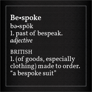
More and more big companies commission their own typefaces, rather than relying upon the thousands of fonts readily available for marketing their goods and services.
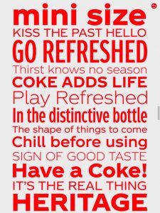
This month, The Coca-Cola Company (TCCC) introduced its bespoke Unity font. Depending on who you ask, some designers love it, and others hate it. Coca-Cola has used a script logotype for decades, and a while back introduced a serif font with the word, “Coke.” Unity is a departure; it is a sans-serif typeface family with several weights.
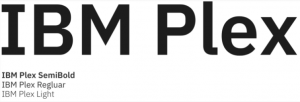
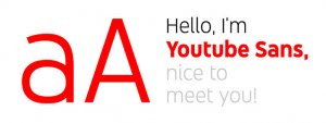
In 2017, IBM rolled out its bespoke typeface families, named Plex, and YouTube introduced YouTube Sans.
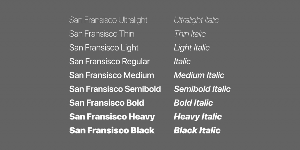
In 2016, Apple introduced San Francisco typefaces at its Worldwide Developer Conference. These fonts were inspired by Helvetica, and were developed for ease of reading on small screens like the Apple Watch and iPhone, as well as on iPads and Mac computers. The same year, CNN introduced CNN Sans—also modeled on Helvetica.
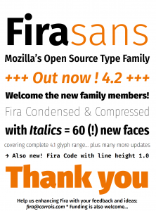
In 2015, Google rebranded its famous “G” using a proprietary font called Product Sans. Product Sans closely resembles the Futura typeface. Google rolled out Roboto In 2013 for the Android OS. Also in 2013, Mozilla rolled out typefaces for its Firefox OS, called Fira Sans and Fira Mono.

It’s all about branding. We are bombarded by thousands of advertisements each day on smartphones, tablets and computers. We see an ad for a fraction of a second before engaging with the brand or discarding the ad. According to Envato, having a recognizable logo is not enough. Companies must stand out from the competition using logos, colors, copy and typography. This is where custom typefaces come in.
Branding requires notable logos, colors, copy and typography. “Bespoke fonts offer brands more control over their identity, and in some cases can even save them money in the long run.”
–Envato
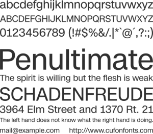
Helvetica (Neue Haas Grotesk) was developed in 1957 by Swiss typographer Max Miedinger and became the de facto standard of international typeface design in the mid-20th Century. It remains popular today—Helvetica Neue is the default Mac font—because it is both readable and legible at many different sizes and weights.
Helvetica is not going away anytime soon. It is still the favorite of many designers because of its versatility and simplicity. Just make room for the new, bespoke typefaces to coexist with Helvetica.


