Howzabluz LLC is a Houston-based cattery that shows and breeds Russian Blue cats. They had a new logo and needed a Website. They also wanted business cards to take to cat shows. Howzabluz liked the idea of a color scheme that represents the Russian Blue breed—a beautiful bluish gray.
Jill B Gilbert updated the brand colors and created a Website that gets hundreds of hits each month. That’s good for a small business!
Brand Refresh
The original brand used a bright blue and tinted black; the updated brand uses slate blue and a very dark marine blue.
A brand is how your customer or audience views your business. A brand includes your organization’s brandidentity—a logo and other assets used to convey your message; a brand strategy or blueprint; and brand marketing to spread your message via different digital, print, and word-of-mouth channels.
If you need a new logo, you can work with an in-house graphic designer or hire a freelancer. Follow the eight tips below for a greater chance of success.
1. Understand the "Why"
Why do you need a new brand? If you are just starting out, you may want to brand your products or services. Maybe you are launching a new product or service within an existing company. Perhaps you have a brand, but feel it is outdated, or it no longer reflects your organization’s mission, vision, and values. Do a majority of stakeholders share this need?
2. Understand the "What"
What do you want to accomplish with your new brand? What benefits do you expect, for example, the ability to reach larger audiences via new digital and print channels, greater market share, easier brand recognition, or other?
3. A brand is more than a logo
A brand is how your customer or audience views your business. It is the voice of your organization or company. A brand includes your organization’s brandidentity—a logo and other assets used to convey your message; a brand strategy or blueprint; and brand marketing to spread your message via different digital, print, and word-of-mouth channels.
4. Do Your Homework
Do your homework before working with the graphic designer. With graphic design projects, it’s easy to express what you don’t like, but not always so easy to express what you do like, and what you really need. Identify your stakeholders, both internal and external to your organization. Talk with these stakeholders to get a feel for how they view the organization and its key message. Get consensus on stakeholder needs, wants, style, and color preferences. It is important to keep in mind that a consensus is something everyone can accept, versus “100% agreement.” Do research and find three to five examples of brands that inspire you; be prepared to talk with the designer about how similar aesthetics might work for your organization.
5. Follow a Process
Creating a brand is a project that should follow a process. This process typically includes the following steps:
Study Client Brief
Research
Brainstorm
Sketch
Develop Concept
Revise
Deliver.
The designer should set expectations upfront regarding the project schedule and specific deliverables, such as the number of concepts and rounds of revisions.
6. Consistency Counts
You will use your brand in digital and print formats, maybe on signage, T-shirts, and more. Make sure that your brand looks great and reads well in different sizes, from an inch or two on a business card or letterhead, to a 12-foot banner at a trade show. You might need a horizontal layout on your web page or a large banner, a vertical layout on stationery and business cards, and an icon only for a website favicon.
7. Set Standards and Communicate Then
If you do not have Brand Guidelines or a Visual Standards Guide, this is a good time to create one. Such a guidelines describe your organization’s mission, vision, and voice, and how your brand communicates these. The Brand Guidelines should provide official colors for print and web materials; your official accepted logo/brand layouts and color combinations; logo/brand placement; and typography for web and other marketing communications. A brand–even when it consists only of letters or words– is artwork that must not be altered in any way, such as changing its aspect ratio, colors, or typography, or placing it within another shape. Make sure to communicate these standards and their use to your staff. Provide simple training materials.
BHK Child Development | Secondary Logo
"A brand is any distinctive feature like a name, term, design, or symbol that identifies goods or services."
A brand is one of your organization’s assets and becomes more valuable as it becomes widely used and recognized in the marketplace. Enforce the proper use of your brand assets to protect them. Protect your brand like the valuable asset it is—stick to your Brand Guidelines/Visual Standards Guide—always! Add a trademark (™) or service mark (SM) symbol to your brand, and apply for registered trademark status (®) as appropriate.
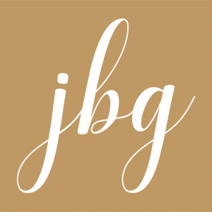
Howzabluz breeds and shows Russian Blue cats. Jill B Gilbert took cues from the owners and ran with it… creating the Texas cattery’s brand as a “cool cat” that brings to mind the Blues Brothers.
The business name “Howzabluz” and the fedora are a rich azure blue; the sunglasses and tagline “Russian Blue Cats” a deep charcoal gray.
The design has made its way to cat shows a few times since its introduction. The brand adorns T-shirts, tote bags, and stickers.
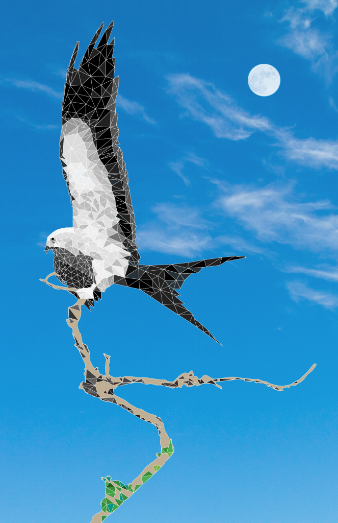
I recently had the opportunity to learn a new skill—how to create low poly illustrations. Low poly, short for low polygon art, is a minimal art style used in video game design, animation, and illustration. This art form requires at least 50% technical skills and the rest artistic skills.
I photographed a Mississippi Kite, a swallowtail bird with its wings spread, roosting in a half-dead tree in nearby Exploration Green. I used another photo of cirrus clouds in a blue sky, and a third photo of the Hunter Moon a couple of weeks ago for the background. I used Adobe Illustrator to create hundreds of triangles to highlight the bird’s colors and contours. This took many hours plus lots of patience and persistence.
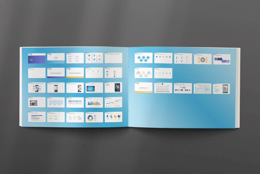
The top three graphic design deliverables my clients request are new or updated brands, brand guidelines, and custom presentation templates.
PowerPoint has been around for more than 35 years. It still rules the roost as the leading slide presentation tool, despite the emergence of tools like Google Slides, Keynote, ZOHO Show, Canva, and Prezi. Organizations large, mid-sized and small use it to communicate all sorts of messages–sometimes well done, and other times not so well done.
With hundreds of free and paid templates available, many of my clients request custom, branded slide templates. Why? Because custom templates do a better job of communicating your brand.
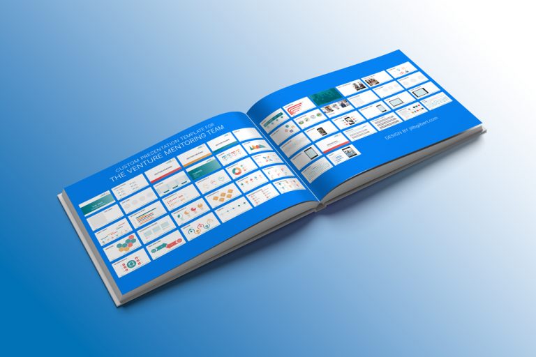
The Venture Mentoring Team | Custom, branded slide deck
Showcase your brand and ditch boring bullet slides
A custom template allows you to showcase your brand. Your brand is more than a logo; it is your company’s personality. Your brand is how others perceive, interact with, and build trust in your company.
Your organization’s personality really shines when you ditch a deck of boring “bullet” slides for a mix of text and graphics. Use a custom template to consistently communicate your brand. See the template above, created for The Venture Mentoring Team. This template fits the organization’s mission, vision, and values, and takes advantage of their logo style and colors. It is a complete package that truly changes how they can communicate from now on.
The Venture Mentoring Team Logo
Primo presentation pointers
Use the template throughout your organization for a consistent message.
Provide guidance on usage of your logo, color palette, typefaces, and fonts (bold, italics, regular, etc.).
Find a style that works for your organization, whether playful or serious, bold or subdued, geometric, minimal or corporate.
Use a single style for graphics and illustrations; don’t use cheap clip art with a first-rate template.
Provide a variety of infographics, photo, and text layouts for different purposes.
Make it easy for others to use the template, providing instructions and training as needed.
If online presentation tools don’t meet your needs, if you want more than the built-in templates that come with your software, or have trouble finding a template you like, then a custom template may be for you.
I have designed dozens (hundreds?) of templates for PowerPoint, Google Slides, and Keynote (for Mac users). If you need a custom, branded presentation template and don’t have the know-how to do it yourself, then consult a pro!
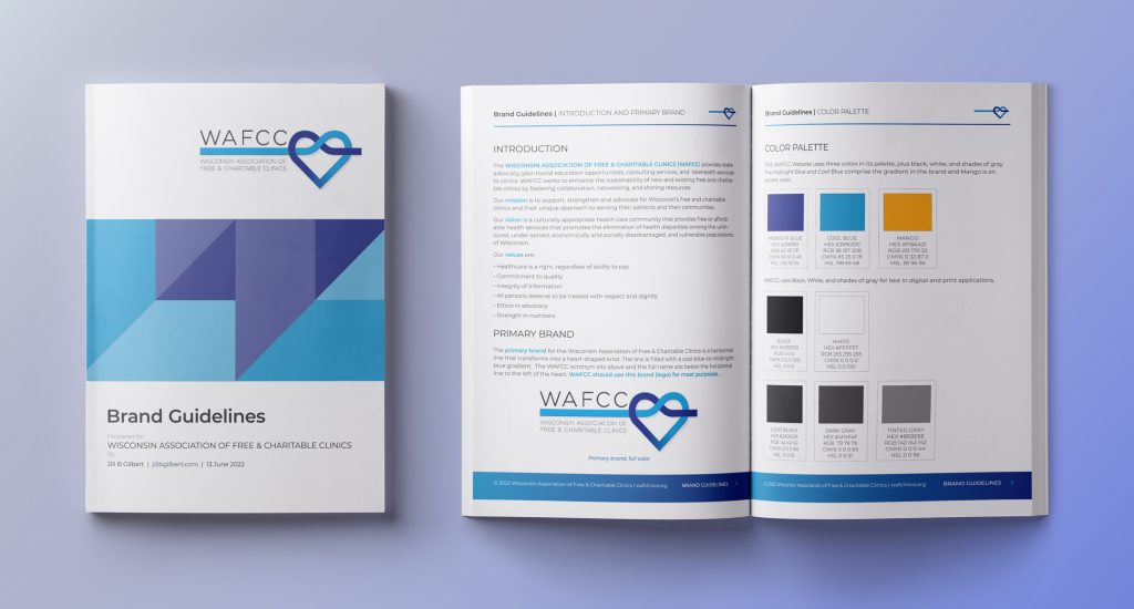
The Wisconsin Association of Free & Charitable Clinics (WAFCC) is an advocate for the State’s ninety free & charitable clinics. The organization provides state advocacy, education opportunities, consulting services, and telehealth services to clinics. WAFCC fosters collaboration, networking, and resource-sharing. They selected Jill B Gilbert for two branding initiatives–brand guidelines and a custom presentation template consistent with these new guidelines.
Brand Guidelines
Brand guidelines are the rules an organization–large or small–follows to ensure their brand is consistent across various digital and print communications. These guidelines typically communicate the organization’s voice, style, logo, type, and colors.
They show the accepted use of the logo, any color variations, and placement, including very important “Do’s and Don’ts.” If an organization uses specific graphic styles, icons, or illustrations, the guidelines contain these, too.
Brand Guidelines are meant to be flexible, changing as the organization grows and changes. The WAFCC Brand Guidelines are a living document, soon to be updated with examples from the new slide presentation template.
Brand Guidelines | Wisconsin Association of Free & Charitable Clinics
"I HIGHLY RECOMMEND ANYONE TO WORK WITH JILL. SHE HAS A WEALTH OF KNOWLEDGE, IS VERY KIND, RESPONSIVE, AND DID A WONDERFUL JOB ON OUR VISUAL BRAND GUIDE."
Heather Ule
WAFCC
Presentation Template
The most common methods of communication are email, PowerPoint (/Google Slides/Keynote/Other) presentations, and social media.
Branding is important in slide presentations, because it sets the tone for your organization’s message. Consistent style and message are key!
Jill B Gilbert designed a template that was a great match for WAFCC’s message and style needs.
"This was my second project with WAFCC. I enjoyed working with Heather and building a relationship. We plan to work together on more projects in the future."
The physician-Patient Alliance for Health & Safety (PPAHS), a New Jersey non-profit organization, provides Continuing Medical Education (CME) to nurses, doctors, respiratory therapists, and other medical professionals. Over 30,000 individuals subscribe to their service.
PPAHS needed advice on a new learning management system they plan to launch later in 2022 and selected Jill B Gilbert to help.
Jill pulled several tools out of her tool kit to help–experience designing and building websites, expertise in graphic design and typography, and, most important, the ability to assess PPAHS’s needs and create a plan for the new LMS website.
PPAHS was thrilled with the results, and plans to use Jill for future projects.
Learning Management System Website Content & Design | PPAHS
Jill is an absolute delight to work with. Truly a guru of design! In addition to help with this project, we learned so much from her about fonts, colors, headings, etc.
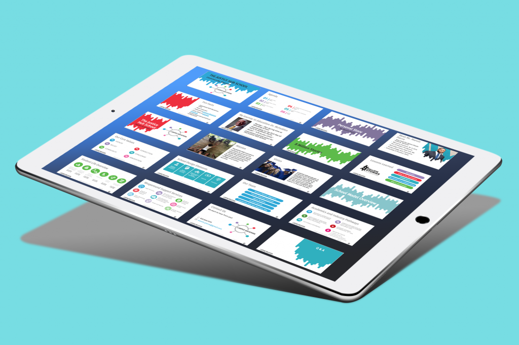
Custom slide template and presentation for The Justice Hub School
The Justice Hub School provides underserved youth in Houston’s Third Ward with academic and leadership skills to succeed in life. Jill B Gilbert was pleased to create a colorful new brand and a stylish custom presentation templates for this public charter school.
Our graphic design team created two templates aimed at different audiences–prospective donors and board members, and prospective students. Both templates employ Justice Hub’s new brand and color scheme. The image above shows the second, less formal, template on an iPad Pro.
A couple of weeks ago, a client selected my design firm to help with getting their brand on merchandise to sell at events and in their online store. I asked if they had their brand in various layouts and file formats for digital and print purposes. If the answer was, “Yes,” they were ready to go.
It turns out that what they really wanted was a new or refreshed brand, as they felt the current one was outdated.
If you want a new or refreshed brand, find answers to the following eleven questions before you speak with your graphic designer.
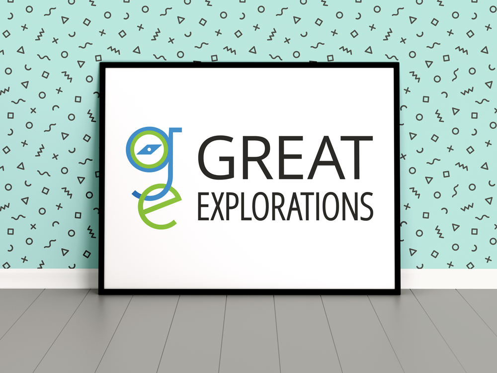
Great Explorations | Original Brand
Arm yourself with plenty of information before you start the design process. If you don’t know where to start, seek advice from a graphic designer in knowledgeable in design, business and marketing issues and trends.
1. What are your business goals?
Believe it or not, a brand is more than a logo or graphic design; it is about your organization’s message, and how you communicate that message verbally and visually. So, it follows that business goals are connected to your brand. What is your organization’s “big picture?” Are you expanding into new markets? Are you planning new products, services, locations, or methods of reaching out to current or prospective clients?
2. What do you want this Brand to accomplish?
Think about how the graphic design of your brand fits into your marketing plans. If you have an established brand, you might want to update it to capture new markets. If you plan to launch a new brand, how will you generate brand awareness in the marketplace?
3. Who is your target audience?
Do/will you use digital marketing–social media, email, blogs to communicate with current and prospective clients– or traditional print, TV, radio and merchandise marketing methods? Where and how will you display your brand?
4. What marketing channels will you use?
Lorem ipsum dolor sit amet, consectetur adipiscing elit. Ut elit tellus, luctus nec ullamcorper mattis, pulvinar dapibus leo.
5. How Do you want your brand perceived?
What 3-5 adjectives describe your brand’s personality? For example, “youthful, urban, and edgy,” “corporate, seasoned, and traditional,” or something else? Do you see your brand as casual or formal; modern or traditional? Where do you see your product or service positioned in the market?
6. What are your brand/company values and mission?
If you closely tie your business model to your values and mission, then your brand design may reflect them. A preschool might want to incorporate a school or students. An environmental organization might want to use a tree, a leaf, something green, or something related to the earth.
7. Do you want to avoid certain topics, themes, imagery or colors?
Images and colors mean different things in different cultures. You may think that all firms that cater to your target audience have brands with similar elements, and you want your brand to stand out. Or, you simply might not like the color orange or purple.
8. Who are your key competitors?
What do you like or dislike about your competitors’ brands? Your graphic designer should create a brand that stands out from the competition, at the same time keeping in mind that you are going after the same audience.
9. Which existing brands do you admire or want to emulate?
If you are a tech startup, do you admire the designs of Apple, Dell, or Microsoft?All of these are quite different, yet recognizable worldwide–and each has gone through a transformation over the decades. What do you specifically like about the brands you admire?
10. What do you like and dislike about your current brand?
Knowing what you like and dislike is valuable information that will help you to launch your new or refreshed brand. You may think the colors or typeface are outdated, or you may think you want to start over with a new design. Either way, this is a great opportunity to enhance your overall brand strategy.
11. What is your decision making style?
When you embark on a branding initiative, your graphic designer will ask you to make a series of decisions, from design choices like brand style, images, color and typography (fonts) to technical choices like file formats, resolution, and the size your brand will be displayed. Where you are on the scale from Decisive to Indecisive will impact your ability to meet project objectives, scope, schedule, budget, and timeline.
Do you make decisions quickly? Do you make decisions based on feelings or facts? Do you get bogged down in “analysis paralysis?” For a description of business decision making types, read more here.
When I say, “You,” I really mean “you and your key stakeholders in this branding effort.” I recommend that you seek input from your key stakeholders before reaching key project milestones, but I do not recommend building your brand “by committee.”
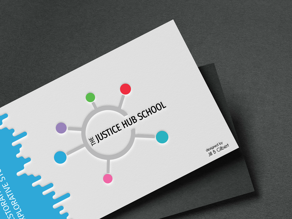
The Justice Hub School | Original Brand
Spending time to answer these eleven questions–including input from key stakeholders–can better position you for success in your branding initiative. Credit to 99 Designs for their original post; I added my perspective to their eleven questions.
Is all this effort worth it? Clients who understand the importance of branding say it is. If branding is new to you, So You Think You Need a New Brand might provide some insight.
As always, if you lack the internal resources to do a branding project, seek outside help. And, if you don’t know where to start, seek advice from a graphic design professional that also understands business and marketing issues. You will be glad you did.
Marvin Pierre is Executive Director of Eight Million Stories, Inc., a nonprofit founded in 2017 to support disconnected youth in Houston, Texas. Building upon the success of Eight Million Stories, he is founding a new school in Houston’s Third Ward. Marvin chose Jill B Gilbert to create a brand for The Justice Hub School that is attractive, edgy and has an urban feel. This project also included development of a brand guidelines document that will grow with the organization.