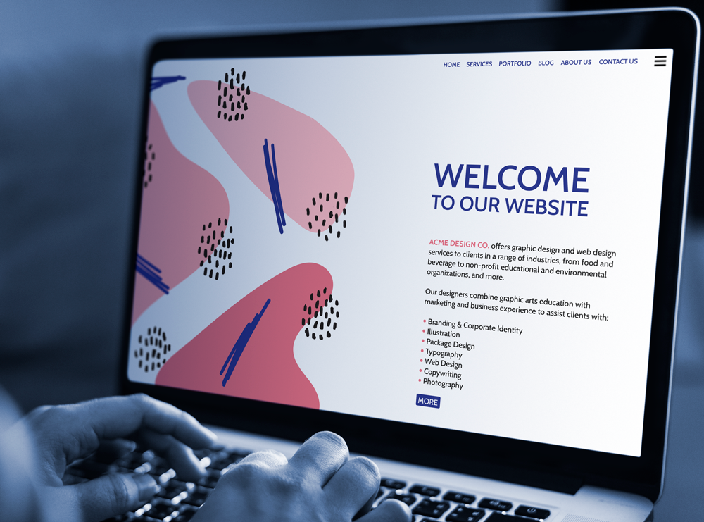
Your website is an important part of your organization’s identity. A well-designed website reflects well on your organization, and a poorly-designed website can damage your reputation. I know this is hard, but spend time planning your website before you build it. Understand your audience and design your site accordingly. Make the site attractive and easy to navigate.
Whether you plan to redesign your website or are in the enviable position of designing a new website from scratch, take the time to find answers to the following questions to set your website project up for success. You will be glad you did!
Purpose
- WHO is your target audience?
- HOW will your website serve that audience?
- WHAT is the compelling marketing message that is tailored to your audience?
- WHAT problem does your website solve for each type of person in your audience?
- WHAT is the site’s purpose, such as informational, e-commerce, blog, portfolio, news, or a combination of several purposes?
Content
- What is the clearly defined goal for each page on your website?
- Is your Home/Welcome page compelling?
- Does your About page describe the problems that you solve in simple and easy-to-understand terms?
- Is your web copy geared to your target audience, clear, easy to understand, and free of jargon?
- Do you have a landing page that you can use to collect email addresses and create email subscriptions?
- Do you have effective Calls to Action that lead your visitors to a desired action?
- What legal content do you need, such as Terms of Use, Privacy, Copyright, and/or other statements?
Design
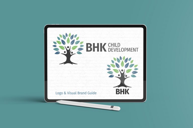
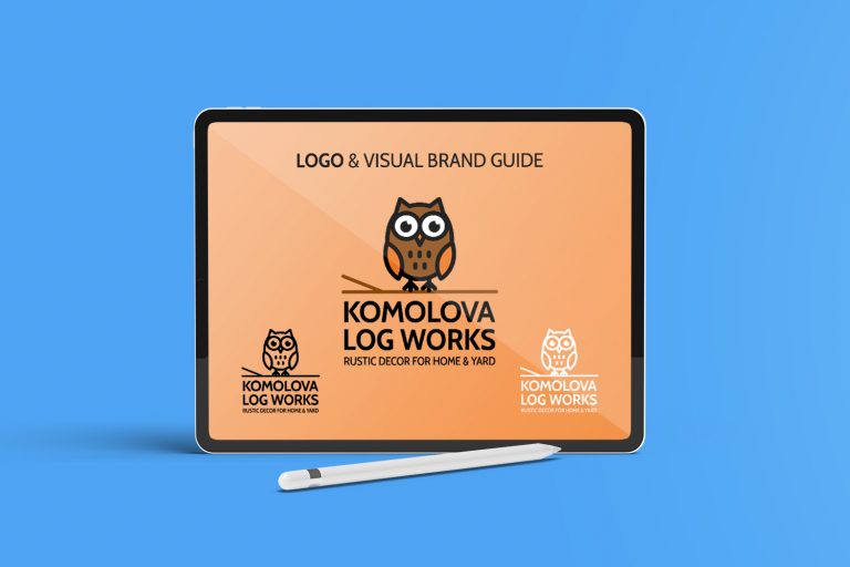
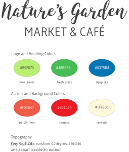
- Is your website “look and feel” cohesive, and consistent with your company’s branding and color standards?
- Is your website’s navigation clear and easy to use?
- Is the site typography easy to read (fonts, type size, type hierarchy, headings, color and contrast)?
- Do you use high quality graphics and images on your website?
- Do your fonts and images load quickly?
- What is your preferred technical platform, e.g., as HTML + CSS, or a Content Management System like WordPress, Wix, or other?
- Is your website responsive—readable on mobile, tablet, laptop, and large screen devices?
- Can you maintain and update your website in-house, or do you need an outside specialist?
Marketing Goals and Objectives
- What business results you expect from your website?
- How do you plan to drive traffic and visitors to your website?
- What system do you have in place to track visitor behavior and interactions on your site?
- How will your organization generate and capture website leads?
- Are your site and any blog posts optimized for search engines?
Security and Backups
- What systems will be in place to protect your site from hackers?
- What tools or systems are needed to address website crashes and spam?
- What user and password security measures will your site have?
- What is your backup and recovery plan, including on-site and offsite storage?
- What is your periodic site audit plan?
Granted, 30 questions is a lot to answer—but take the time to find answers to every question if you want a website that addresses the needs of your audience and yields business results. If you are not sure how to proceed with your website design and build, please consult a professional that understands the technical, marketing, and business aspects of website creation. You will be glad you did!