Paul Rand designed the IBM trademark, the Westinghouse “W,” the marks for American Broadcasting Company (ABC), UPS, Esquire Magazine, Harcourt-Brace and other memorable trademarks. A recent post on logodesignlove discussed a 1971/72 article by Stanley Mason on how Rand presented his work to clients. Long before the days of digital graphic arts, Rand created short-run offset print publications to present to his clients. Paul Rand avoided flashy presentations and let the work speak for itself, presenting booklets to the top decision-making executives. This was pure genius, as these printed materials helped cement the designs as finished products.

In the article, Mason wrote that the trademark “should be distinctive, memorable, and reflect in some way, however abstractly, the nature of the product or service it represents.” Rand’s rebranding of IBM added eight horizontal stripes and a brilliant blue to the previous trademark. This added movement and color made the mark more dynamic and memorable. It remains strong today.

The ABC logo is simple and understated, yet everyone remembers it. Image: Wikimedia Commons

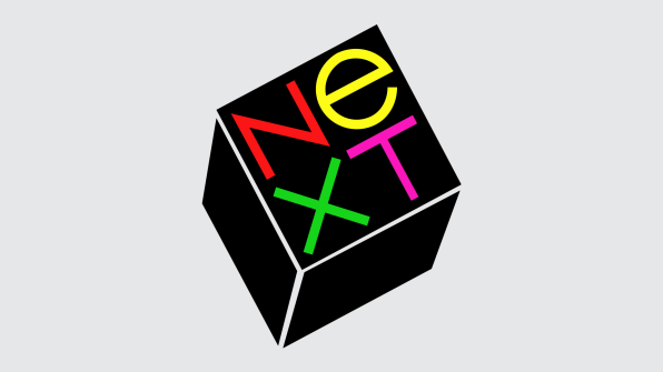
The NeXT computer logo may not be as memorable since the company disappeared. Image: Wikimedia Commons
You can read more and download the Mason article here.
