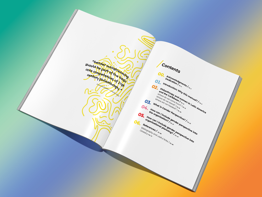
When asked to do a project for a repeat client, naturally, I said, “Yes!” My pro bono graphic design skills would allow my client–and the original author–to more widely distribute an important training manual. Welcome to multilingual graphic design!

The non-profit philanthropic organization in Melbourne, Australia came across an 80-page training manual written in Argentina and had it translated from Spanish into English. They wanted me to create the English manual with the same typesetting and layout as the Spanish version.
This introduced several challenges, also known as localization issues:
- English sentences are shorter than Spanish sentences. This creates pages with less text and more “white space.”
- Some typefaces/fonts are multilingual; others are not.
- Graphic design and style naming conventions differ among languages.
- The translation required the designer to recognize differences in spelling and word usage between Australian English and U.S. English.
- The English translation required rewriting in a few areas to make the words sound more natural.
- The original, Spanish manual looked good to those who are not trained in graphic design. Behind the scenes, the document needed to be set up with consistent typographic styles and colors.
Luckily, I have a working knowledge of Spanish and have written hundreds of English articles. I enjoy layout and typography. I was up to the challenge.
In this case, my mission was to make the English translation look like the original manual, published in Argentina. But what if my client originally envisioned a document that worked well in multiple languages?
Multilingual graphic design considers several localization issues:
- Language differences—the translation and the use of common phrases.
- Cultural differences—the use of acceptable images, colors and words.
- Sentence length in different languages.
- Languages that read from left to right vs. from right to left.
- Multibyte languages with complex characters, e.g., Chinese, Japanese, and Korean.
- Multilingual fonts—fonts that have all the characters, glyphs, and accent marks found in each language you want to use.
- White space—embrace the use of white space when designing a document to be written in multiple languages; one line of text can look as elegant as two.
If you are not well-versed in multilingual graphic design, you can find a design firm that is. This was an enjoyable project with great results. My clients and the author of the original, Spanish training manual were pleased, and I learned a few new things as a bonus.


