You’re a graphic designer, and want to be a digital marketing pro. This entails a transition from traditional marketing to digital marketing. I know, because I mastered the move through exploration, research, and course work.
Moving from analog to digital requires thought and planning
I did not just wake up one day, and poof—I was a digital marketing pro!
Moving from traditional print marketing to digital marketing took significant thought and planning. I had done traditional marketing communications in past job positions and was self-taught in certain aspects of digital marketing when I founded a management consulting firm more than twenty years ago. I knew how to use several Adobe creative apps and learned enough HTML/CSS to manage my Website.
At some point, I knew that I needed more formal training and found a course of study that would take me where I wanted to go. This led to a degree in graphic design. After applying what I learned through formal course work, I continued to explore new technologies and apps to provide digital marketing services.
Five tips for making the transformation from graphic designer to digital marketer
First, decide on the digital marketing services you will provide—social media marketing, content design, web design, web development, web analytics, user interface/user experience (UI/UX) design, advertising, analytics, and more.
Assess your software, IT, business, sales, marketing, and people skills. Yes—whether you work for an employer or are a freelancer, you need to use “soft” people skills to identify clients’ needs and provide the appropriate digital marketing solution.
Network, network, network! Find local digital marketing firms and identify professional organizations. Speak with people in the digital marketing industry about the required skill sets and job opportunities. Find a mentor if you can.
Make a plan to fill skills gaps between where you are currently, and where you want to go. This can entail classroom and/or online training, as well as formal and informal internships.
Finally, work your plan. Acquire new skills. Learn new technologies and software apps. Build your digital portfolio to demonstrate your capabilities, and market to potential employers or clients.
Digital marketing examples
P is for Pterodactyl, sponsored Facebook post
Speed Whiz Energy Drink image for Google Ads
Grace Animal Rehabillitation Center, Instagram Post
Don't get left in the dust
Take your path to success in this exciting creative industry that hardly existed twenty years ago! You can become a digital marketer by shaping and working a thoughtful plan, through networking, and by developing a solid digital portfolio.
Digital marketing continues to morph, especially with Artificial Intelligence (AI), faster computers with more power and storage than ever, and continual changes to software and apps. Don’t get left in the dust… keep on learning new things, and stay ahead of the competition!
Howzabluz LLC is a Houston-based cattery that shows and breeds Russian Blue cats. They had a new logo and needed a Website. They also wanted business cards to take to cat shows. Howzabluz liked the idea of a color scheme that represents the Russian Blue breed—a beautiful bluish gray.
Jill B Gilbert updated the brand colors and created a Website that gets hundreds of hits each month. That’s good for a small business!
Brand Refresh
The original brand used a bright blue and tinted black; the updated brand uses slate blue and a very dark marine blue.
A brand is how your customer or audience views your business. A brand includes your organization’s brandidentity—a logo and other assets used to convey your message; a brand strategy or blueprint; and brand marketing to spread your message via different digital, print, and word-of-mouth channels.
If you need a new logo, you can work with an in-house graphic designer or hire a freelancer. Follow the eight tips below for a greater chance of success.
1. Understand the "Why"
Why do you need a new brand? If you are just starting out, you may want to brand your products or services. Maybe you are launching a new product or service within an existing company. Perhaps you have a brand, but feel it is outdated, or it no longer reflects your organization’s mission, vision, and values. Do a majority of stakeholders share this need?
2. Understand the "What"
What do you want to accomplish with your new brand? What benefits do you expect, for example, the ability to reach larger audiences via new digital and print channels, greater market share, easier brand recognition, or other?
3. A brand is more than a logo
A brand is how your customer or audience views your business. It is the voice of your organization or company. A brand includes your organization’s brandidentity—a logo and other assets used to convey your message; a brand strategy or blueprint; and brand marketing to spread your message via different digital, print, and word-of-mouth channels.
4. Do Your Homework
Do your homework before working with the graphic designer. With graphic design projects, it’s easy to express what you don’t like, but not always so easy to express what you do like, and what you really need. Identify your stakeholders, both internal and external to your organization. Talk with these stakeholders to get a feel for how they view the organization and its key message. Get consensus on stakeholder needs, wants, style, and color preferences. It is important to keep in mind that a consensus is something everyone can accept, versus “100% agreement.” Do research and find three to five examples of brands that inspire you; be prepared to talk with the designer about how similar aesthetics might work for your organization.
5. Follow a Process
Creating a brand is a project that should follow a process. This process typically includes the following steps:
Study Client Brief
Research
Brainstorm
Sketch
Develop Concept
Revise
Deliver.
The designer should set expectations upfront regarding the project schedule and specific deliverables, such as the number of concepts and rounds of revisions.
6. Consistency Counts
You will use your brand in digital and print formats, maybe on signage, T-shirts, and more. Make sure that your brand looks great and reads well in different sizes, from an inch or two on a business card or letterhead, to a 12-foot banner at a trade show. You might need a horizontal layout on your web page or a large banner, a vertical layout on stationery and business cards, and an icon only for a website favicon.
7. Set Standards and Communicate Then
If you do not have Brand Guidelines or a Visual Standards Guide, this is a good time to create one. Such a guidelines describe your organization’s mission, vision, and voice, and how your brand communicates these. The Brand Guidelines should provide official colors for print and web materials; your official accepted logo/brand layouts and color combinations; logo/brand placement; and typography for web and other marketing communications. A brand–even when it consists only of letters or words– is artwork that must not be altered in any way, such as changing its aspect ratio, colors, or typography, or placing it within another shape. Make sure to communicate these standards and their use to your staff. Provide simple training materials.
BHK Child Development | Secondary Logo
"A brand is any distinctive feature like a name, term, design, or symbol that identifies goods or services."
A brand is one of your organization’s assets and becomes more valuable as it becomes widely used and recognized in the marketplace. Enforce the proper use of your brand assets to protect them. Protect your brand like the valuable asset it is—stick to your Brand Guidelines/Visual Standards Guide—always! Add a trademark (™) or service mark (SM) symbol to your brand, and apply for registered trademark status (®) as appropriate.
Nonprofit organization Georgia Lawyers for the Arts (GLA) provides pro bono legal assistance to visual and performing artists and to arts organizations. Each fall, GLA holds a month-long fundraiser where they turn their Atlanta office into an art gallery and invite donors to private gallery viewings.
Last year, Jill B Gilbert created original artwork for the nonprofit’s 2023 Gala Invitation. GLA was so pleased with the graphic design work that they requested an encore performance—a new design for their 2024 Gala Invitation.
Gilbert chose a bright color palette and two contrasting typefaces for the Gala collateral—a bifold, two-sided invitation and a two-sided reply card.
French artist Henri Matisse’s colorful floral cutouts inspired the invitation’s design.
Georgia Lawyers for the Arts 2024 Gala Invitation | Outside
Georgia Lawyers for the Arts 2024 Gala Reply Card
Georgia Lawyers for the Arts 2024 Gala Invitation | Inside
"I can't thank you enough for creating our Gala collateral for the second year in a row! I am so very grateful that you chose to donate your time and share your expertise with our organization! Rest assured that everything we do goes back to the arts community."
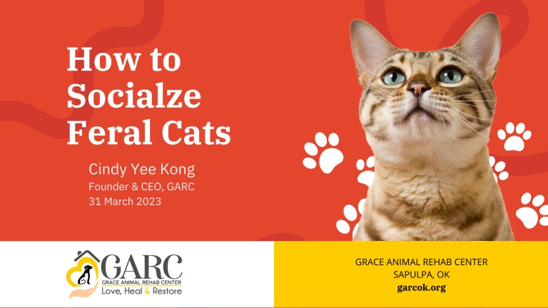
Grace Animal Rehabilitation Center in Sapulpa, Oklahoma rescues, fosters, and places dogs and cats in loving homes. The nonprofit engaged Jill B Gilbert to create graphic designs to publicize an upcoming webinar on social media, and also to prepare a brief presentation for use during the webinar.
Grace Animal Rehabilitation Center, Facebook Post
Grace Animal Rehabillitation Center, Instagram Post
The webinar presentation followed the colorful theme with images of various breeds of cats used in the social media posts.
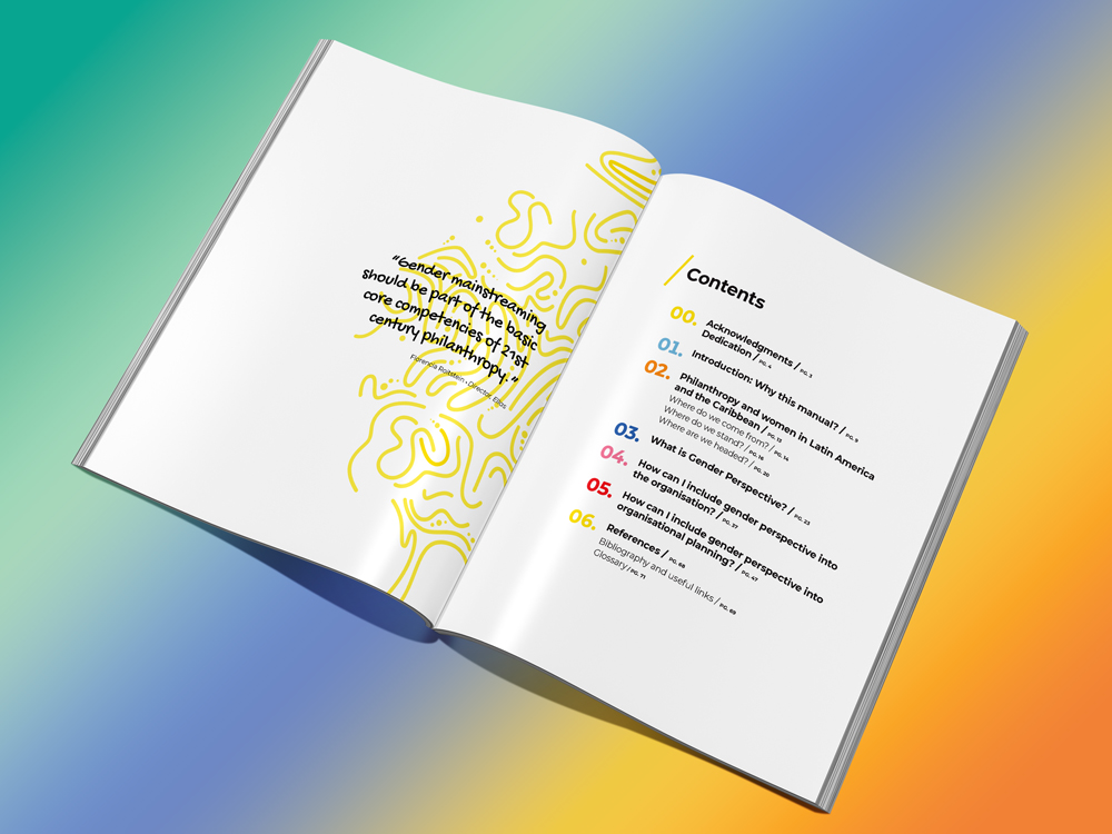
When asked to do a project for a repeat client, naturally, I said, “Yes!” My pro bono graphic design skills would allow my client–and the original author–to more widely distribute an important training manual. Welcome to multilingual graphic design!
Multilingual graphic design | English layout and translation of a Spanish training manual
The non-profit philanthropic organization in Melbourne, Australia came across an 80-page training manual written in Argentina and had it translated from Spanish into English. They wanted me to create the English manual with the same typesetting and layout as the Spanish version.
This introduced several challenges, also known as localization issues:
English sentences are shorter than Spanish sentences. This creates pages with less text and more “white space.”
Some typefaces/fonts are multilingual; others are not.
Graphic design and style naming conventions differ among languages.
The translation required the designer to recognize differences in spelling and word usage between Australian English and U.S. English.
The English translation required rewriting in a few areas to make the words sound more natural.
The original, Spanish manual looked good to those who are not trained in graphic design. Behind the scenes, the document needed to be set up with consistent typographic styles and colors.
Luckily, I have a working knowledge of Spanish and have written hundreds of English articles. I enjoy layout and typography. I was up to the challenge.
In this case, my mission was to make the English translation look like the original manual, published in Argentina. But what if my client originally envisioned a document that worked well in multiple languages?
Multilingual graphic design considers several localization issues:
Language differences—the translation and the use of common phrases.
Cultural differences—the use of acceptable images, colors and words.
Sentence length in different languages.
Languages that read from left to right vs. from right to left.
Multibyte languages with complex characters, e.g., Chinese, Japanese, and Korean.
Multilingual fonts—fonts that have all the characters, glyphs, and accent marks found in each language you want to use.
White space—embrace the use of white space when designing a document to be written in multiple languages; one line of text can look as elegant as two.
If you are not well-versed in multilingual graphic design, you can find a design firm that is. This was an enjoyable project with great results. My clients and the author of the original, Spanish training manual were pleased, and I learned a few new things as a bonus.
Howzabluz breeds and shows Russian Blue cats. Jill B Gilbert took cues from the owners and ran with it… creating the Texas cattery’s brand as a “cool cat” that brings to mind the Blues Brothers.
The business name “Howzabluz” and the fedora are a rich azure blue; the sunglasses and tagline “Russian Blue Cats” a deep charcoal gray.
The design has made its way to cat shows a few times since its introduction. The brand adorns T-shirts, tote bags, and stickers.
Volunteer work benefits a range of educational, environmental, professional development, and philanthropic non-profits in the U.S. and abroad
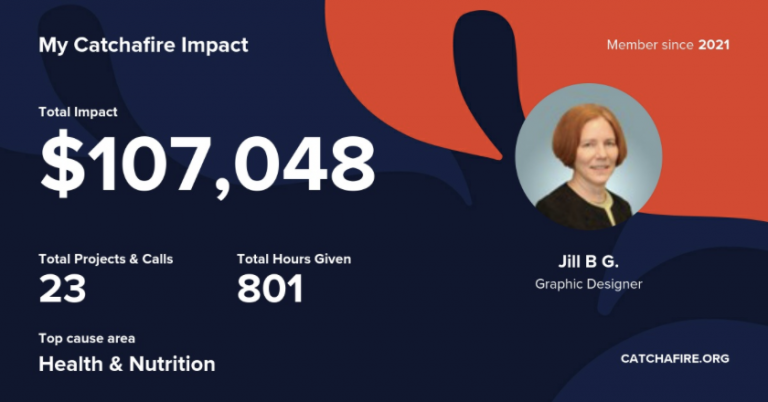
JIll B Gilbert recently reached a milestone: she has provided over 800 hours of volunteer work, saving non-profit organizations more than $USD 100,000. And she’s not slowing down—currently working on her next project!
Gilbert provided marketing communications, graphic design, and web design services on two dozen projects—many were multiple projects for the same client. The projects ranged from a highly-customized presentation for a sister organization to a U.S. National Park, to branding and logo design for childhood education and Head Start programs and a new high school, to custom presentations and brand guidelines for healthcare organizations.
Gilbert began working with volunteer matching organization Catchafire in 2021, during the height of the pandemic. Technology advances in the past 5 years made it possible to complete all of this volunteer work remotely—even for clients in the Houston area—with client meetings via Zoom or Google Meetings. She provided project deliverables in electronic format, using Adobe Creative Cloud apps like Adobe Illustrator, Adobe InDesign, Adobe Photoshop, and Adobe Acrobat; Microsoft PowerPoint, Google Slides, and Apple’s Keynote slide software.
Gilbert remarked, “I have enjoyed working on projects with these non-profits. I am open to paid commissions and plan to continue volunteering marketing, graphic design, and web design services to worthy non-profits so they can spend their budgets to further their missions.”
You can read more about several of the pro bono projects in our blog.
"Jill is extremely organized and creative.
Her commitment to advancing causes is genuine and inspiring. Jill goes above and beyond! It was a pleasure working with her."
Rosa
Bridges to Science
"I highly recommend anyone to work with Jill. She has a wealth of
knowledge, is very kind, responsive, and did a wonderful job on our
visual brand guide."
Heather
Wisconsin Association of Free & Charitable Clinics
"Jill knows design! She understands principles of good design and has in-depth knowledge of professional tools to make your designs look great!"
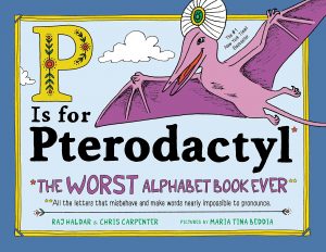
P IS FOR PTERODACTYL is the perfect product for a social media ad campaign. The English language is difficult to learn because of the many exceptions to spelling, grammar and pronunciation rules. This silly, fun read-aloud book by Rapper Lushlife (Raj Haldar) and Chris Carpenter teaches kids the ins and outs of spelling and phonetics. Adults love it, too!
P is for Pterodactyl | The Worst Alphabet Book Ever
Buyer demographics
Who would buy this book? P IS FOR PTERODACTYL is attractive to parents with young children, parents with school-age children learning to read, and to grandparents, aunts, and uncles. More females than males would buy the book. Relatives would buy this book as a gift. Buyers are more likely to be college-educated, often with advanced degrees.
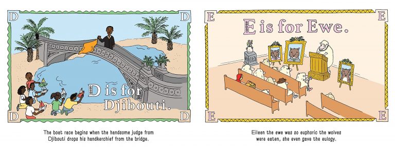
P is for Pterodactyl | inner pages
Buyer persona
Digital marketing technology lets us target specific buyers, or personas. My marketing campaign targets a buyer called “90th Percentile Nana.” She is 55-65 years old, married or widowed, with two or more grandchildren. Her household income is in the 90th percentile of U.S. Households. She has an Amazon Prime account, a college degree, drives a luxury SUV, and has a designer Doodle dog. 90th Percentile Nana is in a book club and is tech-savvy, but prefers physical books to Kindle books. She is a foodie and an amateur chef who walks or exercises to stay fit.
Grandparents love P is for Pterodactyl
Buyer's goals and challenges
Buyer’s goals:
Entertain grandchildren
Visually appealing book
Durable book, can be read over and over
Teach grandchildren the alphabet
Teach grandchildren to read
A New York Times Bestseller and/or award-winning book.
Buyer’s challenges:
Tired of the standard bedtime books
Finding a unique and interesting book
Finding a funny book with educational value.
Social Media Marketing Strategy
Goals and social media platform
The ad campaign goals are to create product awareness through advertising and generate sales leads. Facebook is a good fit for these goals, as it is the leading social platform with 2.7 billion monthly users; 54% Female, 46% Male. Facebook hits the sweet spot for 90th Percentile Nana’s demographics. Facebook has more users, and a greater percentage of users, in the target age and income groups than TikTok, Pinterest, Instagram, or YouTube.
Social media scheduling
A key element of a social media campaign is timing. SproutSocial shows the highest Facebook engagement times are Tuesday, Wednesday and Friday between 9 a.m. and 1 p.m. (Figure 1). The American Marketing Association recommends skipping Saturday posts.
I developed a two-week schedule for Facebook posts and News Feed Ads (ads that pop up on your Facebook feed) targeted at peak engagement times. Content and design strategies include:
Each Facebook Post will be a Sponsored News Feed with one or more images plus text.
Many of the posts will be educational and informative versus “hard sell.”
Each Facebook Ad will appear in the user’s News Feed and will use images or graphics and limited text.
Using images of the book itself will help to build product awareness.
The ads will offer 10% to 15% discounts or free shipping and will ask users to sign up for emails and/or texts.
P is for Pterodactyl, sponsored Facebook post
Metrics
Of the hundreds of social media metrics available, I selected a few to gauge the success of the P IS FOR PTERODACTYL advertising campaign:
engagement
impressions
mentions
tags
reposts
shares.
Marketing Collateral
Marketing pieces for the social media ad campaign use images optimized for Facebook. Collateral includes ads for desktop and mobile views, considering most people interact with social media accounts on smartphones—though 90th Percentile Nana might be more comfortable using a desktop or laptop computer. Marketing collateral also includes an original Acme Books logo for the ad campaign.
P is for Pterodactyl, mobile ads
P is for Pterodactyl, mobile ad with signup form
P is for Pterodactyl, desktop ads
Acme Books logo by Jill B Gilbert
For further information on this digital marketing case study or to hire Jill B Gilbert for marketing communications advice or to design social media graphics, illustrations and ads for your company, please contact us.
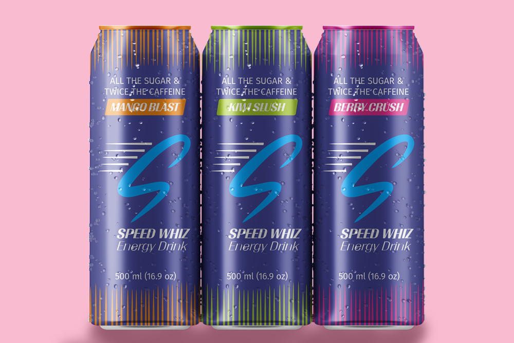
My challenge was to design the packaging for a new energy drink and then create social media ads to post via Google Ads. The result is packaging for three flavors of Speed Whiz Energy Drink, a (fictional) energy drink that provides “All the Sugar & Twice the Caffeine” of normal energy drinks. The 500 ml aluminum can might account for the beverage’s high energy levels–most energy drinks come in smaller cans.
Speed Whiz Energy Drink packaging by Jill B Gilbert
The Google Ads focused on the tag line, “All the Sugar & Twice The Caffeine.” That should get someone’s attention!