I completed a few watercolor tutorials by Every-Tuesday and got hooked. After the tutorials, I found a handful of inkers and watercolor brushes I liked and started drawing colorful fruits and vegetables. I found it engaging.
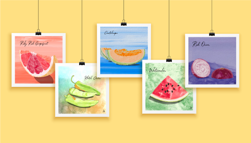
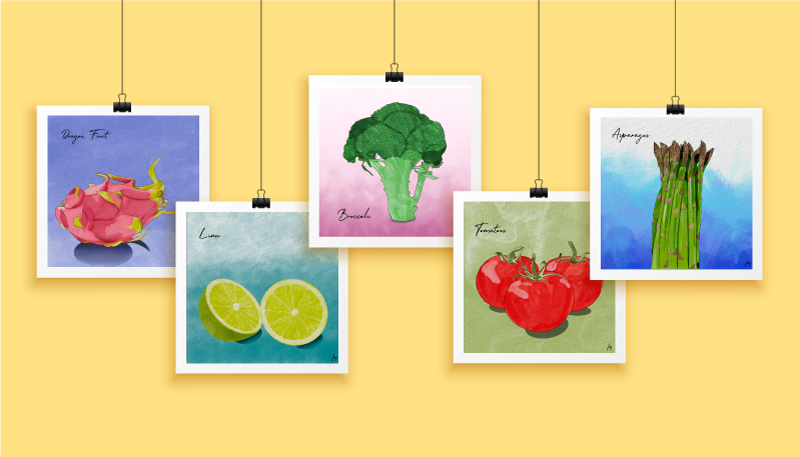
Now, the Watercolor Food for Thought series has 30+ images! You can enjoy some of these below.
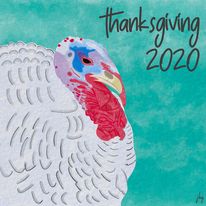
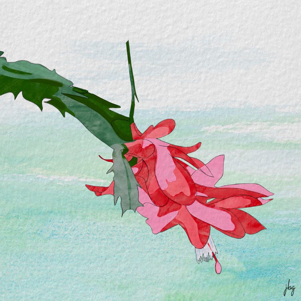
Food for Thought Series | Selected Watercolor DrawingsFood for Thought Series | Selected Watercolor Drawings, Part 2
Patience, the Procreate app, and creating something every day improved my drawing and illustration skills.
Last year, my “go-to” hardware was a MacBook Pro, a Wacom drawing tablet, a wireless keyboard and a 25-inch monitor. Late in 2019 I upgraded my iPad and purchased an Apple pencil. I could use the iPad anywhere, rather than be chained to the desk in my studio.
Back to the pandemic… I have worked at home for over 15 years, so staying home a bit more was not too taxing. I wanted to improve my drawing skills, but could not make myself pick up a sketchbook. I remember my drawing teacher told me, “just try drawing something–anything–each day.” So I started creating something on the iPad nearly every day. Birthday cards, abstract illustrations, watercolor drawings, comic-style illustrations, and more. I learned how to use dozens of different types of “brushes,” something I hadn’t explored much in Adobe Photoshop and Illustrator. I created many works from photos–free stock photos and my own photos. My skills grew, week-to-week and month-to-month.
Do something good. Create something every day.
Jill B Gilbert
I truly improved my drawing and illustration skills during the COVID-19 pandemic. I credit patience, and creating something nearly every day, for much of the improvement. And I credit learning the Procreate app for the rest.
Now I use my sketchbook almost daily. Sometimes I use it at the start of a project. Most days I see where my mind takes me when I start Procreate, and use the sketchbook to take notes and to paste printed versions.
My advice: Do something good. Create something every day.
Procreate is a Raster (pixel) drawing app with many features not found in other drawing apps available for the iPad.
In 2019, my “go-to” tools for making quick–and detailed–graphics and illustrations were Adobe Illustrator and Adobe Photoshop on my Macbook Pro. My setup included a Wacom drawing tablet, a wireless keyboard, and a large monitor. My iPad was a secondary tool, hardly part of my graphic design workflow. I dabbled in the different Illustrator and Photoshop apps for the iPad, but they seemed awkward.
Then I traded in my iPad for an iPad Air (3rd Generation) and bought an Apple Pencil. I kept hearing about an app called Procreate, designed for the original iPad Pro and the Apple Pencil. A blog I follow had lots of Procreate tutorials, so invested a small sum of ten dollars (!) and got started. Read on to learn the ins and outs of Procreate.
Pluses
You can choose from pre-installed drawing templates, or create your own.
You can use pressure sensitivity to change brush behavior and drawing stroke.
Layers! Depending upon the drawing size and resolution, you can have up to 40 or more layers.
Robust text capabilities and the ability to add typefaces.
Preinstalled color palettes.
You can create color palettes manually, from an image or a photo, or import palettes created by others.
You can export and save color palettes.
The shape tool creates “perfect” geometric shapes.
Drawing assist allows you to create straight lines, smooth curves, symmetrical illustrations, and more.
Create CMYK and RGB documents for print and Web, respectively
You can export to several file formats, such as PNG, JPEG, TIFF, layered PSD, and PDF.
You can edit and create Procreate brushes and brush sets.
Thousands of free and paid Procreate brush sets are available.
Procreate for iPad offers multiple layers, clipping masks, color palettes and brushes galore. Artists and graphic designers can create works in almost any style imaginable.
Minuses
As a Raster app, the drawing size and resolution must be set upfront, according to how you intend to use the illustration.
In the current version (5x), you can draw and edit arcs with three or four points, but not “S-curves.”
If you are a Typophile or often create illustrations with 20 or more layers, Procreate will crash periodically, even with decent iPad memory–but I have never lost a file!
There are so many Procreate brushes available, you may find it hard to limit the number you add; currently, you cannot tag brushes as “favorites.”
Cannot lock a color palette; I have accidentally changed color swatches many times.
Conclusion
Procreate offers many features not seen in competitors’ drawing apps. I recommend it as part of a graphic design workflow and use it almost daily. It is a true gem, and well worth the money.
19
Apr
2018
Last week, one of my French friends sent me a link to a PowerPoint presentation on the hidden meaning behind several corporate logos. I knew about the hidden arrow in the FedEx logo; the smiley face and lowercase letter “g” in the Goodwill logo; the smile and arrow from A to Z in the Amazon logo; and the hidden number 31 in the Baskin-Robbins logo. I know enough French to translate the captions on the slides.
Toyota Brand Mark
Today, I came across an English version in a blog post by Onextrapixel. It is a pleasant and quick read. The biggest surprise is the meaning of Toyota’s oval icon—it combines strokes for each of the English letters in the company name!
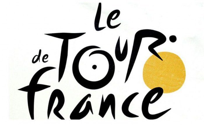
Tour de France brand mark shows a bicycle rider and the sun
Another favorite is Le Tour de France brand. The letter “R” depicts a bicycle rider and the letter “O” and the yellow circle represent two bicycle wheels and the sun; the ride takes place only during daylight hours.
Both of these brands have stood the test of time—they are crisp and memorable. Their hidden meanings make them more interesting.
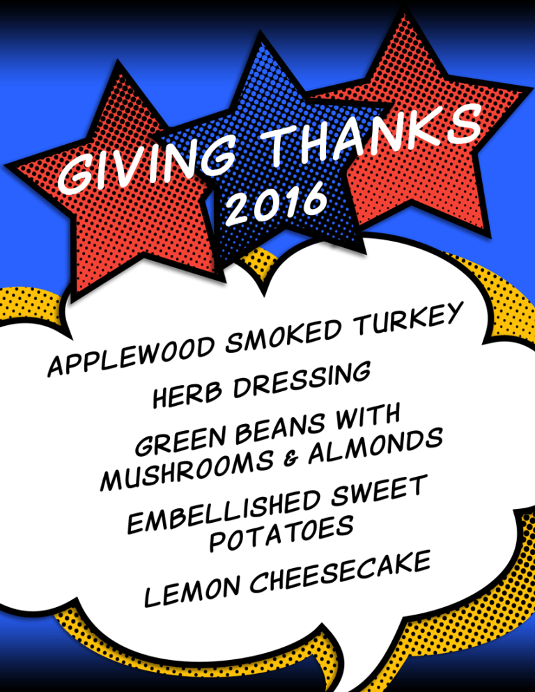
Fall is in the air (finally) and we celebrate Thanksgiving this week. I am thankful for friends and family, our adopted dog, great professors, art & design mentors, and more. I will illustrate my dinner menu, as I have done for many years, but this year I have Ninja Illustrator and Photoshop skills. Will it be comic book style, chalkboard style, or vintage style, or a mashup?
The origin of printed menus
The whole printed menu “thing” came from my Mom, who was a Registered Dietitian. She knew how to plan meals for the masses or for our family of six. She was a good cook and baker. Mom would scribble out her menu on a slip of scrap paper and stick it to the refrigerator, just to make sure that she did not forget to cook or serve one of the many dishes she had planned.
Amateur chef meets graphic designer
I love to cook and bake, and have done both since I was a young child. After I had a home of my own, I started to generate menus for various dinners and parties as soon as I could get my hands on a computer. At first, all I had at my disposal was a simple word processor. Later, I became very proficient at MS PowerPoint and Word, and used lots of clip art. Then I started an Art & Design degree program. What I used to do in Microsoft programs was primitive, compared to the capabilities of Adobe Creative Cloud apps, Snagit and online tools, plus a myriad of free resources.
Here is the menu… more for practice than for show, since we are having dinner for two! I used a primary color palette and generated halftone patterns in my custom colors for the stars and the cloud backdrop. I used a comic book font found at dafont.com.