Design

Why the Internet is blue

Blue rules on the Internet

Envato’s blog post confirmed what many of us have known for a while… blue is the favorite color on the Internet. Just look at logos for social networking sites, and you will see a sea of blue, with some other colors sprinkled in. Facebook Twitter, LinkedIn and Google all use blue for logos and Web sites.

The sky is blue, and the atmosphere is blue. But why did Internet pioneers choose blue, or a specific blue?

  • Tim Berners-Lee, the father of the Internet, was shown blue links on early screen prototypes. The color stuck.
  • Mark Zuckerberg chose blue for FaceBook because he is (red/green) colorblind.
  • Google tested 41 shades of blue for Internet links, and today billions of people see the blue that won the user test.

Designer Paul Herbert’s 2016 analysis of the hues used on the ten most popular Internet sites shows that blue is by far the most popular color, with twice the usage of red or yellow, and four times the usage of green or purple(see my post, The colors of the Web). You can find an interactive version of the image below on his Web site.

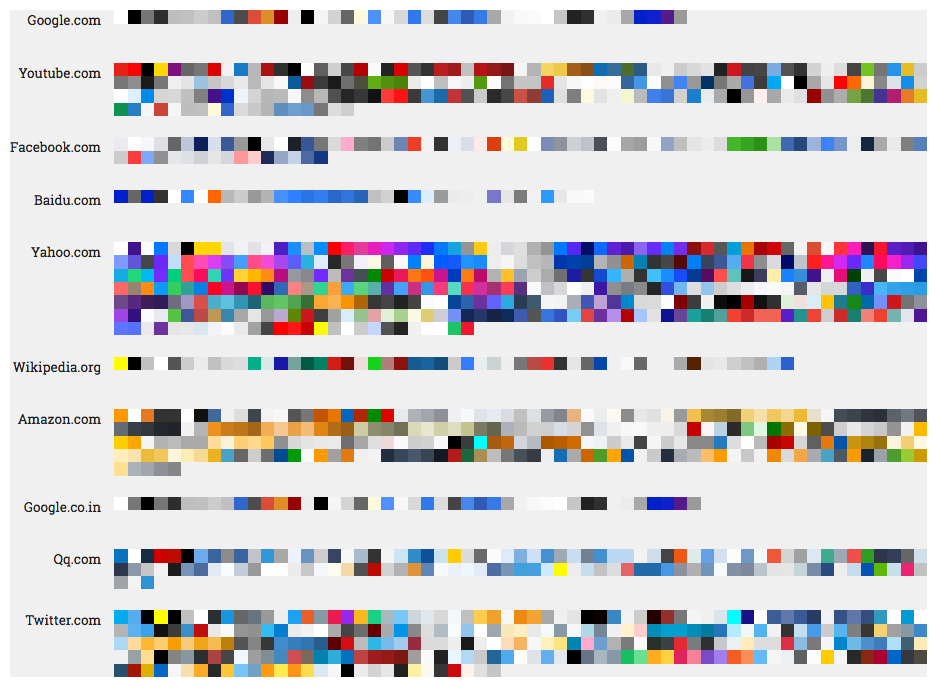
Colors of the 10 most popular Web sites, 2016 (http://paulhebertdesigns.com/web_colors/)

Blue has many personalities

Blue is like a chameleon, with many hues and many personalities. Blue can convey professionalism, it can be warm and inviting, exciting, or cold and scientific. Which blues do you use?

Posted by JBG in Color, Corporate Identity, Design, Web Design

Giving thanks: amateur chef meets graphic designer

Fall is in the air (finally) and we celebrate Thanksgiving this week. I am thankful for friends and family, our adopted dog, great professors, art & design mentors, and more.  I will illustrate my dinner menu, as I have done for many years, but this year I have Ninja Illustrator and Photoshop skills. Will it be comic book style, chalkboard style, or vintage style, or a mashup?

The origin of printed menus

The whole printed menu “thing” came from my Mom, who was a Registered Dietitian. She knew how to plan meals for the masses or for our family of six. She was a good cook and baker. Mom would scribble out her menu on a slip of scrap paper and stick it to the refrigerator, just to make sure that she did not forget to cook or serve one of the many dishes she had planned.

Amateur chef meets graphic designer

I love to cook and bake, and have done both since I was a young child. After I had a home of my own, I started to generate menus for various dinners and parties as soon as I could get my hands on a computer. At first, all I had at my disposal was a simple word processor. Later, I became very proficient at MS PowerPoint and Word, and used lots of clip art. Then I started an Art & Design degree program. What I used to do in Microsoft programs was primitive, compared to the capabilities of Adobe Creative Cloud apps, Snagit and online tools, plus a myriad of  free resources.

Here is the menu… more for practice than for show, since we are having dinner for two! I used a primary color palette and generated halftone patterns in my custom colors for the stars and the cloud backdrop. I used a comic book font found at dafont.com.

Posted by JBG in Design, Graphics, Illustration

Designing and building a user interface (UX)

If you have ever designed a Web site, an app or a software User Interface (UX), then you know that it is part art, and part science. The process takes several steps and you may go through several versions of a design before arriving at the final design. Your interface will help users solve certain problems. Therefore, getting the right people involved and keeping them engaged throughout the process is critical.

UX Distilling

Designers are asked to perform minor miracles by transforming large amounts of information into simplified communicative designs.

–Daniel O’Sullivan

Daniel O’Sullivan wrote an InVision blog post about UX Distilling. He likens designing and building a great (UX) to distilling a fine bourbon. O’Sullivan uses a five-step process: identify components | gather requirements | outline | mockup | refine.

Step 1: Identify Components

Identify which ingredients are needed

  • navigation
  • features
  • metrics

Step 2: Gather Requirements

Carefully choose the finest ingredients.

  • for each of the identified components in Step 1
  • focus on helpful and positive metrics vs. all metrics

Step 3: Outline (Design)

Combine the ingredients and distill.

  • know your tools; you don’t have to know how to code, but you have to understand how code works
  • use proper color theory
  • identify iconography

Step 4: Mockup

Beautifully bottle the bourbon.

  • use Photoshop, Illustrator or other tools

Step 5: Refine

Serve and enjoy, and serve and enjoy.

  • use prototyping tools
  • conduct UX testing
  • build
  • an iterative process

My Take

O’Sullivan’s summary of the process is easy to digest and makes perfect sense. I have managed many software business requirements and implementation projects over the last 20 years and follow a similar process. In the early days, I used PowerPoints and crude drawing tools to create mockups. Today, Photoshop, Illustrator and prototyping tools make the process much easier.

To get the full story, watch at least the first 20-25 minutes of the video presentation.

Posted by JBG in Best Practices, Design, Web Design, 0 comments

Art education pays off

A couple of days ago, my husband found an online art quiz, Can You Guess the Famous Artist from a Tiny Part of Their Painting We scored 96%, missing only two of fifty questions; I had never heard of one artist.

The first two questions were “gimmes”–Van Gogh’s The Starry Night and Picasso’s Seated Woman.

Years of going to art museums as a child, plus my time in the Art & Design program—including my crash course in Art Appreciation—has paid off! I really appreciate the different styles and can recognize the characteristics of many artists. I would never confuse the works of Jackson Pollock, say, for those of Georgia O’Keeffe! However, shown a portion of a Picasso vs. a Bracques cubist work, I might have more difficulty identifying the artist.

Posted by JBG in Art, Design, 0 comments

Size matters

Your body text is too small

When coding a client website, I needed to make several adjustments in heading and body text size. As a recent blog post by Christian Miller (aka Xtian Miller) says, you can make body text too small, but nobody complains if it is too large. The benefits of using LARGER body text include:

  1. easier to read from a distance
  2. improved readability
  3. improved usability
  4. increased visual impact

Miller says that the majority of Web sites use 15-18 px body text… which brings to mind the (rhetorical?) question that I posed last week–which units to use, points or pixels–when sizing text? I started to use ems and % for line height in my last few Web projects. I like using these relative measurements rather than fixed measurements, once the base font size is defined. I can also use these relative units for font height, for example, headings and other text used for highlights and emphasis.

Miller also writes that “Mobile First” designs can cause designers to be afraid of using larger body text. He provides examples of several sites that use 20 px or larger body text, including Jeffrey Zeldman’s.

Posted by JBG in Best Practices, Corporate Identity, Design, Guidelines, Typography, Web Design, 0 comments

What is minimalist design?

I like minimalist design, but I really did not know exactly what it was until I read this blog post, Minimalist Design: 25 Beautiful Examples and Practical Tips.

Minimalism can be described as the stripping away of all unnecessary elements and focusing on what needs to be there. In this sense, minimalism encourages purpose.”

Worth reading… and I look forward to applying some of the design principles in the future.

Posted by JBG in Best Practices, Design, Web Design, 0 comments

(Almost) everything you need to know about color on the Web

W3 Schools

W3 Schools is a great resource for information on using colors in HTML. The colors HOME page starts with a tutorial on the most common color designations–named colors, RGB, and HEX. The tutorial lets you try the HTML yourself.

If you want to explore different color standards, you can 

  • dive into different national and trade organization color standards
  • find the HEX codes for your favorite Crayola crayon colors
  • see the latest color trends, 
  • and much more!
Posted by JBG in Color, Design, Web Design, 0 comments

Case Study: Client’s design selection process

Background

Our client runs a small business and wants to draw in more customers. An updated Web site will help them to market the business. Our team’s design goals were to develop a fresh look and to bring the site up to current HTML and CSS standards. This included making the new site responsive, so users can access it from a desktop, tablet, or smartphone.

First, we met with the Client to understand their needs and business requirements. Second, our team developed a site structure with the key pages and elements. Third, we coded the Web designs with sample pages.

Typography first, color second

We presented our Client with three different Web designs with desktop and mobile mockups. The Client was neutral during the presentation and did not seem to favor one design over another. Later, when he provided feedback to the project manager, the Client was interested in typography first, colors second, and hardly mentioned other design elements.

Typography can make or break a Web site

It was interesting that many of the changes to get our client site “ready for prime time” involved typography and Gestalt principles. Typography and Gestalt can make a site a success or a disaster.

Typefaces:

  • must fit the organization’s image to convey the intended message and purpose of the Website,
  • must be legible and readable,
  • should be limited to two or three, and
  • should be styled differently to provide emphasis and to separate thoughts.

I took an Invision course, Designing with Type, to learn basic type terms, font pairing mechanics, how to use type on a grid, and more. This will help me to design better Web sites and other graphic communications.

Top 100 Web fonts

Typography trends change, and so do Web fonts. For example, hand-lettered brush fonts are very popular now. In case you were wondering, here is the list of the Top 100 Web fonts for September 2016 and the Top 100 Web fonts for October 2016.

Posted by JBG in Branding, Corporate Identity, Design, Marketing, Typography, Web Design, 0 comments