Best Practices

Should you build your own website, or hire a professional?

If your organization’s website needs a major refresh, you can hire a professional or build it yourself. After all, thousands of free and paid website templates are available, and website building tools are better than ever before. TV and social media ads make it look so easy to build a website! Let’s look at some of the questions to answer before you make a “build or buy” decision.

Website “build vs. buy” questions

What are your objectives? Why do you want to change your site? You may want to refresh your site because it is outdated, because your company is growing or adding products or services, to start a blog, to add the ability to sell products or services online, or for other reasons. Think about the technical and financial objective you want to achieve.

What types of changes do you need? You might be thinking of a total new look and feel, a change to the website structure, or both. Maybe you need a media library to easily store and retrieve images, videos, etc. You might need entire new features, e.g., a blog or e-commerce capabilities. You simply might want a new website that is easier to maintain in-house, rather than hiring a web professional to make changes each time you need them.

How is your current website built? Is it written (coded) in HTML + CSS, or is it built on one of the new platforms like WordPress, SquareSpace, WIX, or other? If it is an HTML site, you will need to know how to write code. If it built on one of the newer platforms, you may be able to build your own site; it may look professional but, depending on your HTML know-how, the site can be a mess behind the scenes. Yes, you read that right! This is because you cannot refresh these sites just by applying a new theme. Many of the current “drag-and-drop” website themes have widgets, code blocks, and other complexities. These site elements may not work in the new theme without a lot of tweaking.

How tech-savvy are you? If you are a lover of things tech, and the first of your friends to get the latest electronics, and you are committed to doing site updates yourself in the future, then building a website may be for you. If you use computers, social media and smartphones every day, but rarely update your electronics or software, this is a warning sign that you should speak to a web designer. But read further…

What is your timeline? If you need it quickly and can effectively plan and build a website, then do-it-yourself might work for you. Just keep your project objectives in mind, spend adequate time planning, get advice as needed, and go for it! If you need it quickly, don’t even consider slapping something together quickly to get a new, improved website up and running. This will do more harm than good. If you have a reasonable timeline, then you have plenty of options, both do-it-yourself and professionally-built.

What will it cost? First, think about the value that the website updates will bring to your company in terms of new clients, more business, and better market penetration. Second, consider the total cost to your organization. This is a cost-benefit issue, not the price tag to get the site up and running. If web development or computer coding are not your core business, you may find yourself spending hours updating the website yourself, at a significant cost to you in terms of lost revenue, missed marketing opportunities, missed new clients, etc. Third, what are the ongoing maintenance and update costs for the next three to five years?

Congratulations! If you have read this far, you now have more questions than answers! At the least, you understand some of the “build vs. buy” issues, and the many choices available to you. If you still have questions about what is best for you, please consult a professional. A short discussion could save you hours of time and a stack of money.

Posted by Jill B Gilbert in Best Practices, Consulting, Design, Guidelines, Web Design

Drawing during the pandemic improves skills measurably

Patience, the Procreate app, and creating something every day improved my drawing and illustration skills.

Last year, my “go-to” hardware was a MacBook Pro, a Wacom drawing tablet, a wireless keyboard and a 25-inch monitor. Late in 2019 I upgraded my iPad and purchased an Apple pencil. I could use the iPad anywhere, rather than be chained to the desk in my studio.

Back to the pandemic… I have worked at home for over 15 years, so staying home a bit more was not too taxing. I wanted to improve my drawing skills, but could not make myself pick up a sketchbook. I remember my drawing teacher told me, “just try drawing something–anything–each day.” So I started creating something on the iPad nearly every day. Birthday cards, abstract illustrations, watercolor drawings, comic-style illustrations, and more. I learned how to use dozens of different types of “brushes,” something I hadn’t explored much in Adobe Photoshop and Illustrator. I created many works from photos–free stock photos and my own photos. My skills grew, week-to-week and month-to-month. 

Do something good. Create something every day.

Jill B Gilbert

I truly improved my drawing and illustration skills during the COVID-19 pandemic. I credit patience, and creating something nearly every day, for much of the improvement. And I credit learning the Procreate app for the rest.

Now I use my sketchbook almost daily. Sometimes I use it at the start of a project. Most days I see where my mind takes me when I start Procreate, and use the sketchbook to take notes and to paste printed versions.

My advice: Do something good. Create something every day.

Posted by Jill B Gilbert in Art, Best Practices, Graphics, Illustration

Looking for design inspiration? Try these blogs…

Most designers do not just wake up in the morning, feeling inspired. Something they see or do gets their creative juices flowing. I often find my inspiration on the Internet, and I follow several design blogs. If you don’t know where to look, here is a compilation of 20 design and development blogs to follow. It includes several I have followed for years, plus some new ones I am eager to try… if only there were more hours in the day!

Posted by Jill B Gilbert in Best Practices, Design, Guidelines, Web Design

Experience imparts value

As a consultant, it is interesting to see if prospective clients want a “second set of hands” or if they want advice to help them address a business need. In my past life as a management consultant in the software business, I sought the second type of assignment. The more problem-solving, the better.

In my role as a freelance creative professional, I still seek, and truly enjoy, “value-added” assignments where I can solve problems. I am still a consultant. The difference is, now I have lots of business and marketing expertise plus I have an eye for, and possess, Web and graphic design skills.

Image credit: Freepik

A beginning consultant brings skills, an experienced consultant brings value.”

–Jeffrey Zeldman

Web design guru Jeffrey Zeldman says that an experienced consultant brings value. To survive as an independent consultant at any age, and to remain meaningful in the digital design world, you must bring something different to the table. You must bring value.

Posted by Jill B Gilbert in Best Practices, Consulting, Design

Develop style guides for your design projects

Whether you are developing a 50-page Website, a small mobile phone app, or an annual report for a corporate client, you should get in the habit of developing a style guide.

Branding and style guides are important for projects large and small. They help to provide consistent messages about an organization and provide a degree of professionalism. Creative Bloq has a good post on this topic, with examples of thirteen style guides for famous organizations.

Client project style guide

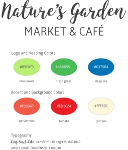
The client’s goal was to refresh their brand and their Web site to draw more customers to their wellness practice and retail establishment. I prepared a simple style guide, using Adobe Illustrator. The Style Guide displays the brand, color chips for main and accent colors, typography and usage examples:

Style Guide | Nature’s Garden

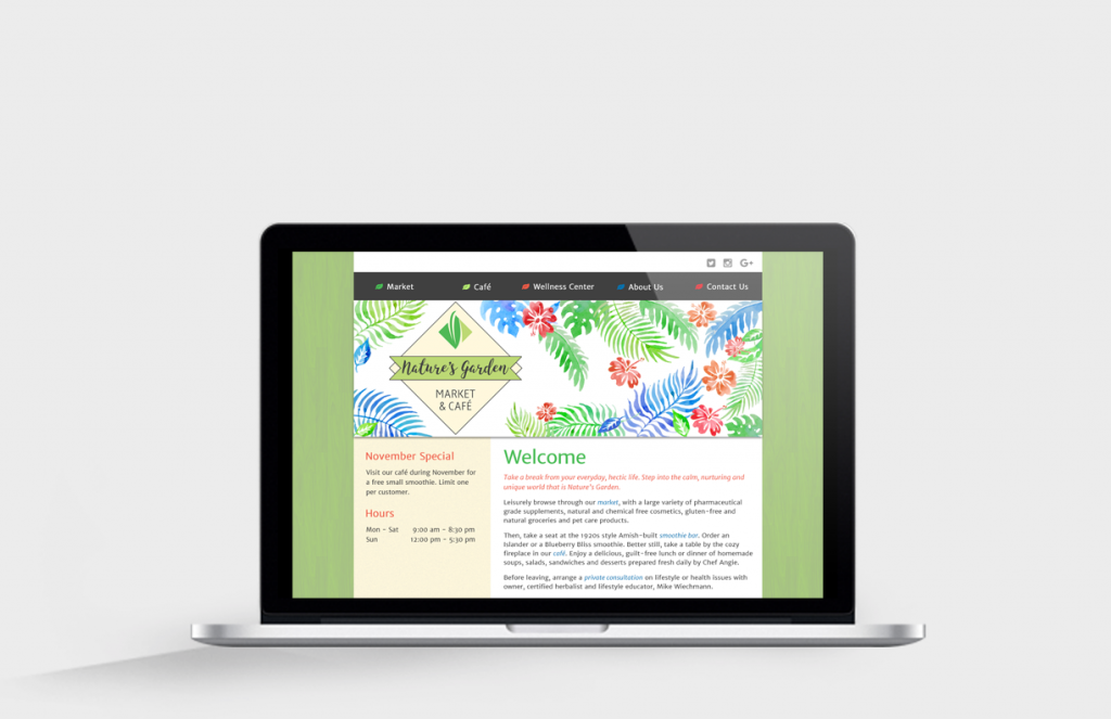
Here is how the styles look when applied to a “mobile first” Website design. Note how the colors and the leaf motif are repeated throughout the page. The design works well on a smartphone, on a tablet or on a large HD screen.

Mobile View | Nature’s Garden
Responsive Home Page on Retina Display

University style guide

On a whim, I researched my alma mater’s color and brand guidelines. The Miami University is a nationally recognized Public Ivy, and its brand is particularly important. The brand must convey the Public Ivy experience.

The University uses different reds for print, Web and merchandise use. Several formal and informal logos are available for these uses. The use of certain “vintage” logos requires special permission.

The branding guidelines include logos, colors, typography and graphic elements. They encompass Web, print publications, social media, photos, use in athletic programs and more.

How people – alumni, students, future students, faculty and staff, fans, donors, and the public at large – feel about Miami University directly relates to the University’s success. In a sense, the brand speaks on the University’s behalf without saying a word. It represents who we are and what we stand for. It is the visual representation of our reputation.

Miami University Brand Guidelines

Here is the “M” spirit mark often used on sportswear and signs.

The Miami University Spirit Mark

Posted by Jill B Gilbert in Best Practices, Branding, Color, Corporate Identity, Graphics, Guidelines, Logo Design, Marketing, Standards, Typography, Web Design

Designing and building a user interface (UX)

If you have ever designed a Web site, an app or a software User Interface (UX), then you know that it is part art, and part science. The process takes several steps and you may go through several versions of a design before arriving at the final design. Your interface will help users solve certain problems. Therefore, getting the right people involved and keeping them engaged throughout the process is critical.

UX Distilling

Designers are asked to perform minor miracles by transforming large amounts of information into simplified communicative designs.

–Daniel O’Sullivan

Daniel O’Sullivan wrote an InVision blog post about UX Distilling. He likens designing and building a great (UX) to distilling a fine bourbon. O’Sullivan uses a five-step process: identify components | gather requirements | outline | mockup | refine.

Step 1: Identify Components

Identify which ingredients are needed

  • navigation
  • features
  • metrics

Step 2: Gather Requirements

Carefully choose the finest ingredients.

  • for each of the identified components in Step 1
  • focus on helpful and positive metrics vs. all metrics

Step 3: Outline (Design)

Combine the ingredients and distill.

  • know your tools; you don’t have to know how to code, but you have to understand how code works
  • use proper color theory
  • identify iconography

Step 4: Mockup

Beautifully bottle the bourbon.

  • use Photoshop, Illustrator or other tools

Step 5: Refine

Serve and enjoy, and serve and enjoy.

  • use prototyping tools
  • conduct UX testing
  • build
  • an iterative process

My Take

O’Sullivan’s summary of the process is easy to digest and makes perfect sense. I have managed many software business requirements and implementation projects over the last 20 years and follow a similar process. In the early days, I used PowerPoints and crude drawing tools to create mockups. Today, Photoshop, Illustrator and prototyping tools make the process much easier.

To get the full story, watch at least the first 20-25 minutes of the video presentation.

Posted by Jill B Gilbert in Best Practices, Design, Web Design, 0 comments

Size matters

Your body text is too small

When coding a client website, I needed to make several adjustments in heading and body text size. As a recent blog post by Christian Miller (aka Xtian Miller) says, you can make body text too small, but nobody complains if it is too large. The benefits of using LARGER body text include:

  1. easier to read from a distance
  2. improved readability
  3. improved usability
  4. increased visual impact

Miller says that the majority of Web sites use 15-18 px body text… which brings to mind the (rhetorical?) question that I posed last week–which units to use, points or pixels–when sizing text? I started to use ems and % for line height in my last few Web projects. I like using these relative measurements rather than fixed measurements, once the base font size is defined. I can also use these relative units for font height, for example, headings and other text used for highlights and emphasis.

Miller also writes that “Mobile First” designs can cause designers to be afraid of using larger body text. He provides examples of several sites that use 20 px or larger body text, including Jeffrey Zeldman’s.

Posted by Jill B Gilbert in Best Practices, Corporate Identity, Design, Guidelines, Typography, Web Design, 0 comments

What is minimalist design?

I like minimalist design, but I really did not know exactly what it was until I read this blog post, Minimalist Design: 25 Beautiful Examples and Practical Tips.

Minimalism can be described as the stripping away of all unnecessary elements and focusing on what needs to be there. In this sense, minimalism encourages purpose.”

Worth reading… and I look forward to applying some of the design principles in the future.

Posted by Jill B Gilbert in Best Practices, Design, Web Design, 0 comments