style guide

How we helped the Wisconsin Association of Free & Charitable Clinics upgrade their branding

The Wisconsin Association of Free & Charitable Clinics (WAFCC) is an advocate for the State’s ninety free & charitable clinics. The organization provides state advocacy, education opportunities, consulting services, and telehealth services to clinics. WAFCC fosters collaboration, networking, and resource-sharing. They selected Jill B Gilbert for two branding initiatives–brand guidelines and a custom presentation template consistent with these new guidelines. 

Brand Guidelines

Brand guidelines are the rules an organization–large or small–follows to ensure their brand is consistent across various digital and print communications.  These guidelines typically communicate the organization’s voice, style, logo, type, and colors. 

They show the accepted use of the logo, any color variations, and placement, including  very important “Do’s and Don’ts.” If an organization uses specific graphic styles, icons, or illustrations, the guidelines contain these, too.

Brand Guidelines are meant to be flexible, changing as the organization grows and changes. The WAFCC Brand Guidelines are a living document, soon to be updated with examples from the new slide presentation template. 

Wisconsin Association of Free & Charitable Clinics (WAFCC) Brand Guidelines Mockup
Brand Guidelines | Wisconsin Association of Free & Charitable Clinics
"I HIGHLY RECOMMEND ANYONE TO WORK WITH JILL. SHE HAS A WEALTH OF KNOWLEDGE, IS VERY KIND, RESPONSIVE, AND DID A WONDERFUL JOB ON OUR VISUAL BRAND GUIDE."​
Heather Ule
WAFCC

Presentation Template

The most common methods of communication are email,  PowerPoint (/Google Slides/Keynote/Other) presentations, and social media. 

Branding is important in slide presentations, because it sets the tone for your organization’s message. Consistent style and message are key!

Jill B Gilbert designed a template that was a great match for WAFCC’s message and style needs. 

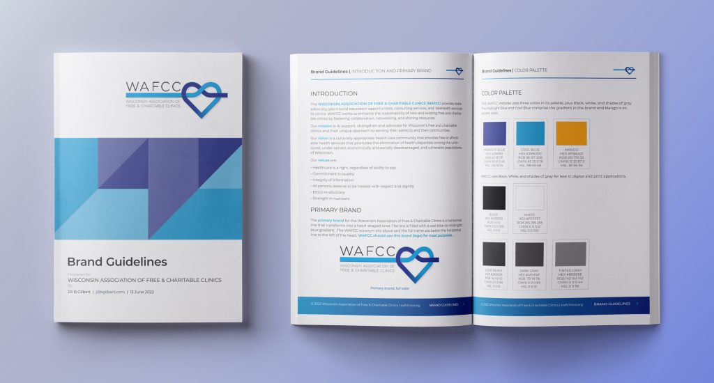
"This was my second project with WAFCC. I enjoyed working with Heather and building a relationship. We plan to work together on more projects in the future."
Wisconsin Association of Free & Charitable Clinics Slide Presentation Template
Wisconsin Association of Free & Charitable Clinics | Presentation Template
Posted by Jill B Gilbert in Best Practices, Branding, Color, Consulting, Corporate Identity, Design, Graphics, Guidelines, Logo Design, Marketing, Standards, Typography

Komolova Log Works Selects Jill B Gilbert to Create a New Brand

Komolova Log Works logo in full color, all black and all white
Komolova Log Works | Logo & Visual Brand Guide

When Eric and Nancy Raup needed a brand for Eric’s craft furniture and decor business, they immediately thought of Jill B Gilbert.

After identifying Komolova Log Works’ needs, Jill created three design concepts. After further discussions and iterations, Komolova revealed that they wanted to include an owl. 

Here is the result—a playful owl standing on a tree branch. The logo, tag line, and color palette work together to communicate the brand, as well as the rustic setting for the business. 

Posted by Jill B Gilbert, 0 comments

Develop style guides for your design projects

Whether you are developing a 50-page Website, a small mobile phone app, or an annual report for a corporate client, you should get in the habit of developing a style guide.

Branding and style guides are important for projects large and small. They help to provide consistent messages about an organization and provide a degree of professionalism. Creative Bloq has a good post on this topic, with examples of thirteen style guides for famous organizations.

Client project style guide

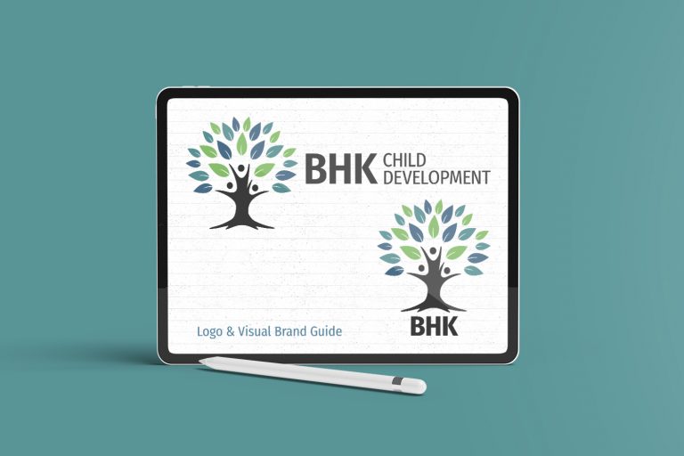
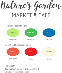
The client’s goal was to refresh their brand and their Web site to draw more customers to their wellness practice and retail establishment. I prepared a simple style guide, using Adobe Illustrator. The Style Guide displays the brand, color chips for main and accent colors, typography and usage examples:

Style Guide | Nature’s Garden

Here is how the styles look when applied to a “mobile first” Website design. Note how the colors and the leaf motif are repeated throughout the page. The design works well on a smartphone, on a tablet or on a large HD screen.

Mobile View | Nature’s Garden
Responsive Home Page on Retina Display

University style guide

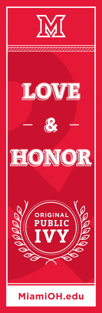
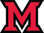
On a whim, I researched my alma mater’s color and brand guidelines. The Miami University is a nationally recognized Public Ivy, and its brand is particularly important. The brand must convey the Public Ivy experience.

The University uses different reds for print, Web and merchandise use. Several formal and informal logos are available for these uses. The use of certain “vintage” logos requires special permission.

The branding guidelines include logos, colors, typography and graphic elements. They encompass Web, print publications, social media, photos, use in athletic programs and more.

How people – alumni, students, future students, faculty and staff, fans, donors, and the public at large – feel about Miami University directly relates to the University’s success. In a sense, the brand speaks on the University’s behalf without saying a word. It represents who we are and what we stand for. It is the visual representation of our reputation.

Miami University Brand Guidelines

Here is the “M” spirit mark often used on sportswear and signs.

The Miami University Spirit Mark

Posted by Jill B Gilbert in Best Practices, Branding, Color, Corporate Identity, Graphics, Guidelines, Logo Design, Marketing, Standards, Typography, Web Design