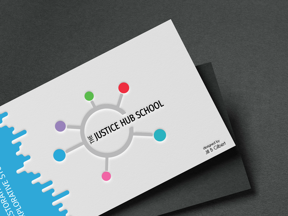
I have a client that needs graphic design work for multiple brands, and wants all of their brands in a single portfolio. Their services generally target the same audience, and the audience can choose one or more services; these services do not compete with one another. My client seeks consistency in the way they portray the different services in digital and print media.
If your organization manages more than one brand, you have different options to manage them. Your branding strategy–key to your marketing strategy–depends on your target audience and customers.
Whether you already have several brands, or you anticipate new product or service lines, you can find a structure that works for your organization.
Individual Brands or Parent and Sub-Brands
Two options for managing multiple brands are:
- a multi-brand strategy with individual brands for each product/service, and
- a single, parent brand with multiple sub-brands.
If the products or services aim to fulfill different purposes or have different visions, you may want to to separate your brands. If your products or services reflect an overarching vision or purpose, you might choose the parent/sub-brand option.
Your company’s vision, values, customers, and market position can guide your choice of options.
- Who are your customer segments?
- Do your products/services target vastly different segments?
- Do these differing segments want to be associated with one another?
- If you plan a new product/service, does it reflect your existing brand’s deeper purpose and vision, or does it reflect a new purpose and vision?
Examples
Multi-brand strategy
Procter & Gamble uses a multi-brand strategy, with individual brands for each product line. Some of their product lines include Tide, Gain, Crest, Pampers, Bounty, Swiffer, Oral B, and Gillette. Some of their products compete with each other, for example, Tide and Gain, but Procter & Gamble gets a piece of the laundry market share from both products, aimed at different consumers.
Parent brand and sub-brand strategy
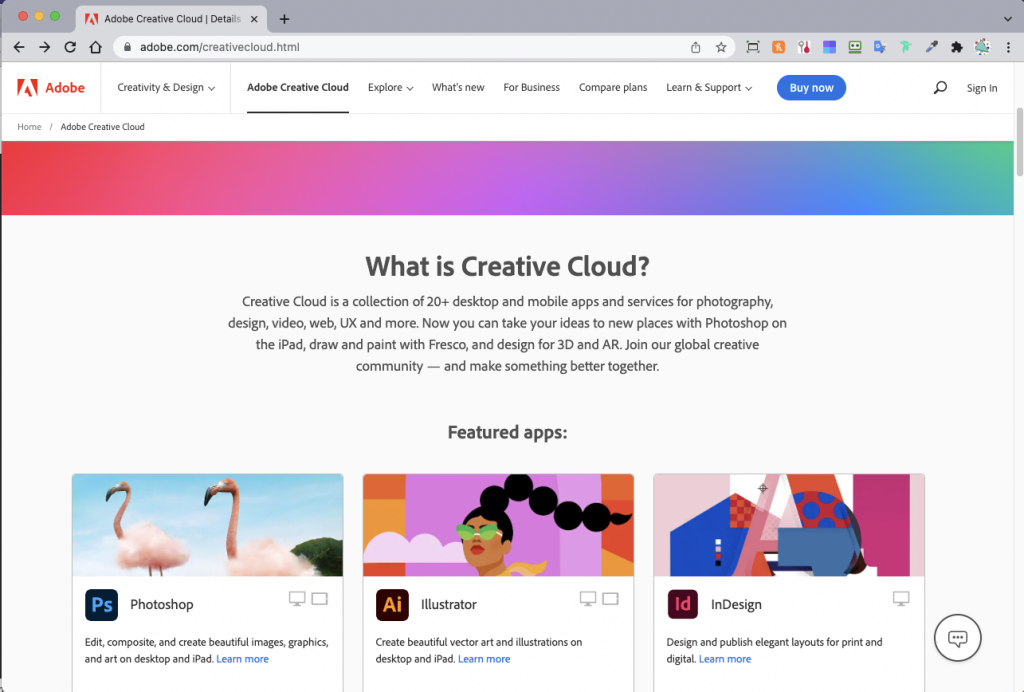
Adobe has multiple products under a single brand. Creative Cloud, their main product line, includes Adobe Acrobat, Adobe Acrobat Reader, Adobe Photoshop, Adobe Illustrator, Adobe Lightroom, and more. Adobe markets Creative Cloud to very different audiences, and allows individual users and teams to select the apps that best meet their graphic design, photography, and other creative needs.
In closing, if your organization manages several brands, make sure that you have a clear strategy. And make sure to document this strategy and also provide clear brand guidelines so you can communicate consistently and clearly with your target audience.
References
Pruitt, Jeff, Approaches to Branding Multiple Brands, Inc. Magazine, accessed 02 November 2021.
Pruitt, Jeff, 4 Branding Structures When Multiple Products and Services are Involved, Inc. Magazine, accessed 02 November 2021.
Dearth, Brian, Multi-Brand Strategy: 5 Top Trends in 2021, Vaimo, accessed 14 January 2022.
Adobe Creative Cloud, accessed 14 January 2022.
Procter & Gamble Brands, accessed 14 January 2022.