
18
Oct
2021
Halloween Thanks to CLHS Teachers and Staff: “No Tricks, Just Treats!”

Each year, Pantone selects a Color of the Year that establishes design and fashion trends. And the Pantone Colors of the Year for 2021 are… Illuminating and Ultimate Gray. This is the first time that Pantone selected two colors.
The bright yellow and the medium gray colors signify a fresh start, and together are bright and cheery. Last year, the color was Classic Blue–which, as it turns out, describes 2020 well.
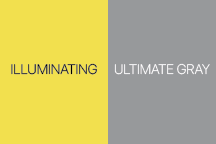
I used the Pantone Connect app to discover different color harmonies for the 2021 Colors of the Year–analogous, complementary, triadic, and tetradic color palettes. I selected fourteen colors plus yellow and gray to create art in the style of Damian Hirst. Here is the colorful result.
Note: you can use Pantone Connect online in a browser, as an extension to Adobe Creative Cloud applications, and as a smartphone app.
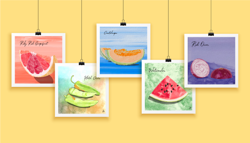
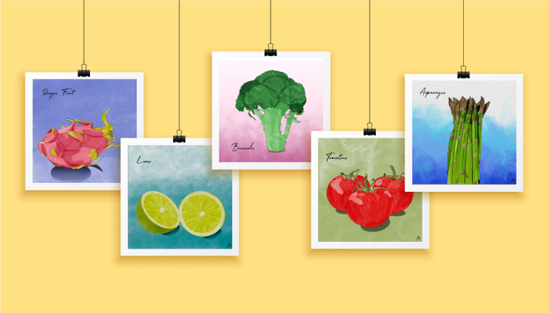
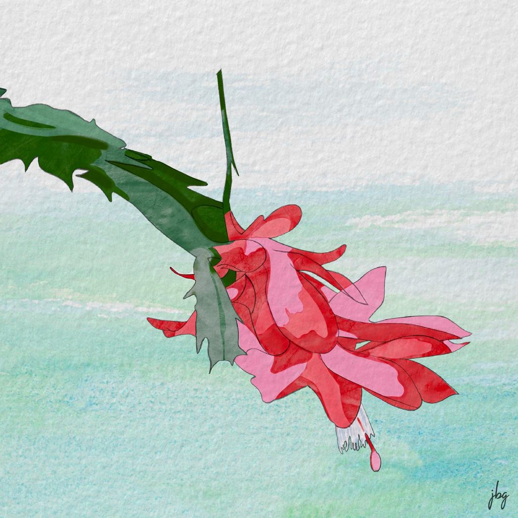
I completed a few watercolor tutorials by Every-Tuesday and got hooked. After the tutorials, I found a handful of inkers and watercolor brushes I liked and started drawing colorful fruits and vegetables. I found it engaging.
Now, the Watercolor Food for Thought series has 30+ images! You can enjoy some of these below.
Patience, the Procreate app, and creating something every day improved my drawing and illustration skills.
Last year, my “go-to” hardware was a MacBook Pro, a Wacom drawing tablet, a wireless keyboard and a 25-inch monitor. Late in 2019 I upgraded my iPad and purchased an Apple pencil. I could use the iPad anywhere, rather than be chained to the desk in my studio.
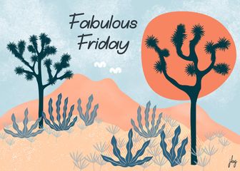
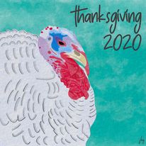
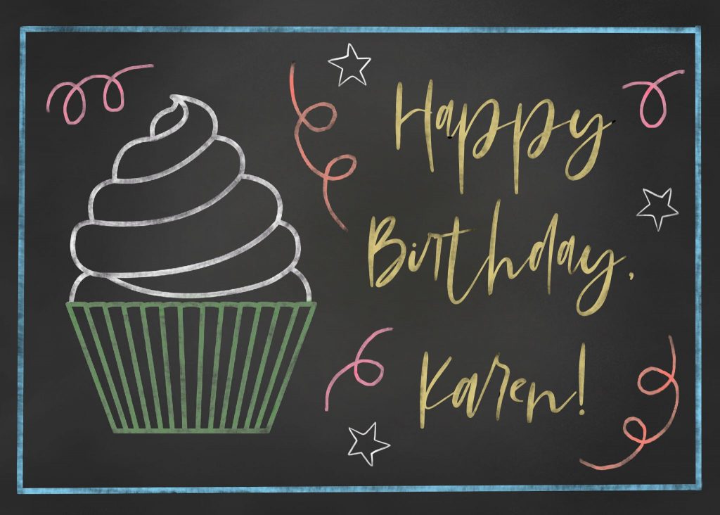
Back to the pandemic… I have worked at home for over 15 years, so staying home a bit more was not too taxing. I wanted to improve my drawing skills, but could not make myself pick up a sketchbook. I remember my drawing teacher told me, “just try drawing something–anything–each day.” So I started creating something on the iPad nearly every day. Birthday cards, abstract illustrations, watercolor drawings, comic-style illustrations, and more. I learned how to use dozens of different types of “brushes,” something I hadn’t explored much in Adobe Photoshop and Illustrator. I created many works from photos–free stock photos and my own photos. My skills grew, week-to-week and month-to-month.
Do something good. Create something every day.
Jill B Gilbert
I truly improved my drawing and illustration skills during the COVID-19 pandemic. I credit patience, and creating something nearly every day, for much of the improvement. And I credit learning the Procreate app for the rest.
Now I use my sketchbook almost daily. Sometimes I use it at the start of a project. Most days I see where my mind takes me when I start Procreate, and use the sketchbook to take notes and to paste printed versions.
My advice: Do something good. Create something every day.
Procreate is a Raster (pixel) drawing app with many features not found in other drawing apps available for the iPad.
In 2019, my “go-to” tools for making quick–and detailed–graphics and illustrations were Adobe Illustrator and Adobe Photoshop on my Macbook Pro. My setup included a Wacom drawing tablet, a wireless keyboard, and a large monitor. My iPad was a secondary tool, hardly part of my graphic design workflow. I dabbled in the different Illustrator and Photoshop apps for the iPad, but they seemed awkward.
Then I traded in my iPad for an iPad Air (3rd Generation) and bought an Apple Pencil. I kept hearing about an app called Procreate, designed for the original iPad Pro and the Apple Pencil. A blog I follow had lots of Procreate tutorials, so invested a small sum of ten dollars (!) and got started. Read on to learn the ins and outs of Procreate.


Procreate offers many features not seen in competitors’ drawing apps. I recommend it as part of a graphic design workflow and use it almost daily. It is a true gem, and well worth the money.
On April 20, San Jacinto College Vice-Chancellor Laurel Williamson, QEP Director Ann Pearson, and the QEP Committee announced that it selected Jill B Gilbert’s design to represent the program for the next five years (see the QEP page here). The college’s Quality Enhancement Plan (QEP), Thinking and Beyond, promotes student success through critical thinking.
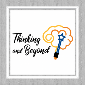
Gilbert’s design addresses the “right brain” creative and “left brain” logical aspects of critical thinking, as well as the San Jacinto Monument, topped by a star, and a USB connector to symbolize how students are always plugged in—the connection between critical thinking and technology.
Viewed another way, the symbol depicts a launched rocket, shooting for the stars, with puffs of exhaust parting as the rocket travels upward. This is an homage to Houston, aka the Space City; Jill’s Dad, a rocket scientist, and her little brother who followed in his Dad’s footsteps.
A couple of days ago, my husband found an online art quiz, Can You Guess the Famous Artist from a Tiny Part of Their Painting? We scored 96%, missing only two of fifty questions; I had never heard of one artist.
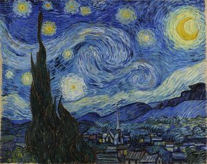
The first two questions were “gimmes”–Van Gogh’s The Starry Night and Picasso’s Seated Woman.
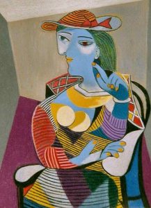
Years of going to art museums as a child, plus my time in the Art & Design program—including my crash course in Art Appreciation—has paid off! I really appreciate the different styles and can recognize the characteristics of many artists. I would never confuse the works of Jackson Pollock, say, for those of Georgia O’Keeffe! However, shown a portion of a Picasso vs. a Bracques cubist work, I might have more difficulty identifying the artist.


