Google

Will bespoke typefaces replace Helvetica?

Bespoke typefaces are on the rise

Definition of Bespoke

More and more big companies commission their own typefaces, rather than relying upon the thousands of fonts readily available for marketing their goods and services.

Recent, notable bespoke typefaces

2018

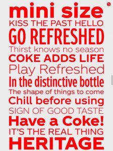
This month, The Coca-Cola Company (TCCC) introduced its bespoke Unity font.  Depending on who you ask, some designers love it, and others hate it. Coca-Cola has used a script logotype for decades, and a while back introduced a serif font with the word, “Coke.” Unity is a departure; it is a sans-serif typeface family with several weights.

Coca-Cola’s Unity Typeface

2017

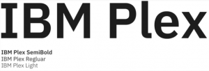
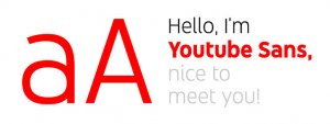
In 2017, IBM rolled out its bespoke typeface families, named Plex, and YouTube introduced YouTube Sans.

IBM Plex Typeface Family
YouTube Sans Typeface Family

2016

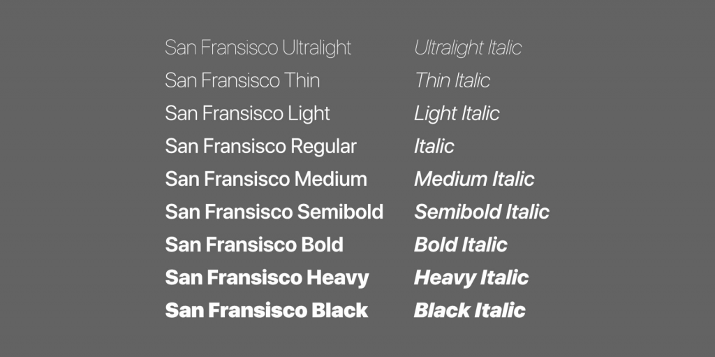
In 2016, Apple introduced San Francisco typefaces at its Worldwide Developer Conference. These fonts were inspired by Helvetica, and were developed for ease of reading on small screens like the Apple Watch and iPhone, as well as on iPads and Mac computers. The same year, CNN introduced CNN Sans—also modeled on Helvetica.

Apple’s San Francisco Typeface Family
CNN Sans Typeface Family

2015

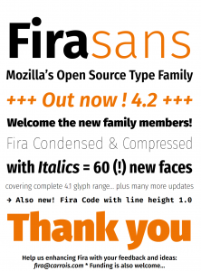
In 2015, Google rebranded its famous “G” using a proprietary font called Product Sans. Product Sans closely resembles the Futura typeface. Google rolled out Roboto In 2013 for the Android OS. Also in 2013, Mozilla rolled out typefaces for its Firefox OS, called Fira Sans and Fira Mono.

Google Logo, 2015
Roboto Typeface
Mozilla’s Fira Sans Typeface Family

Why use a bespoke typeface?

It’s all about branding. We are bombarded by thousands of advertisements each day on smartphones, tablets and computers. We see an ad for a fraction of a second before engaging with the brand or discarding the ad. According to Envato, having a recognizable logo is not enough. Companies must stand out from the competition using logos, colors, copy and typography. This is where custom typefaces come in.

Branding requires notable logos, colors, copy and typography. “Bespoke fonts offer brands more control over their identity, and in some cases can even save them money in the long run.”

–Envato

Will bespoke typefaces put an end to Helvetica?

Helvetica (Neue Haas Grotesk) was developed in 1957 by Swiss typographer Max Miedinger and became the de facto standard of international typeface design in the mid-20th Century. It remains popular today—Helvetica Neue is the default Mac font—because it is both readable and legible at many different sizes and weights.

Helvetica is not going away anytime soon. It is still the favorite of many designers because of its versatility and simplicity. Just make room for the new, bespoke typefaces to coexist with Helvetica.

Posted by Jill B Gilbert in Branding, Color, Corporate Identity, Design, Graphics, Logo Design, Marketing, Standards, Typography

Why the Internet is blue

Blue rules on the Internet

Envato’s blog post confirmed what many of us have known for a while… blue is the favorite color on the Internet. Just look at logos for social networking sites, and you will see a sea of blue, with some other colors sprinkled in. Facebook Twitter, LinkedIn and Google all use blue for logos and Web sites.

The sky is blue, and the atmosphere is blue. But why did Internet pioneers choose blue, or a specific blue?

  • Tim Berners-Lee, the father of the Internet, was shown blue links on early screen prototypes. The color stuck.
  • Mark Zuckerberg chose blue for FaceBook because he is (red/green) colorblind.
  • Google tested 41 shades of blue for Internet links, and today billions of people see the blue that won the user test.

Designer Paul Herbert’s 2016 analysis of the hues used on the ten most popular Internet sites shows that blue is by far the most popular color, with twice the usage of red or yellow, and four times the usage of green or purple(see my post, The colors of the Web). You can find an interactive version of the image below on his Web site.

Colors of the 10 most popular Web sites, 2016 (http://paulhebertdesigns.com/web_colors/)

Blue has many personalities

Blue is like a chameleon, with many hues and many personalities. Blue can convey professionalism, it can be warm and inviting, exciting, or cold and scientific. Which blues do you use?

Posted by Jill B Gilbert in Color, Corporate Identity, Design, Web Design

FontAwesome vs. Google Material Icons

I have used the FontAwesome desktop font for my Web designs and used the Web font on one of my projects. If you like the ability to use the desktop font for your designs in Photoshop and insert the icon names in your HTML, then you have the flexibility to style them to your own specs using CSS. You can find all of the hundreds of FontAwesome icons on their Cheatsheet; just copy and paste the one you want into your Photoshop design. However, FontAwesome takes a lot of resources, especially if you need only a few icons, e.g., phone, location, mail, and social icons. 

Google Material Icons to the rescue! Google offers the MaterialIcons Regular desktop font (TrueType), and a Google Web font as well.  Google claims that its Web font is very compact and does not require a lot of resources. If you prefer to host the icons, you can download individual icons in .png or .svg formats in any color you like, and save these in your Dreamweaver Images folder. Or you can download and host the 900-plus icons on your own server.

I made a “cheat sheet” in Photoshop using Google’s Noto Sans Regular and MaterialIcons Regular fonts. Some of the glyphs are pretty intuitive, e.g., type a lowercase “c” for Close, lowercase “p” for Phone, and lowercase “s” for Search. If you get stuck, just use the Glyphs panel in Photoshop or the Mac FontBook in other programs. Google has fewer icons than FontAwesome, and lacks icons for the common social platforms. 

Posted by Jill B Gilbert in Typography, Web Design, 0 comments