
Last week, one of my French friends sent me a link to a PowerPoint presentation on the hidden meaning behind several corporate logos. I knew about the hidden arrow in the FedEx logo; the smiley face and lowercase letter “g” in the Goodwill logo; the smile and arrow from A to Z in the Amazon logo; and the hidden number 31 in the Baskin-Robbins logo. I know enough French to translate the captions on the slides.
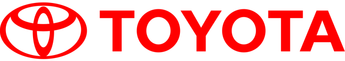
Today, I came across an English version in a blog post by Onextrapixel. It is a pleasant and quick read. The biggest surprise is the meaning of Toyota’s oval icon—it combines strokes for each of the English letters in the company name!
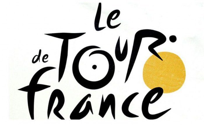
Another favorite is Le Tour de France brand. The letter “R” depicts a bicycle rider and the letter “O” and the yellow circle represent two bicycle wheels and the sun; the ride takes place only during daylight hours.
Both of these brands have stood the test of time—they are crisp and memorable. Their hidden meanings make them more interesting.