Halloween 2021 Comic Cover
When I studied Art & Design, we had a Photoshop project due just before Halloween. I now call it “The Pumpkin Challenge.” Our assignment was to take a digital coloring book page of a Jack O’ Lantern–just black lines–and use different Photoshop brushes to color the drawing. My pumpkin that year used red, yellow, blue and black halftone dots to create shades of orange and blue. I added a few bats, and it was done!
Last year, I created a special Halloween comic book cover with the same pumpkin outline, elevating the project with other illustration and typography work. This was the first edition of Iconic Comics. I sent it to my former professor, and he was excited to show it to the class.
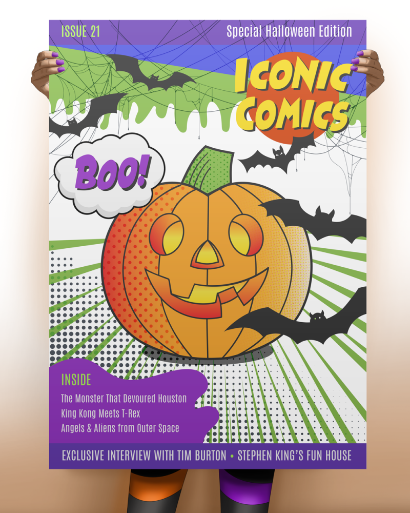
This year, I continued the tradition with a 2021 version of the Iconic Comics Special Halloween edition. I drew the pumpkin outlines, the green “goo” and the purple blob using the Adobe Illustrator Pen Tool (my former nemesis). I must admit that these days, I use Illustrator more than Photoshop for graphics. I created a Halloween color palette of orange, purple, green and black. The pumpkin uses gradients and three different halftone effects for shading and highlights. I found vector drawings of the spider webs and bats on Vecteezy, and modified them to fit my theme.
I sent a copy of the latest comic book cover to my professor, who was happy to share it with his class. Enjoy!