Jill B Gilbert

Should you build your own website, or hire a professional?

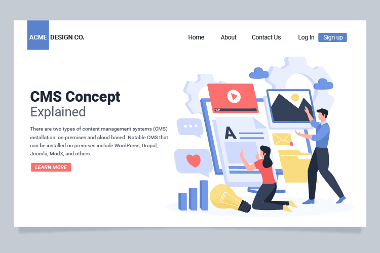
If your organization’s website needs a major refresh, you can hire a professional or build it yourself. After all, thousands of free and paid website templates are available, and website building tools are better than ever before. TV and social media ads make it look so easy to build a website! Let’s look at some of the questions to answer before you make a “build or buy” decision.

Website “build vs. buy” questions

What are your objectives? Why do you want to change your site? You may want to refresh your site because it is outdated, because your company is growing or adding products or services, to start a blog, to add the ability to sell products or services online, or for other reasons. Think about the technical and financial objective you want to achieve.

What types of changes do you need? You might be thinking of a total new look and feel, a change to the website structure, or both. Maybe you need a media library to easily store and retrieve images, videos, etc. You might need entire new features, e.g., a blog or e-commerce capabilities. You simply might want a new website that is easier to maintain in-house, rather than hiring a web professional to make changes each time you need them.

How is your current website built? Is it written (coded) in HTML + CSS, or is it built on one of the new platforms like WordPress, SquareSpace, WIX, or other? If it is an HTML site, you will need to know how to write code. If it built on one of the newer platforms, you may be able to build your own site; it may look professional but, depending on your HTML know-how, the site can be a mess behind the scenes. Yes, you read that right! This is because you cannot refresh these sites just by applying a new theme. Many of the current “drag-and-drop” website themes have widgets, code blocks, and other complexities. These site elements may not work in the new theme without a lot of tweaking.

How tech-savvy are you? If you are a lover of things tech, and the first of your friends to get the latest electronics, and you are committed to doing site updates yourself in the future, then building a website may be for you. If you use computers, social media and smartphones every day, but rarely update your electronics or software, this is a warning sign that you should speak to a web designer. But read further…

What is your timeline? If you need it quickly and can effectively plan and build a website, then do-it-yourself might work for you. Just keep your project objectives in mind, spend adequate time planning, get advice as needed, and go for it! If you need it quickly, don’t even consider slapping something together quickly to get a new, improved website up and running. This will do more harm than good. If you have a reasonable timeline, then you have plenty of options, both do-it-yourself and professionally-built.

What will it cost? First, think about the value that the website updates will bring to your company in terms of new clients, more business, and better market penetration. Second, consider the total cost to your organization. This is a cost-benefit issue, not the price tag to get the site up and running. If web development or computer coding are not your core business, you may find yourself spending hours updating the website yourself, at a significant cost to you in terms of lost revenue, missed marketing opportunities, missed new clients, etc. Third, what are the ongoing maintenance and update costs for the next three to five years?

Congratulations! If you have read this far, you now have more questions than answers! At the least, you understand some of the “build vs. buy” issues, and the many choices available to you. If you still have questions about what is best for you, please consult a professional. A short discussion could save you hours of time and a stack of money.

Posted by Jill B Gilbert in Best Practices, Consulting, Design, Guidelines, Web Design

Pantone Colors of the Year | 2021

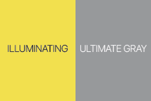
Each year, Pantone selects a Color of the Year that establishes design and fashion trends. And the Pantone Colors of the Year for 2021 are… Illuminating and Ultimate Gray. This is the first time that Pantone selected two colors.

The bright yellow and the medium gray colors signify a fresh start, and together are bright and cheery. Last year, the color was Classic Blue–which, as it turns out, describes 2020 well.

Pantone Colors of the Year for 2021, Illuminating and Ultimate Gray

I used the Pantone Connect app to discover different color harmonies for the 2021 Colors of the Year–analogous, complementary, triadic, and tetradic color palettes. I selected fourteen colors plus yellow and gray to create art in the style of Damian Hirst. Here is the colorful result.

Color of the Year 2021 Harmonies in the style of Damian Hirst

Note: you can use Pantone Connect online in a browser, as an extension to Adobe Creative Cloud applications, and as a smartphone app.

Posted by Jill B Gilbert in Art, Color, Design

Watercolor “Food for Thought” Series

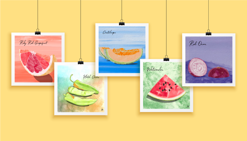
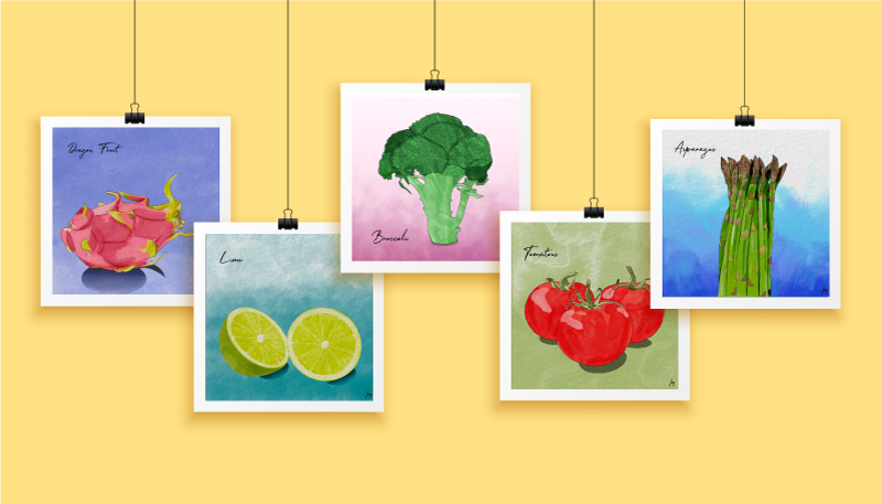
I completed a few watercolor tutorials by Every-Tuesday and got hooked. After the tutorials, I found a handful of inkers and watercolor brushes I liked and started drawing colorful fruits and vegetables. I found it engaging.

Now, the Watercolor Food for Thought series has 30+ images! You can enjoy some of these below.

Selected watercolor drawings from the Food for Thought series by Jill B Gilbert. Ruby Red Grapefruit, Hatch Chilis, Cantaloupe, Watermelon, and Red Onion.
Food for Thought Series | Selected Watercolor Drawings
Selected watercolor drawings from the Food for Thought series by Jill B Gilbert. Dragon Fruit, Lime, Broccoli, Tomatoes, Asparagus
Food for Thought Series | Selected Watercolor Drawings, Part 2
Posted by Jill B Gilbert in Art, Color, Illustration

Watercolor Cactus Series

Since I live in the Southwest and like desert plants, I followed a series of tutorials to draw watercolor cacti. The resulting drawings were abstract and I wanted more realistic watercolor images. Working with photos–including some of my own–I created a series of cactus and succulent drawings.

Like any series, these cactus drawings have evolved–I learned a few tricks along the way to improve my drawings.

A high school friend who now lives in the Phoenix area paid me the highest compliment; she said that my rendering and color choices look like the scenes she sees every day.

Posted by Jill B Gilbert in Art, Design

Drawing during the pandemic improves skills measurably

Patience, the Procreate app, and creating something every day improved my drawing and illustration skills.

Last year, my “go-to” hardware was a MacBook Pro, a Wacom drawing tablet, a wireless keyboard and a 25-inch monitor. Late in 2019 I upgraded my iPad and purchased an Apple pencil. I could use the iPad anywhere, rather than be chained to the desk in my studio.

Back to the pandemic… I have worked at home for over 15 years, so staying home a bit more was not too taxing. I wanted to improve my drawing skills, but could not make myself pick up a sketchbook. I remember my drawing teacher told me, “just try drawing something–anything–each day.” So I started creating something on the iPad nearly every day. Birthday cards, abstract illustrations, watercolor drawings, comic-style illustrations, and more. I learned how to use dozens of different types of “brushes,” something I hadn’t explored much in Adobe Photoshop and Illustrator. I created many works from photos–free stock photos and my own photos. My skills grew, week-to-week and month-to-month. 

Do something good. Create something every day.

Jill B Gilbert

I truly improved my drawing and illustration skills during the COVID-19 pandemic. I credit patience, and creating something nearly every day, for much of the improvement. And I credit learning the Procreate app for the rest.

Now I use my sketchbook almost daily. Sometimes I use it at the start of a project. Most days I see where my mind takes me when I start Procreate, and use the sketchbook to take notes and to paste printed versions.

My advice: Do something good. Create something every day.

Posted by Jill B Gilbert in Art, Best Practices, Graphics, Illustration

Procreate for iPad review

Procreate is a Raster (pixel) drawing app with many features not found in other drawing apps available for the iPad.

In 2019, my “go-to” tools for making quick–and detailed–graphics and illustrations were Adobe Illustrator and Adobe Photoshop on my Macbook Pro. My setup included a Wacom drawing tablet, a wireless keyboard, and a large monitor. My iPad was a secondary tool, hardly part of my graphic design workflow. I dabbled in the different Illustrator and Photoshop apps for the iPad, but they seemed awkward. 

Then I traded in my iPad for an iPad Air (3rd Generation) and bought an Apple Pencil. I kept hearing about an app called Procreate, designed for the original iPad Pro and the Apple Pencil. A blog I follow had lots of Procreate tutorials, so invested a small sum of ten dollars (!) and got started. Read on to learn the ins and outs of Procreate.

Pluses

  • You can choose from pre-installed drawing templates, or create your own.
  • You can use pressure sensitivity to change brush behavior and drawing stroke.
  • Layers! Depending upon the drawing size and resolution, you can have up to 40 or more layers.
  • Robust text capabilities and the ability to add typefaces.
  • Preinstalled color palettes.
  • You can create color palettes manually, from an image or a photo, or import palettes created by others.
  • You can export and save color palettes.
  • The shape tool creates “perfect” geometric shapes.
  • Drawing assist allows you to create straight lines, smooth curves, symmetrical illustrations, and more.
  • Create CMYK and RGB documents for print and Web, respectively
  • You can export to several file formats, such as PNG, JPEG, TIFF, layered PSD, and PDF.
  • You can edit and create Procreate brushes and brush sets.
  • Thousands of free and paid Procreate brush sets are available.

Minuses

  • As a Raster app, the drawing size and resolution must be set upfront, according to how you intend to use the illustration.
  • In the current version (5x), you can draw and edit arcs with three or four points, but not “S-curves.”
  • If you are a Typophile or often create illustrations with 20 or more layers, Procreate will crash periodically, even with decent iPad memory–but I have never lost a file!
  • There are so many Procreate brushes available, you may find it hard to limit the number you add; currently, you cannot tag brushes as “favorites.”
  • Cannot lock a color palette; I have accidentally changed color swatches many times.

Conclusion

Procreate offers many features not seen in competitors’ drawing apps. I recommend it as part of a graphic design workflow and use it almost daily. It is a true gem, and well worth the money. 

Posted by Jill B Gilbert in Art, Design, Graphics, Illustration

San Jacinto College selects Jill B Gilbert’s design for Quality Enhancement Plan

On April 20, San Jacinto College Vice-Chancellor Laurel Williamson, QEP Director Ann Pearson, and the QEP Committee announced that it selected Jill B Gilbert’s design to represent the program for the next five years (see the QEP page here). The college’s Quality Enhancement Plan (QEP), Thinking and Beyond, promotes student success through critical thinking.

The winning design for San Jacinto College’s Quality Enhancement Program

Gilbert’s design addresses the “right brain” creative and “left brain” logical aspects of critical thinking, as well as the San Jacinto Monument, topped by a star, and a USB connector to symbolize how students are always plugged in—the connection between critical thinking and technology.

Viewed another way, the symbol depicts a launched rocket, shooting for the stars, with puffs of exhaust parting as the rocket travels upward. This is an homage to Houston, aka the Space City; Jill’s Dad, a rocket scientist, and her little brother who followed in his Dad’s footsteps.

Posted by Jill B Gilbert in Art, Branding, Design, Education, Graphics, Logo Design, Marketing

Last week, one of my French friends sent me a link to a PowerPoint presentation on the hidden meaning behind several corporate logos. I knew about the hidden arrow in the FedEx logo; the smiley face and lowercase letter “g” in the Goodwill logo; the smile and arrow from A to Z in the Amazon logo; and the hidden number 31 in the Baskin-Robbins logo. I know enough French to translate the captions on the slides.

Toyota Brand Mark

Today, I came across an English version in a blog post by Onextrapixel. It is a pleasant and quick read. The biggest surprise is the meaning of Toyota’s oval icon—it combines strokes for each of the English letters in the company name!

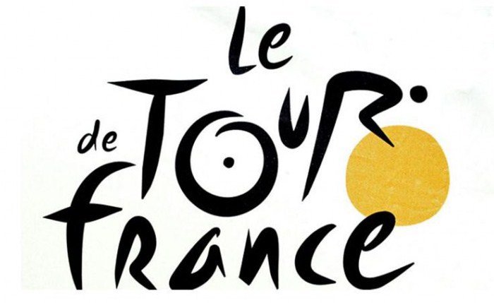
Tour de France brand mark shows a bicycle rider and the sun

Another favorite is Le Tour de France brand. The letter “R” depicts a bicycle rider and the letter “O” and the yellow circle represent two bicycle wheels and the sun; the ride takes place only during daylight hours.

Both of these brands have stood the test of time—they are crisp and memorable. Their hidden meanings make them more interesting.

Posted by Jill B Gilbert in Branding, Corporate Identity, Design, Illustration, Logo Design

Looking for design inspiration? Try these blogs…

Most designers do not just wake up in the morning, feeling inspired. Something they see or do gets their creative juices flowing. I often find my inspiration on the Internet, and I follow several design blogs. If you don’t know where to look, here is a compilation of 20 design and development blogs to follow. It includes several I have followed for years, plus some new ones I am eager to try… if only there were more hours in the day!

Posted by Jill B Gilbert in Best Practices, Design, Guidelines, Web Design

Branding lessons well worth learning

A Fast Company Design article relates how Steve Jobs worked with legendary designer Paul Rand to develop a logo for NeXT Computer.

NeXT logo (Source: Wikimedia Commons)

Whether you have millions of dollars or a more modest marketing budget, the takeaways ring true.

  • A logo must be distinctive, memorable, and clear.
  • A logo derives meaning from the quality of the thing (product or service) it represents; brands, by themselves, don’t make companies successful.
  • The designer’s role is to solve a problem, not to suggest options.
  • Logomarks—symbols like the Nike swoosh—could cost $100 million, plus could take years to become well-known.
  • Once a brand is designed, you must communicate standards and guidelines for its usage throughout your company.
Posted by Jill B Gilbert in Branding, Corporate Identity, Design, Logo Design, Marketing, Standards