Jill B Gilbert

17 Amazing Benefits of Using Lip Balm to Restore Dry, Cracked Lips Today

Marketing in the Digital Age

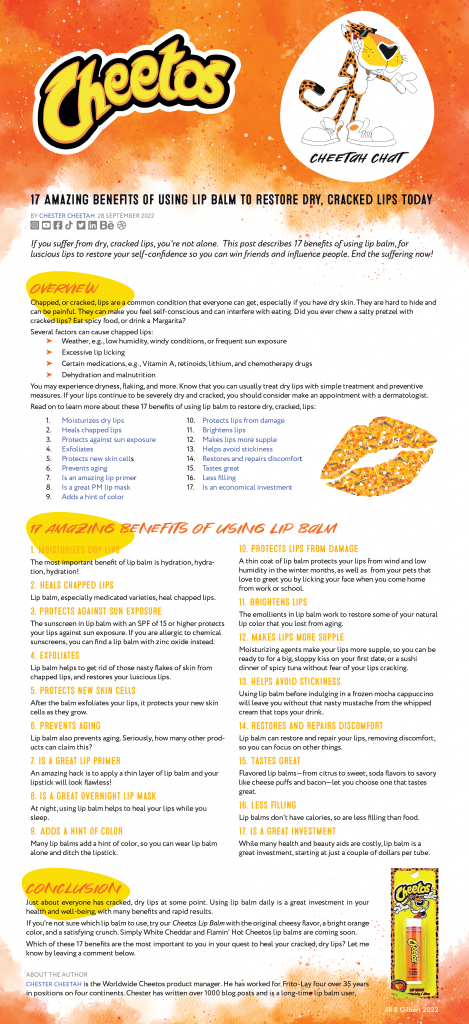
You’re probably wondering why I am interested in lip balm. Since I live in Houston, I need it when the humidity drops below 70% or if I have spicy food for lunch and wipe my lips too often. But seriously… my challenge was to create two marketing pieces for Cheetos Lip Balm. Cheetos introduced the lip balm in 2005—I am not making this up—and it was a marketing flop. Today, I think that  marketing such a product could be a success because of the prevalence of social media marketing channels. After all, pickle- and bacon-flavored lip balms are available, as well as dozens of other sweet, spicy, and savory flavors of lip balm.


You can see my Cheetos Lip Balm blog post below. It’s a bit tongue-in-cheek in places (pun intended). Enjoy!


Posted by Jill B Gilbert in Art, Branding, Corporate Identity, Design, Graphics, Marketing, Typography

How we helped the Wisconsin Association of Free & Charitable Clinics upgrade their branding

The Wisconsin Association of Free & Charitable Clinics (WAFCC) is an advocate for the State’s ninety free & charitable clinics. The organization provides state advocacy, education opportunities, consulting services, and telehealth services to clinics. WAFCC fosters collaboration, networking, and resource-sharing. They selected Jill B Gilbert for two branding initiatives–brand guidelines and a custom presentation template consistent with these new guidelines. 

Brand Guidelines

Brand guidelines are the rules an organization–large or small–follows to ensure their brand is consistent across various digital and print communications.  These guidelines typically communicate the organization’s voice, style, logo, type, and colors. 

They show the accepted use of the logo, any color variations, and placement, including  very important “Do’s and Don’ts.” If an organization uses specific graphic styles, icons, or illustrations, the guidelines contain these, too.

Brand Guidelines are meant to be flexible, changing as the organization grows and changes. The WAFCC Brand Guidelines are a living document, soon to be updated with examples from the new slide presentation template. 

Wisconsin Association of Free & Charitable Clinics (WAFCC) Brand Guidelines Mockup
Brand Guidelines | Wisconsin Association of Free & Charitable Clinics
"I HIGHLY RECOMMEND ANYONE TO WORK WITH JILL. SHE HAS A WEALTH OF KNOWLEDGE, IS VERY KIND, RESPONSIVE, AND DID A WONDERFUL JOB ON OUR VISUAL BRAND GUIDE."​
Heather Ule
WAFCC

Presentation Template

The most common methods of communication are email,  PowerPoint (/Google Slides/Keynote/Other) presentations, and social media. 

Branding is important in slide presentations, because it sets the tone for your organization’s message. Consistent style and message are key!

Jill B Gilbert designed a template that was a great match for WAFCC’s message and style needs. 

"This was my second project with WAFCC. I enjoyed working with Heather and building a relationship. We plan to work together on more projects in the future."
Wisconsin Association of Free & Charitable Clinics Slide Presentation Template
Wisconsin Association of Free & Charitable Clinics | Presentation Template
Posted by Jill B Gilbert in Best Practices, Branding, Color, Consulting, Corporate Identity, Design, Graphics, Guidelines, Logo Design, Marketing, Standards, Typography

Jill B Gilbert selected to advise Physician-Patient Alliance for Health & Safety on Learning Management System

The physician-Patient Alliance for Health & Safety (PPAHS), a New Jersey non-profit organization, provides Continuing Medical Education (CME) to nurses, doctors, respiratory therapists, and other medical professionals. Over 30,000 individuals subscribe to their service.

PPAHS needed advice on a new learning management system they plan to launch later in 2022 and selected Jill B Gilbert to help. 

Jill pulled several tools out of her tool kit to help–experience designing and building websites, expertise in graphic design and typography, and, most important, the ability to assess PPAHS’s needs and create a plan for the new LMS website. 

PPAHS was thrilled with the results, and plans to use Jill for future projects. 

Slide presentation for the Physician-Patient Alliance for Health & Safety
Learning Management System Website Content & Design | PPAHS
Jill is an absolute delight to work with. Truly a guru of design! In addition to help with this project, we learned so much from her about fonts, colors, headings, etc.
Dots in a Row
Michael Wong
Executive Director, PPAHS
Posted by Jill B Gilbert in Branding, Color, Consulting, Design, Graphics, Typography, Web Design

The Eclectic Menagerie is full of whimsical, larger-than-life sculptures

Roadrunner

e•clec’•tic men•a’•ger•ie
:
site south of Houston with an eclectic collection of concrete and metal sculptures

sculpture garden curated by Texas Pipe & Supply with larger-than-life rusted steel and stainless steel sculptures by local artists

Elcectic Menagerie Park. A private collection of massive steel monsters guarding a Texas pipe works.
—Atlas Obscura

Driving south of Houston on Texas 288 over the years, I have marveled at the giant animal sculptures along the freeway. I was excited to see new additions as I drove by, but never stopped to look. Then I researched The Eclectic Menagerie Park, located on a narrow strip of the Texas Pipe & Supply property. I made it my mission to stop and smell the (metal) roses.

Jerry Rubenstein, Chairman of the Board of Texas Pipe & Supply, started the outdoor sculpture museum decades ago with a couple of concrete animal statues. He commissioned local artists Ron Lee and Mark Rankin to create about two dozen metal sculptures, from a giant dinosaur and armadillo to a fishing rod and reel with Jerry's old red pickup truck caught on the lure. A stealth bomber stands at attention as Snoopy flies his Sopwith Camel. A semi truck cab is stuck in the dirt, waiting to be towed out. King Kong hangs menacingly on a crane and colorful cows stand on a surfboard up in the sky.

Enjoy a sample of the Eclectic Menagerie images below. 

Eclectic Menagerie Gallery

Posted by Jill B Gilbert in Art, Design, Photography, 0 comments

Entropy. The Beauty in dirt, rust and decay.

Lichen and moss on rock

en’•tro•py 
:
a process of degradation or running down or a trend to disorder

Entropy. It's a natural phenomenon, a measure of chaos, disorder and randomness in a system. It's part of the life cycle, where things ultimately decay and the cycle starts anew.

life’•cycle
the series of stages in form and functional activity through which an organism passes between successive recurrences of a specified primary stage

I took a series of random walks through manmade and natural settings—in search of interesting lines, forms, colors and textures—and found beauty in rusty, dirty and decayed things.

Some observations from these walks:
  • colorful moss and lichens on rocks improve with time.
  • rust patterns on manhole covers, sewer grates and checker plate metal are attractive.
  • usually overlooked, thistles other weeds have exquisite forms and colors.
  • fungi on decaying trees have unusual shapes and rich textures.
  • earth cracked after months of drought reveals beautiful, random patterns.
  • dirt splashed on a fire hydrant or squashed by giant tires creates uniform patterns. 

Enjoy these things while you can; they are temporary. At the end of their life cycles, they crumble into the earth or wash away, only to start the cycle again. That’s entropy, returning things to an orderly state. Enjoy my photos below. 

Entropy image gallery

Posted by Jill B Gilbert in Art, Design, Photography, 0 comments

Old, rusty, abandoned equipment provides great photographic subject matter

35mm filmstrip, abandoned farm

Old, rusty, and abandoned equipment fascinates me. It has rich lines, angles, and textures, even though its colors are faded. A large property south of Houston, Texas provides a backdrop for a recent photo session. Perhaps a farm in its former life, the City has walled off the property with a six-foot fence and planted vines along this fence that, eventually, will obscure the view of what some feel is unsightly. Suburban progress encroaching on this old, rusty aesthetic.  

Rusted steel drums, corrugated metal and giant tires rest peacefully next to a barbed wire fence. A Corvette body sits on the ground, a shell of its former sleek design. A rusty axle reminds me of an old plow. A couple of Case excavators and an old John Deere Tractor sit idle, as if their operators took a lunch break and never returned. But there is life, as Black Angus cows and their petite newborn calves graze near a once-colorful dump truck. They look at me as I snap photos. 

I want to go inside and get a closer look at these interesting items, but the electric fence warns me to stay out. I enjoy what I see from the road…

Abandoned farm Photos

Posted by Jill B Gilbert in Art, Design, Photography

When the dog bites, when the bee stings…

Illustration of a bee flying near flowers, with the title Bee Calm

I had just returned from walking our dog, Maggie, which happens three or four times each day. I unclipped her leash to let her run in the yard and noticed a stray leaf that needed to be picked up. As I bent down, a bee or wasp stung me on the face. I had a fat lip in seconds and calmly drove myself to the ER. 

I drew this “BEE CALM” illustration later that day to remember to remain calm during emergencies. I used Procreate on my iPad Air with several stamp and texture brushes. A nice memory of a scary situation! By the way, I never found the insect responsible…

Posted by Jill B Gilbert in Art, Graphics, Illustration

Jill B Gilbert delivers stylish slide templates for The Justice Hub School

Custom slide template and presentation for The Justice Hub School

 The Justice Hub School provides underserved youth in Houston’s Third Ward with academic and leadership skills to succeed in life. Jill B Gilbert was pleased to create a colorful new brand and a stylish custom presentation templates for this public charter school. 

Our graphic design team created two templates aimed at different audiences–prospective donors and board members, and prospective students. Both templates employ Justice Hub’s new brand and color scheme. The image above shows the second, less formal, template on an iPad Pro. 

Posted by Jill B Gilbert in Branding, Color, Corporate Identity, Design, Education, Logo Design, Marketing, Standards, Typography, 0 comments

Approaches to branding multiple products or services under one business

I have a client that needs graphic design work for multiple brands, and wants all of their brands in a single portfolio. Their services generally target the same audience, and the audience can choose one or more services; these services do not compete with one another. My client seeks consistency in the way they portray the different services in digital and print media. 

If your organization manages more than one brand, you have different options to manage them. Your branding strategy–key to your marketing strategy–depends on your target audience and customers. 

Whether you already have several brands, or you anticipate new product or service lines, you can find a structure that works for your organization.

Individual Brands or Parent and Sub-Brands

Two options for managing multiple brands are:

  1. a multi-brand strategy with individual brands for each product/service, and
  2. a single, parent brand with multiple sub-brands. 

If the products or services aim to fulfill different purposes or have different visions, you may want to to separate your brands. If your products or services reflect an overarching vision or purpose, you might choose the parent/sub-brand option.

Your company’s vision, values, customers, and market position can guide your choice of options. 

  • Who are your customer segments?
  • Do your products/services target vastly different segments?
  • Do these differing segments want to be associated with one another?
  • If you plan a new product/service, does it reflect your existing brand’s deeper purpose and vision, or does it reflect a new purpose and vision?

Examples

Multi-brand strategy

Procter & Gamble uses a multi-brand strategy, with individual brands for each product line. Some of their product lines include Tide, Gain, Crest, Pampers, Bounty, Swiffer, Oral B, and Gillette. Some of their products compete with each other, for example, Tide and Gain, but Procter & Gamble gets a piece of the laundry market share from both products, aimed at different consumers. 

Parent brand and sub-brand strategy

Adobe has multiple products under a single brand. Creative Cloud, their main product line, includes Adobe Acrobat, Adobe Acrobat Reader, Adobe Photoshop, Adobe Illustrator, Adobe Lightroom, and more. Adobe markets Creative Cloud to very different audiences, and allows individual users and teams to select the apps that best meet their graphic design, photography, and other creative needs. 


Adobe Creative Cloud includes over 20 desktop and mobile apps

In closing, if your organization manages several brands, make sure that you have a clear strategy. And make sure to document this strategy and also provide clear brand guidelines so you can communicate consistently and clearly with your target audience. 

References

Pruitt, Jeff, Approaches to Branding Multiple Brands, Inc. Magazine, accessed 02 November 2021.

Pruitt, Jeff, 4 Branding Structures When Multiple Products and Services are Involved, Inc. Magazine, accessed 02 November 2021.

Dearth, Brian, Multi-Brand Strategy: 5 Top Trends in 2021, Vaimo, accessed 14 January 2022.

Adobe Creative Cloud, accessed 14 January 2022. 

Procter & Gamble Brands, accessed 14 January 2022. 

Posted by Jill B Gilbert in Best Practices, Branding, Corporate Identity, Guidelines, Logo Design, Marketing, Standards, Typography